HOME | DD
 electricnet — andreasgraulund.com
Published: 2006-07-29 10:42:11 +0000 UTC; Views: 7679; Favourites: 62; Downloads: 367
Redirect to original
Description
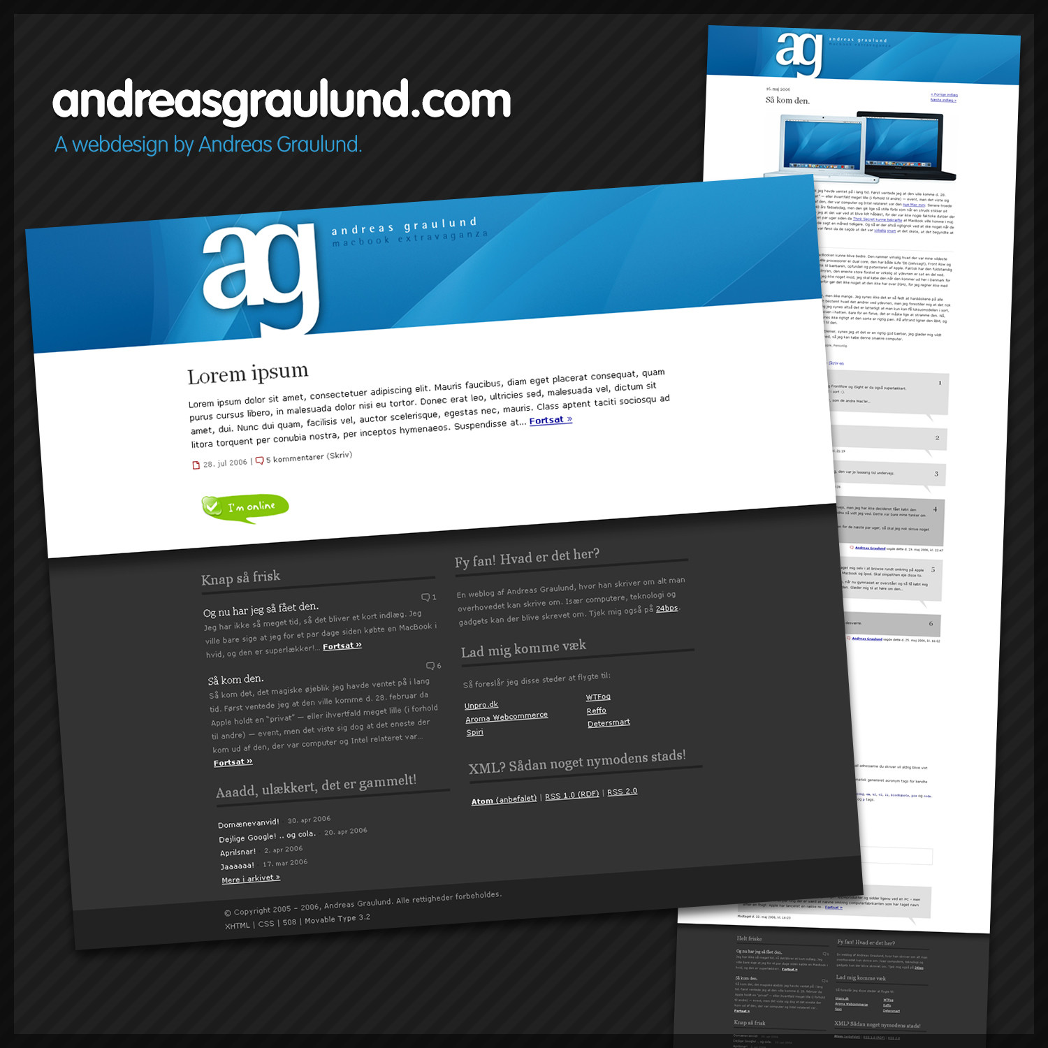
I have always designed webpages, but I've never really showed them here on dA, as it has been more photography-focused. But as I'm doing more and more webdesign and less photography, I figured I wanted to start uploading my webdesigns too.So here we go! This is my personal weblog, located on andreasgraulund.com (yeah, that is my real name. D: ). It's a Danish blog, so I understand if you don't get what it says at all. Fortunately, as we all know, it's the design that matters. :D I focused on creating a simple yet different design focusing on horizontal blocks rather than vertical blocks, which most blogs are built from (hence a main column and a sidebar). The header image has changed background many times, but I decided to show the last one. This header is changed to fit to the excitement I had because the MacBook just came out at that time.
The screenshots show the front page with a test post, and an individual post page, with a real post about the MacBook.
 This particular design is currently offline. Handcoded valid XHTML, CSS and PHP, of course.
Related content


Comments: 40

Hi, great work you have there, i have featured your artwork in my Journal [link]
👍: 0 ⏩: 0


oooh, tilty awesomeness ftw. quite unique!
and in other news, *shuffles paper on desk*
YOU HAVE A REAL NAME!?

👍: 0 ⏩: 0


Mac-o-skypey desing...  (Smile)")
Great job, once again.
👍: 0 ⏩: 0


Great stuff mate, congrats on the contest win as well!
👍: 0 ⏩: 0


Dude, that's some sweet design. I didn't know you were a designer.
Ever do any photographer's webpages?
")
👍: 0 ⏩: 1

Haven't done much of that so far, but it should be easy. 
Thanks for the comment!

👍: 0 ⏩: 0

")


Wow, awesome elec! Did you really design this? ")

👍: 0 ⏩: 1
You're right, I haven't showed them before. D:
Thanks for your comment! :D
👍: 0 ⏩: 0

This is rockin! I am usually not so much a fan of dark designs, but this one has flare with the addition of white in it as well as blue! You know they say that sites that feature blues in them are the ones that stand out most in users minds?
👍: 0 ⏩: 1
Haha, I didn't know they say that!
Thanks for your comment.


👍: 0 ⏩: 1
Yea I read it on one of ^depthskins designs ")
👍: 0 ⏩: 0

I really like the font you used in the titlebar next to your initials. What is is called, and where can I get it?
👍: 0 ⏩: 1
It's the same font I use in the initials too. 
Thanks for your comment!

👍: 0 ⏩: 1


Jeg synes det er godt fundet på nogen af de små sætninger du har skrevet som overskrift, det er cool nok.
Udover det synes jeg du har brugt farverne godt til at fokusere rundt på tingene.
Lækkert arbejde.
👍: 0 ⏩: 0

gorgeous fluid design you have created, very nicely constructed, hope the code is nice and clean as well
as for:
"Wow m8 i really like that template it all fits. just seems a bit large. If it was smaller it would look neater. Good job."
its fluid, you want it smaller, just resize your broswer, it will fit to a minimum of what looks to be 760px which means it is designed with 800x600 users in mind, and for that its great!
at least this way being fluid it doesn't look like a tiny spec on my 1600x1200 i am now using!
👍: 0 ⏩: 1
 (Wink)")
And of course the code is nice and clean. It's XHTML, you can also just look at the code by going to the link in the description! :D
Thanks for your comment!
👍: 0 ⏩: 1
it is fluid in such a way that the images flow to a large screen resolution, it means that even though the content is fixed width, there is still something fluid expanding around the content rather than a blank white background
so depending on your definition of fluidity, it is and it isn't
👍: 0 ⏩: 1
Yeah, that's what I meant, when you use horizontal blocks, you're able to make the background fluid, however the content is limited to a fixed with.
Thanks :D

👍: 0 ⏩: 1
yeah its good to see someone with a fresh attitude to design that still allows for users of 800x600 to see his full content in the site easily, yet expands so that it is large enough to fill a screen double the resolution to keep large screen resolution users happy as well
+fav as well
👍: 0 ⏩: 1


That's a really nice design D: D: D: *is jealous*
👍: 0 ⏩: 0


Wow m8 i really like that template it all fits. just seems a bit large. If it was smaller it would look neater. Good job.
👍: 0 ⏩: 0