HOME | DD
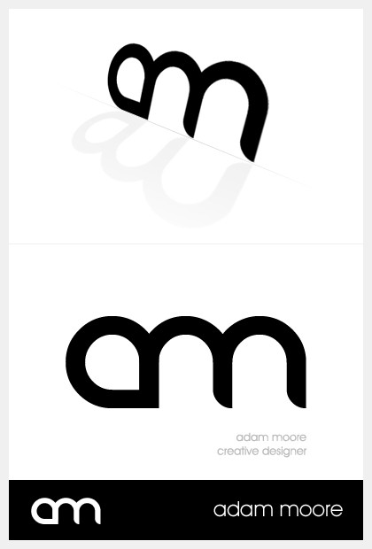
 elusive — AM '08
Published: 2008-05-06 14:55:43 +0000 UTC; Views: 5881; Favourites: 29; Downloads: 0
Redirect to original
Description
Just a revamp on a logo that ~woyte designed for me. I wanted to do something a little different for this year, and this is what I came up with. It follows the same kind of style just a bit different.Related content


Comments: 73

CW could be done, I think  (Smile)")
👍: 0 ⏩: 0


")

It actually reminded me of last.fm's logo. How rare!
👍: 0 ⏩: 1


That font is kickass
👍: 0 ⏩: 1


Very nice. Clean and simple, yet means something towards your name. 9/10
👍: 0 ⏩: 1

I'm not loving it. It's certainly passable, but it's not much more than a ligature of 2 characters of a trendy looking font. It looks like a bit of a caterpillar at first glance.
You've practically made the heavy use of avant garde a signature. I think you could capitalize on that more and emphasize your whole name more.
Perhaps something like this: [link]
👍: 0 ⏩: 1
Hmm perhaps. I think i'm more likely to stick to the avant garde type as well. I believe the Phirewire logotype will actually be my signature piece on work too, now that I think about it.
I will see if I can mock something up soon similar to your mock (thanks for the time too by the way) and see what I can come up with
👍: 0 ⏩: 0

Too trendy for my tastes, wouldn't you rather stand out than blend in?
👍: 0 ⏩: 1
Yeah ")
👍: 0 ⏩: 0

I like it, but I must say, the style (and the use of REZ) is way overused in logo design.
👍: 0 ⏩: 1
That font.
Also known as Rezland, and and another font called Danube. (i think thats what you used, my mistake.)
👍: 0 ⏩: 1
See, its so common that I can name it off the top of my head.
👍: 0 ⏩: 1
I'm only going to use the Phirewire logo to tag my work from this point on, however.
👍: 0 ⏩: 1
I must say, I like the Phirewire logo a lot.
So when will the site be up?
👍: 0 ⏩: 1
Hopefully sooner then later :S I was working on it this weekend.
👍: 0 ⏩: 1
I'll keep my eyes peeled for it.

👍: 0 ⏩: 0

You know.. Its like the rez of dim logos out there. lol Kidding. Nice logo
👍: 0 ⏩: 0


 (Wink)")


I love those 0.1point lines... have always and will forever love narrow lines.
Very cool. Minimalistic yet funky stylish.
👍: 0 ⏩: 1


Thanks dude
It does mean a lot coming from such an entity in dA

👍: 0 ⏩: 0


| Next =>