HOME | DD
 elusive — Interface - Catalyst
Published: 2006-12-10 18:09:14 +0000 UTC; Views: 11678; Favourites: 53; Downloads: 16
Redirect to original
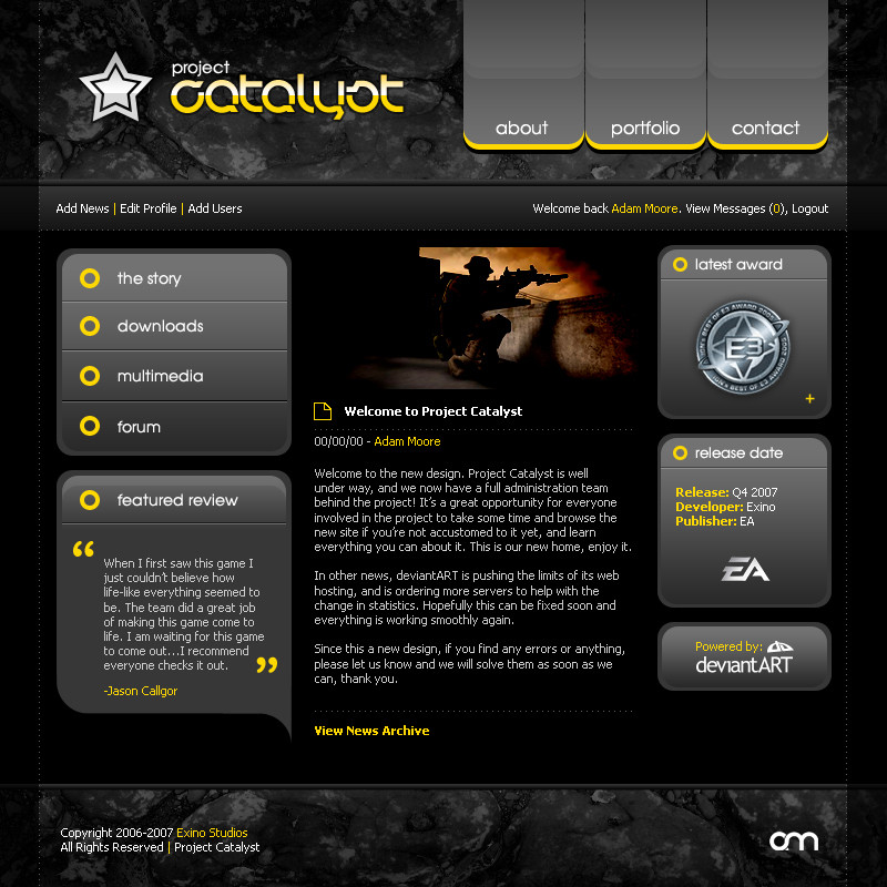
Description
I haven't posted anything in awhile, so I did this up this morning during breakfast. I also used the donation textures from the charity fund for ^bleedsopretty in this.Anyways, hope you like it. PhotoShop CS2 (~2-3 hours).
Related content


Comments: 104

Inspiration. I'm really trying to get in the groove of doing stuff like this in photoshop....i guess my question is, do you import this entire image into dreamweaver and do an image map, or do you manually break it apart, and put it in. I just wanna know the best way to go about something like this.
👍: 0 ⏩: 1

My steps are:
Build the entire main page + subpages + templates in Photoshop. Than save them to a flat format (usually .gif). Than split it apart piece by piece, and write all the code in either Notepad or Dreamweaver  (Smile)")
👍: 0 ⏩: 1
Wow! Thanks so much for the steps, very much appreciated. I'm gonna try it out and see what i come up with....if the result isn't too much of an attrocity lol i'll post it so u can see. 
👍: 0 ⏩: 0


Middle, third paragraph:Since this a new design
👍: 0 ⏩: 1
It's just filler text anyways
")
👍: 0 ⏩: 1

👍: 0 ⏩: 0


")

I used to use that kind of navboxes in other works, i mean like the duplicate shape down the button. Never uploaded tho.
Looks great man, but i think that you could exploit more the theme.
👍: 0 ⏩: 1


too big navboxes, I think. It looks too tiny with 19* monitor.
👍: 0 ⏩: 1

I really like navboxes, but text too big. Anyway nice work.
👍: 0 ⏩: 1

Will you ever run out of great ideas? I hope not!! Great job man
👍: 0 ⏩: 1
Thanks
👍: 0 ⏩: 1

feel free to post it on DA if you like. I can't wait to see it.
And please ... please don't just do it to get it done with, I don't care if you have to wait a week until you get ispiration. I want it to look very good, not to be greedy for anything.
👍: 0 ⏩: 0

As usual a very sexy, clean and stylish design.
I just would use a bit thinner border for the boxes, would come nice I think.
Apart from that it's fantastic, great job!
👍: 0 ⏩: 1
Yeah I might release a version update later with a more thinner base.
👍: 0 ⏩: 0


hmmm, not too fond of it due to 90% of it being black and white with gradients..
but thats just me
👍: 0 ⏩: 1
I wanted it to be darker. I will make a light version eventually.
👍: 0 ⏩: 0

simple and works very good...
(btw i think that image there is from Americas army game, i play it
 (Wink)")
👍: 0 ⏩: 1

I like it ... resembles Blade, but cooler ")
👍: 0 ⏩: 1
Haha, thanks. Except this took 1/5th the time.
👍: 0 ⏩: 1
That's strange ... Blade looks not quite as complex as this.
👍: 0 ⏩: 0

Is that Elisha Cuthburt? ")
👍: 0 ⏩: 0

A very nice layout elusive. I find that the left part of the design (navigation) is too emphasized as compared to the other side and the center content. Its because of the large height of the of buttons (blank space in each button) and large fonts. The color scheme is good.
👍: 0 ⏩: 1
Thanks for the thoughtful feedback. Always nice to get a quality response
👍: 0 ⏩: 0

| Next =>