HOME | DD
 elusive — ZoDev Design
Published: 2007-12-03 14:53:14 +0000 UTC; Views: 12215; Favourites: 76; Downloads: 0
Redirect to original
Description
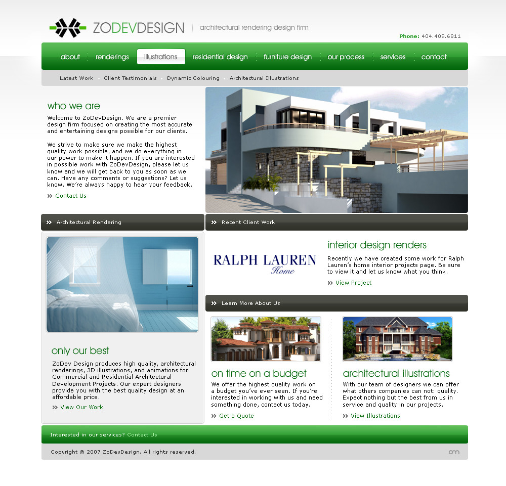
Project work for a great architectural company ZoDev Design.I will have some more projects to post in awhile, and you'll see more of my 'crazy' creative side most of you have become fond of me for, but for now, you have this to check out.
Also, don't give it, "It's too normal", as normal is just what needs to be done sometimes (understandably). Thanks
 (Smile)")
Company: [link]
Related content


Comments: 135

It's been changed some since launch. Thanks!
👍: 0 ⏩: 0


I like the menu, but I think for the rest, it's like you said yourself, a bit too normal.
👍: 0 ⏩: 0

Caught my eye, I think it was simply the rounded content with the plastic look but still looked extremely professional
👍: 0 ⏩: 1
I'm glad you like it
👍: 0 ⏩: 0

AGH Tables... But other then that it's pretty nifty..
Tables is more work, but we aren't web coders, and I wish I could get away with using a table from time to time.
👍: 0 ⏩: 1
There will be tables, i'm sure. But the site isn't coded yet? ")
👍: 0 ⏩: 2

Coding webpage layouts in CSS is really easy. I'm sure you'll have no problem picking it up considering your other skills that you have shown in designing webpages.
If you ever need help with CSS, let me know. I've been using it for all my webpages for the last couple of years.
👍: 0 ⏩: 0
w00t! you can add me on Instant Messenger for help.. but I don't do advanced positioning.
👍: 0 ⏩: 0

formal and cool
the colors and the harmony 'r great
well, and in my opinion, much better than the actual one!

👍: 0 ⏩: 1
Thank you
")
👍: 0 ⏩: 0


Good design, I really like the menu. Some of the spacings don't line up correctly though, such as the "only our best" section (the gap on the left is bigger than the one on the right). Apart from that, good job
👍: 0 ⏩: 1
Yeah I have another version actually that was changed, just not uploaded haha.
👍: 0 ⏩: 0


Cool details, but I think boxes are a little too close, maybe more space between them would be better ?
👍: 0 ⏩: 1
Perhaps
👍: 0 ⏩: 1

I really like your work, Adam.
Everything is so well balanced and presented. I like the fact nothing is all clumped up like most designers.
👍: 0 ⏩: 1
The design was modified by the client, but I refuse to post the updated version as I don't like it as much

👍: 0 ⏩: 0


Aww man I absolutely love this! The colours, the nav, the style its just perfect!
👍: 0 ⏩: 1

Some may say it's "normal", but your attention to detail that can be so easily overlooked by some is what really makes this piece beautiful.
👍: 0 ⏩: 1


I dunnnnnooo man, I kinda liked the red one a lot better.
...kidding. I love it.
👍: 0 ⏩: 1
haha, thanks  (Wink)")
The day you pick red over green will be the day.
👍: 0 ⏩: 1


I must admit I find it more logical to have the arrows as it is - and I also think it might be confusing if the logotype was highlighted as you are suggesting.
👍: 0 ⏩: 0

very nice buttons, are you working on devolving too??
👍: 0 ⏩: 1
yeah the nickname
name of developing lol
👍: 0 ⏩: 0
omg it's normal
Anyway only thing that really jumps to my eye is that the text under the title: "interior design renders" doesn't align with "architectural illustrations" which seems a bit weird to me.
👍: 0 ⏩: 1
That might be something I will be fixing when I take a look at it before I code it
👍: 0 ⏩: 0


I like that blue room! How peaceful, eh? Probably cost a million bucks. I think the design is simple and clean. That's all that's needed sometimes ya know? Good work.
👍: 0 ⏩: 1
| Next =>