HOME | DD
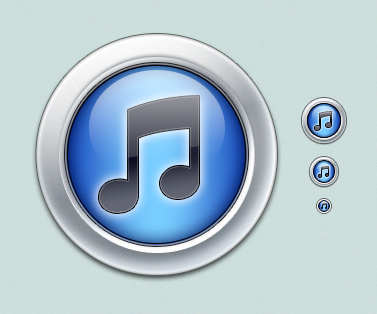
 elusive — iTunes 10 Icon
Published: 2010-09-02 17:33:58 +0000 UTC; Views: 9308; Favourites: 26; Downloads: 856
Redirect to original
Description
Wasn't overly crazy about the new iTunes 10 icon, so I devised my own version for the time being.I figured someone else might like it too.
Related content


Comments: 17


 (Smile)")

This looks 10x times better than the orginal
👍: 0 ⏩: 0

Nice work man, i like the icon. But i really don't like the new iTunes 10 icon, the icon itself is good but i expected something fancier from apple. It's to simple in my opinion.
👍: 0 ⏩: 0

It's... fundamentally the same? How does a wavy gradient instead of an arc-cut one make any difference? O.o
👍: 0 ⏩: 1

Indeed. I wanted more depth, that's all.
👍: 0 ⏩: 0
Yours win
How do you make your glare on the 'orb' wrap around the circumference so well? If you know what I mean...I don't think I'm being very descriptive now that I read this back to myself

👍: 0 ⏩: 1

Well they are shapes with gradients. I really don't know how to explain. If you want I can send you a PSD so you can take a look at it.
👍: 0 ⏩: 1
Sure. It doesn't have to be anything really besides the circle/shape with the gradient on it. I was just curious about one element of it specifically.
You can reach me at adam@exino.com -- much appreciate Javier.
👍: 0 ⏩: 0


")

 (Wink)")


You think just like I do! Already recreated my own style and started writing a tutorial, but you jumped me on this one! Haha!
👍: 0 ⏩: 0
