HOME | DD
 ember-reed — neru and azreal

Published: 2007-03-28 14:30:19 +0000 UTC; Views: 3595; Favourites: 68; Downloads: 76
Redirect to original
Description
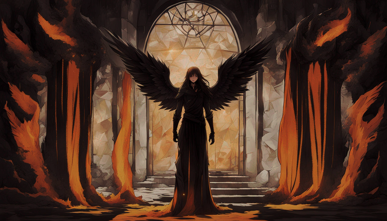
uninspiring title, i know! they just remind me of too many dualities to pick one.this is for 's couples contest.
wow. this is the first colored pencil draing i have done in almost three years. in doing so, i was able to remind myself simultaneaously why i liked using them, and why i stopped using them.
regardless, i am very VERY happy with this one. took me a long time since i as so afraid of screwing it up, and i almost did.
the character in the fron is neru, and the character in the back is azreal. they are the main characters from the novel i'm currently working on. i won't give away anything more than that. these characters are way WAY too complex for a short explanation. i can only say that neru is good, and azreal is not. also, neru is an android: azreal is also not. azreal is holding his infamous sword(s). he only has one, but it would have looked so weird without another one. x_x
most of this was drawn with colored pencils. i scanned it in two pieces since it was kinda big, and then added the bits like the light behind azreal, and the glowing bit from neru's heart. ANYWAY...
EDIT: i changed a few things, made a few details a little clearer, and added a quick background. i also made it a bit brighter! ^_^ nuthin much
for contest:
TITLE: neru and azreal
DESCRIPTION: neru and azreal are opposing forces born from eachother. while they both share much in common, it has allways been they're destiny to cancel eachother out. neru was an android, hence the mechanical wings. her angel wings are to contrast her desires with her reality, like the light around azreal.
Related content


Comments: 59

i hadn't noticed the leaning. and the "object" in the background is another character. he's facing the other way. his wings and his swords are what fill the background!
👍: 0 ⏩: 0

Those wings are so creative!
And with pencils? OMG, that's really cool!
One point though:
I think the ears are not detailed enough, more dept and like a whole xD other wise she couldn't hear anything ;D


👍: 0 ⏩: 1
well, unfortunately, that bit was intentional. she's an android, not human. they're meant to look like ears but actually house a series of observational components. they have a similar purpose to ears, but that's not what they are. thanks for the crit! of you think of anything else, don't hesitate to comment!
👍: 0 ⏩: 1
Oh I see
So she can't hear? xD

👍: 0 ⏩: 0

Buetifull i LOVE the wings <3 *_* and im amazed by the fact you did it with mostly pencils . only thing i cant suggest is added abit more shading on the girl
👍: 0 ⏩: 1
it's something very hard to do with coloured pencils, but if i had done this today with the pc, i would never have allowed such a distinct light source to go to waste! i'm starting to think i should have chosen a newer piece to critique, but i didn't want it to be a fan art, which is why i chose this instead! thanks for the crit. if you think of anything you want to add, please don't hesitate!
👍: 0 ⏩: 0

great job. i know we're supposed to critique this, but i really can't find any flaws in it. i love the detail in the metallic wings and the figure in the background. that's amazing that you used colored pencils and only minimal digital altering.
👍: 0 ⏩: 1
flaws are not the only thing you should be looking for. if you had done this, would you have done things differently? use your imagination!
👍: 0 ⏩: 1
hmm. if i had done this, i probably would've omitted those white angel wings on the bottom. for the metallic wings, i'd have put a few more 'feathers' that are smaller and in between the larger ones to make it more wing-like. other than that i really like all the choices you made.
👍: 0 ⏩: 0

Wow. This is probably one of the coolest and most beautiful pictures I've seen. You should be proud of this. Fave.
👍: 0 ⏩: 0


wait... that's colored pencil?! you're kidding right?
👍: 0 ⏩: 0


Stunning! I absolutely love her wings... Neatly done!
👍: 0 ⏩: 1
^_^ thanks. it's the last piece i did in this style. colored pencil has a unique look, but it takes to long to do. hence why i'm trying to improve on my ability with my tablet! ^_^
👍: 0 ⏩: 0


Love the duality of this, Is terribly WELL executed.
👍: 0 ⏩: 1
again, thankyou! your comments are so kind! i think i was really inspired when i sat down to sketch this one. took me a long time to finish tho! ^_^
👍: 0 ⏩: 1


")

omg! this is awesome! i love the wings and the details and the overall composition xD amazing!
👍: 0 ⏩: 1
^_^ thanks. this is my favorite now!
👍: 0 ⏩: 1

Woah, that must've take you forever! Great job. I love all the little details. Keep up the good work.
👍: 0 ⏩: 0


ooooh love it  (Smile)")
👍: 0 ⏩: 0

I see really great work here, I like seeing these duality pictures from time to time and your work is quite good, I may have trouble finding flaws. The softness of the outlines and details is interesting but it does cause to blend into each other a little too much, the metal parts may have looked a bit more metal if they had a crisper edge. You may want to add some detail to the inside of the girls ear, even a simple line or two would do to give it a bit of depth since it looks overly round at the moment, showing some more shadow could do the same thing too I believe. Well this looks great, you have done some nice work here
👍: 0 ⏩: 1
FINALLY. comment consisting of more than three ords. it as becoming a bit monotonous. i agree ith the edges thing, but there asn't much more i could do with it. the origional is actually a lot crisper looking, but the scan looked horible so i had to soften it a bit. i'm glad you like the duality! ^_^
👍: 0 ⏩: 1
I know the feeling about three words (when I get them ;_ (Wink)")

👍: 0 ⏩: 0


beautiful beautiful beautiful! The details are amazing!
👍: 0 ⏩: 1


...colored pencil...? OMG I have a long way to go lol Absolutely amazing!
👍: 0 ⏩: 1
i edited it a bit with the pc when i was done, so don't loose all hope. in recent deviations on my fromt page, you will see the before and after pic with the origional of this before i edited it. might make it seem a bit less hopeless. colored pencils never look THIS good!
👍: 0 ⏩: 1
Whew lol, I was guna say lol Anyway, what filters and effects did you use? Im currently working on a background for my Kagome piece and I have no idea how it's guna look once scanned.
👍: 0 ⏩: 1
i don't know about filters and effects. i softened the focus a bit, decreased the brightness, increased the contrast, and the rest i did with brushes. it'sjust about balance. it's easier than it looks! ^_^
👍: 0 ⏩: 1
That's good to know because I'm almost done with the background for my Kagome piece in colored pencil and I'm afraid of what it's going to look like when I actually scan it in
👍: 0 ⏩: 0

Really nice drawing, and to think it is colored with color pencils is just adding to the quality of it.
I particularly like the wings mechanical thingies..
Good job
👍: 0 ⏩: 1
yeah, colored pencils are hard to use... great results tho! glad you liked it!
👍: 0 ⏩: 0


great design! great layout! nice use of colours!! lovie the glowing ethereal look!
👍: 0 ⏩: 1
thanks. this took a lot of work, but i'm glad you like it.
👍: 0 ⏩: 0

oh wow the edits made it even more beautiful ; ;
👍: 0 ⏩: 1
i thought you would like it! i'm working on having enough money to buy the supplies i need to do acrylic painting. i have some really great ideas for it. one of them was actually another aya and mallin pic, similar to the contrast in this one. if i ever get what i need, you'll be seeing that here soon! ^_^
👍: 0 ⏩: 0
| Next =>