HOME | DD
 Eric-3 — -2018- Despair
#dragon #hunter #spyro #spyrothedragon
Published: 2018-04-11 20:08:52 +0000 UTC; Views: 2070; Favourites: 68; Downloads: 10
Redirect to original
Description
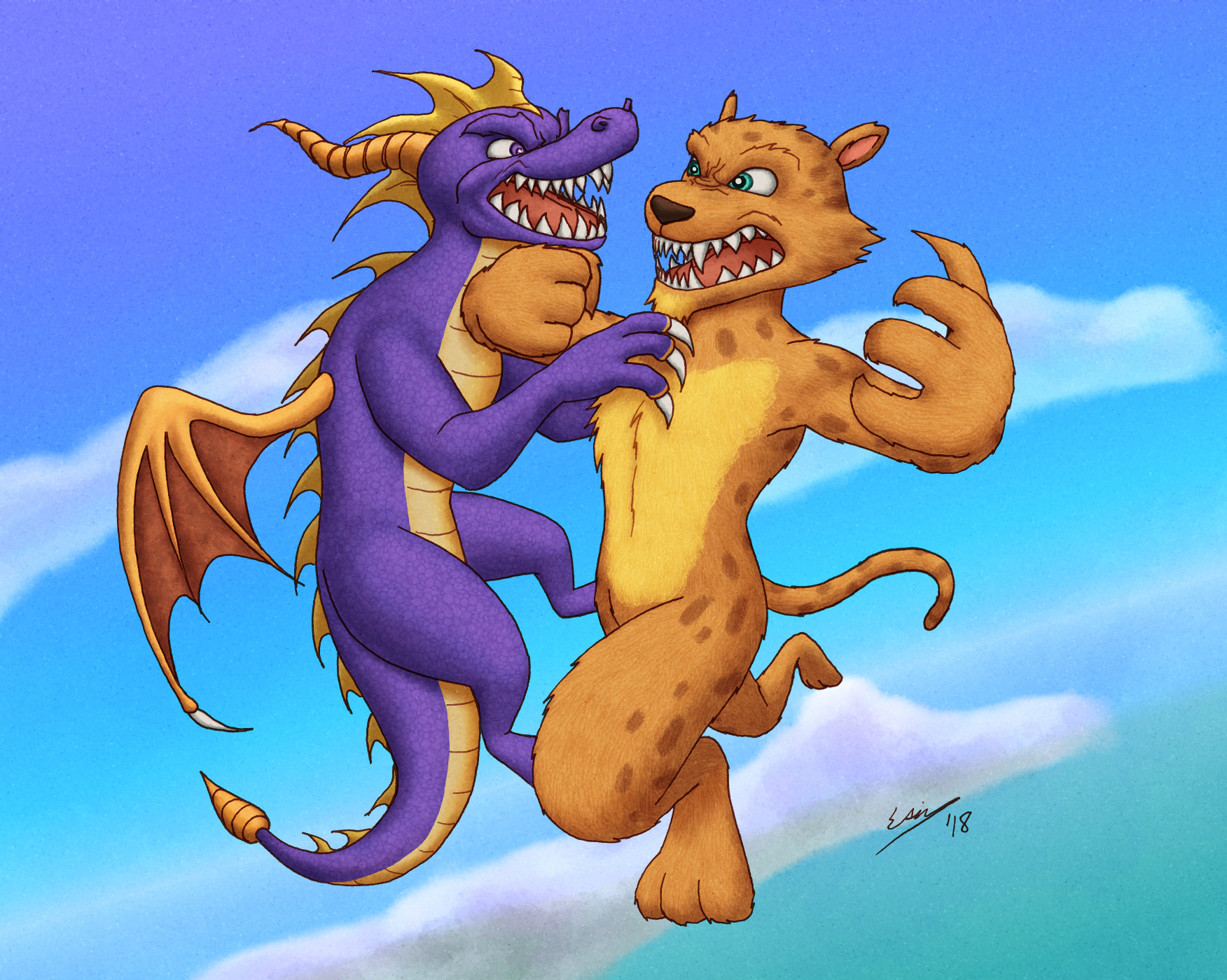
Spyro vs Hunter.This was inspired by a let's play I watched of Spyro 2 that created "Sad Hunter", a Hunter lamenting that Spyro was a more capable hero than himself and in turn trying to sabotage Spyro. I always liked Hunter in Spyro: Year of the Dragon (I played that before 2), and this put a funny spin on his character that I wanted to work with. So here's a sick rival battle.
")
I'm not used to drawing especially cartoony characters or even animals in general, so I was a little lost with how to proceed with drawing these characters in my own style. I think it really shows, since the drawing looks kind of awkward and unpolished to me.
Even worse is that, at least in some parts, I don't know WHY it looks awkward to me. So I can't easily tell what I did wrong and how to fix it. I just know something's...off. I had to fix some of it digitally, but yeah, I didn't know what exactly was bothering me to know how to fix everything.
I think it largely has to do with Hunter's pose. I'm not used to four-legged creatures and trying to put one in a battle pose is even harder. That also lead to me not knowing what to do with Hunter's pose and it doesn't look natural to me. He's supposed to be trying to elbow Spyro away (who's trying to bite him, apparently) with one arm and counterattack with the other.
I'm fairly pleased with how the colouring went though. It was a little tough trying to pick some of Spyro's colours since the in-game model looks a little different from the higher-quality 3D renders from like covers and ads and stuff, so I had to decide what colours I wanted to go by. The in-game model doesn't even have the yellow spike things on his back.
Hunter was a little difficult too. As far as the original PS1 games went, I could only find the in-game model of Hunter. Of course, it's pretty low-resolution, so the details and colours aren't as clear as I'd like. I'm pretty sure I did actually mess it up, but it's hard to explain in just words. Anyway, I just went with how I thought it would look best for the picture.
I left the colours pretty saturated by my standards to try and match the feel of the games (in terms of colour...not aggression).
Weird that I keep happening to draw pictures connected to video games and then they get remakes announced shortly after. It's happened with Final Fantasy VII, Shadow of the Colossus, and now Spyro (I started this picture months ago, before the announcement).
So I guess I should draw something that I want to see a remake of
 ...
...
Related content


Comments: 9

👍: 0 ⏩: 0

I really like the expressions on each character; loads of emotion and depth. And, as always, the poses are beyond excellent.

👍: 0 ⏩: 1
 (Smile)")


Haha. It's been several years since I last played that to remember how it went for me.
👍: 0 ⏩: 0

It overall looks great the way it is, and that headcanon is interesting...
👍: 0 ⏩: 1
Thanks for the fave.
Yeah, I found it intriguing too.

👍: 0 ⏩: 0