HOME | DD
 ether — squared

Published: 2005-11-07 23:46:17 +0000 UTC; Views: 1179; Favourites: 0; Downloads: 311
Redirect to original
Description
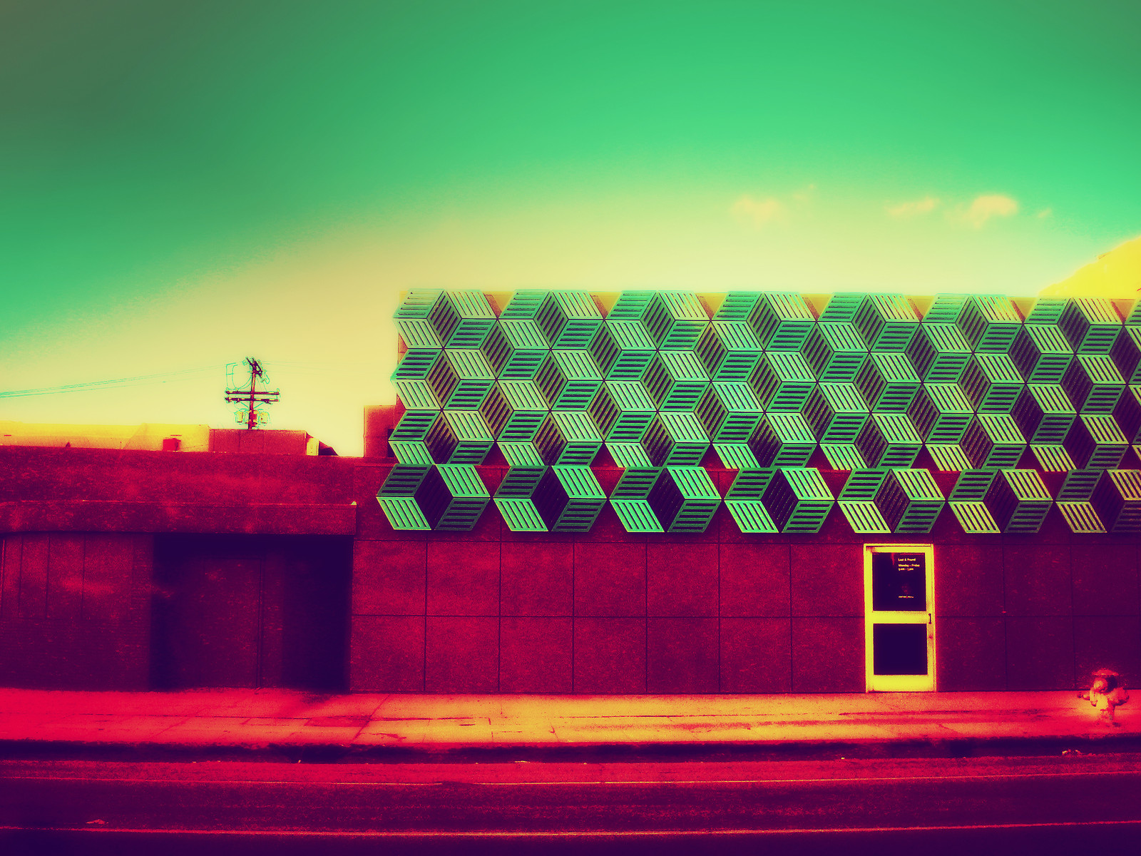
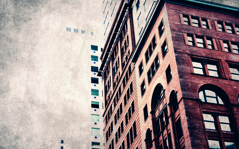
don't be square sparky, don't be square!!woke up this morning with a need to make a wall using these exact colors plus a mass of squares.
Related content


Comments: 3

A composition that works on several levels.
The eye is guided deliberately by simple blocks of colour to a scene of delightful complexity, but before one even reaches this focal point the balance of the colour spaces surrounding it creates a scene of harmony and a path for the eye step around and admire the centerpiece, much like one would walk around a sculpture in 3D space.
Not only are the divisions of color balanced with each other in shape, size, and hue, but are balanced with the profusion of squares as well, such that the bouquet of squares extends further into the lower right to compensate for the upper left's dominating size. the larger parts of the image are pinned nicely together by the splash of squares and the intent to do so is clear in the single square perfectly centered where they meet.
The squares are nicely anchored by a pillar of distinctly lighter color extending from the left, almost as if it were slamming into the walls that are the other blocks of color, and the squares are the resultant exquisite explosion of particles. This anchor also allows for a pleasant view from any rotation.
This level of visual balance is also evident in your photography. I only wish you could experiment more with things such as this.
The only thing that truly bothers me is the pattern in the upper right, which I find highly disruptive and UNbalancing, such that I find the thumbnail view more attractive since the pattern is not evident at that size.
I imagine it could have an even better effect if gradients were used in the surrounding sections to create yet another level of harmonious visual movement.
On the whole it has the correct level of complexity for a good wallpaper, not to mention the appropriate placement of a focal area to balance the other elements present on the left side of a typical desktop. Generally very pleasant to look at in any setting.
👍: 0 ⏩: 0

 (Smile)")