HOME | DD
 Factor--- — Illustrator Midterm
Published: 2005-03-18 12:09:53 +0000 UTC; Views: 144; Favourites: 0; Downloads: 18
Redirect to original
Description
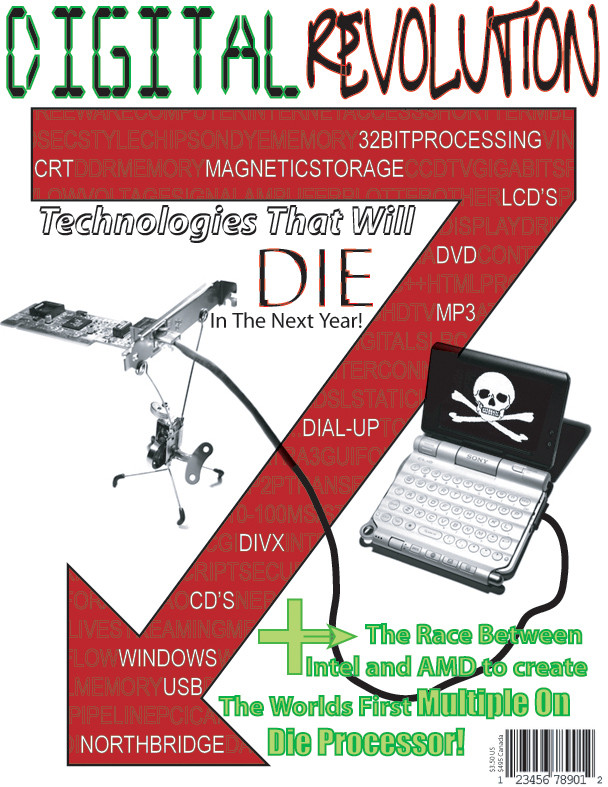
Hey, I just thought I'd give you all a look at my L33T Illustrator Skillzorz.. (ok, they are not l33t..)This was for my Illustrator class... I'm getting better, I started off this class with no prior knowledge of Illustrator at all (other than knowing it was a vector graphic program). So I hope to someday be using this as much or more than photoshop (Which I have been working with for many many years) to do all my graphics.
 (Smile)")
The two photo's used in this are my own, and you can find them in my stock account.
Related content


Comments: 11

i like how "Windows" is listed as a technology that will die in the next year.... we can only hope...
as for critique, i notice that on the word "Revolution" on the top, where you have overlapping letters (R and E, T and U), the outlines of both are visible still... i think you should arrange those so that either one letter or the other appears to be on top, rather than having them cross yet both show up. (i think that made sense ")
")
👍: 0 ⏩: 1

oh yeah, windows is going down into the blue screen of death hell it belongs in!
um, anyway.. Thank you very much for that bit of critique, your right with the overlapping, but that's because I was just using a simple font...
👍: 0 ⏩: 0

I've got some constructive criticism over the top letters, "Digital Revolution". Colorwise, they've got the most weight in the picture, and that's not balanced near the bottom of the page, which it makes it seem somewhat like they're ready to just fall off the top on their own. Also, their fonts are entirely different from anything else found on the page, which makes them seem a bit awkward. One is entirely a digital font, which contrasts well with the graffiti like font, but every other piece of typography on the page is much more plain, like the "Arial" font. So it's seen as the title with its own characteristics, but it ends up separate with everything else on the page.
👍: 0 ⏩: 1
Humm, you make a good point... Thank you very much for the critique, I'll be sure to be on a look out for those things for the final.
👍: 0 ⏩: 1
My pleasure. Guess I learned something from all those design classes and critiques.
👍: 0 ⏩: 0

Nice Job.
👍: 0 ⏩: 2
Oh, you need not worry.. I'll still use photoshop all the time! It's just that I kind of plan to be a graphic designer for ad's or some other stuff, and I'd like my work to be based mainly in Illustrator. Obviously when I take a photograph for an add, I have to do a lot of work to it, that will all be in PS, but the add itself with the photograph included will be in Illustrator. chill man, it's all cool. I don't plan on getting rid of PS all that soon (as in ever)
👍: 0 ⏩: 1

lol, just a touch obsessive there?
sorry, couldnt help but notice such a rant
👍: 0 ⏩: 1
Thats okay. sorry. I am just a huge Photoshop fan.
")
👍: 0 ⏩: 0
