HOME | DD
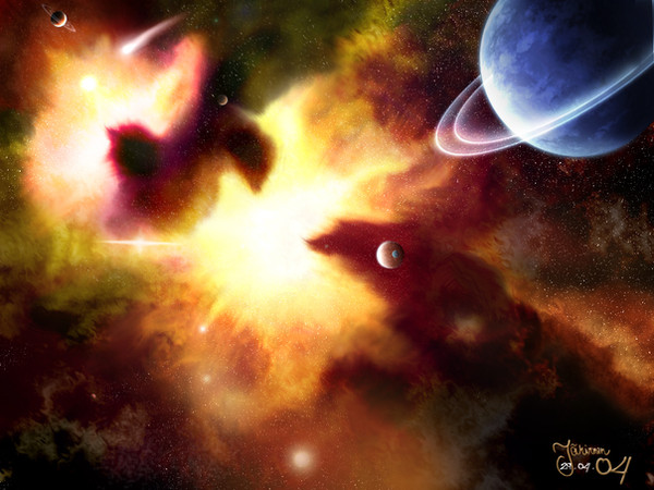
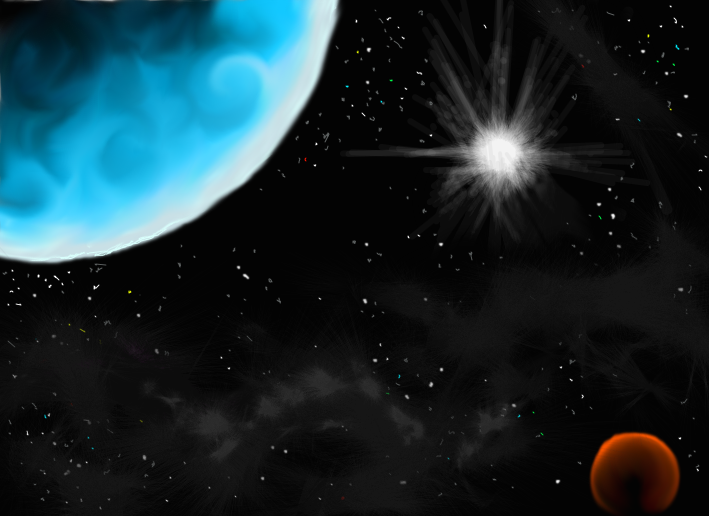
 Faei — Beginning
Published: 2005-01-04 16:30:13 +0000 UTC; Views: 1745; Favourites: 24; Downloads: 268
Redirect to original
Description
My first piece of art. I'm new here in DevianART, so lets see how this works.Related content


Comments: 27

This is gorgeous! I love the intensity of the colors and all the little planets ^_^
👍: 0 ⏩: 1

Hehe, thanks. Pretty surprising, this is my first deviation and I still get comments on it.
")
👍: 0 ⏩: 0

I like this one very much. The colors are amazing and the picture seems to give off a life of it's own. I won't advance critique. Wonderful job.
Jenny
👍: 0 ⏩: 0

ahh, a sight that would match the Hubble telescope. Very lovely work ^__^
👍: 0 ⏩: 0

it's really good. that has to be one of the best first peices i've seen since.. a long time ago. nice job. also, if you really are looking for critique, there is one thing taht you might want. move the planet a little bit. dunno what ti is, but somehting about it looks slightly wrong. and i only noticed it because you you mentioned you wanted critique, so i went back up and looked. nice job
👍: 0 ⏩: 1
Don't really need critique with this, since it's my first work and I've learned much after that.  (Wink)")
👍: 0 ⏩: 0

 (Smile)")


Very, very nice work here. I really love the powerfull colors and brushing; but one thing that catched my eye: YOu can see stars through the little planet. Keep up the sweet work
Greets,
~aiRaGe speaking here

👍: 0 ⏩: 0


very nice for a first...
2 things: rings around the blue planet just arent doin it for me...
and the top of the nebula, near the middle is blurred(even the background stars)...
besides that it looks great
👍: 0 ⏩: 0

Very nice; could you spill your technique on painting nebulae?
")
👍: 0 ⏩: 1
Heh, thanks. I'll do it when I feel like capable, It think my knowledge wouldn't help much yet.
👍: 0 ⏩: 0

Thank you all. Well, this one didn't take so long, like 6 hours or so.
👍: 0 ⏩: 0

Wow, thats awesome, especially seeing as its your first piece 
👍: 0 ⏩: 0

This is very impressive. There seems to be a lot going on in the piece all at the same time. This would make a wonderful poster since there is so much to look at.
👍: 0 ⏩: 0


Composition of the nebula is really nice. You almost dont even need the planet on the top right.
The background stars are slapped on, and thats a big no no. Its not as simple as copying a noise filtered black background and hitting screen. You should carefully chose where stars are, how they blend in and out, and show randomness.
They deserve just as much time as everything else.
You tend to clutter alot too. You have too much stuff going on. You dont need comets, and bright lens flared stars all over the place. Quite frankly you could have small planets with just the nebula as a background and it would hold just as strongly.
Colors are nice, but a bit confused. Its nice to unify colors a bit by using the primary color of the piece. (yours is a orangey red) What you do is make a layer on top of everything, fill it completely with the primary color in your compostion, hit soft light on layer properties, and adjust transparency. It helps to put everything in a relatively close proximity of color. (helps with color theory too)
Blue planet at the top right is not working. Its jarring and takes away from the center focus of the composition. If it was a redish orange, it would blend in better. I know you were trying to use a complimetary color for it to jarr the colors in the painting, but thats a bit of a stretch.
I would also crop the image on the right. The nebula should be the center focus.
👍: 0 ⏩: 1
Thanks for preoccupating in this piece, even if I told you to not do so. I mostly had the same opinions now as you do, but of course it was a big support to comment on this one also. That tip on colors sounds very useful. I also formulate the placements and such little bit better in my mind now on. Thank you.
👍: 0 ⏩: 0

Thanks for comments.
I'd also like to hear some advancing critique/comments from advanced Deviants.
👍: 0 ⏩: 0
Thank you for comments.
I'd like to hear some advancing critique also.
👍: 0 ⏩: 0


welcome to da, very nice introduction piece - what was used to make it?
👍: 0 ⏩: 0