HOME | DD
 farcelet — clone game : debating philosophy
Published: 2012-10-28 18:01:23 +0000 UTC; Views: 763; Favourites: 12; Downloads: 11
Redirect to original
Description
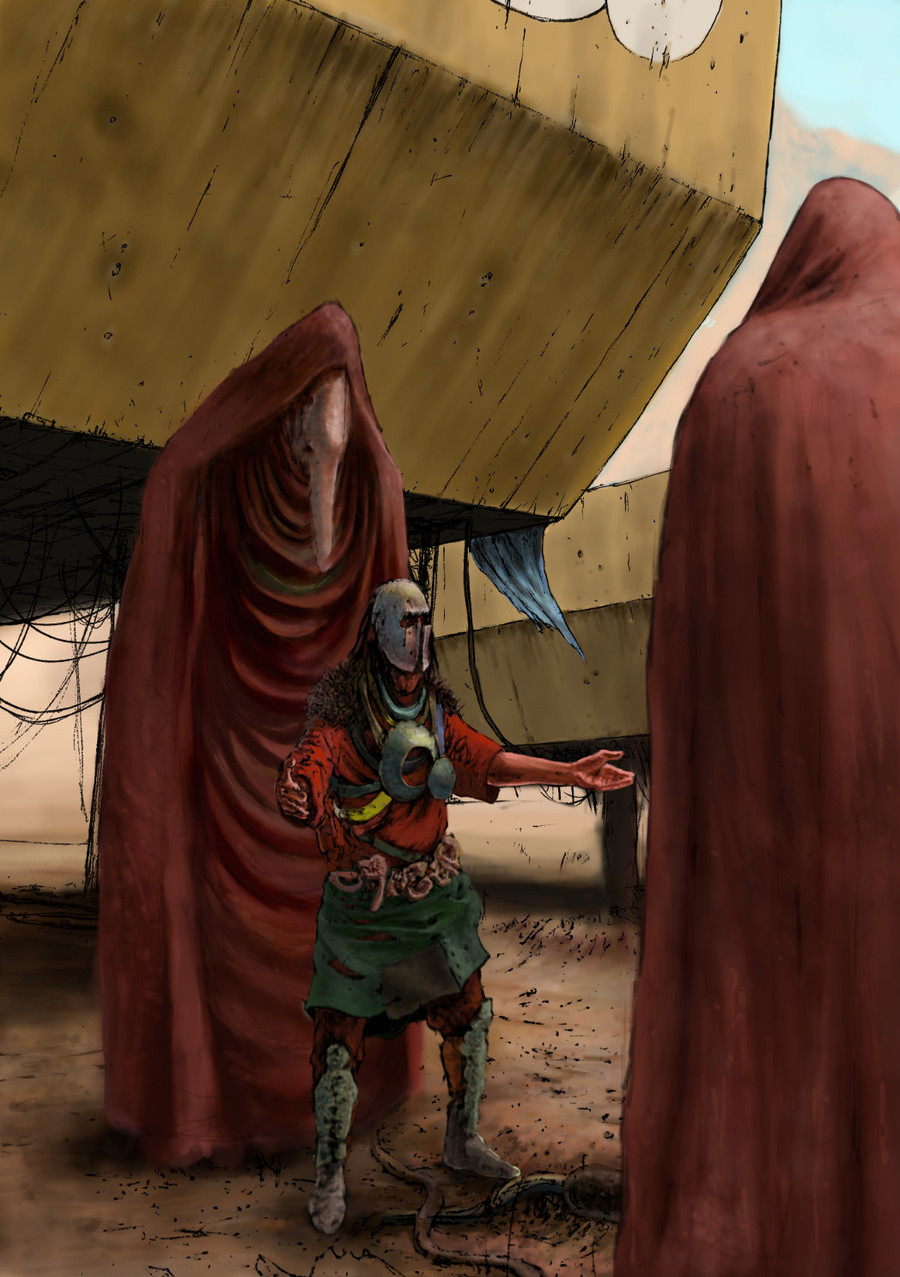
Pen, digital colouringAn early morning discussion among clones before takeoff.
Concept art for unnamed project - hope you enjoy!
 (Smile)")
Related content


Comments: 14

YES! good job with composition, color and figures... maybe his right hand is bit flat and shoulders seem to be placed a bit too low though that is questionable because you covered dat area with fur
👍: 0 ⏩: 1

Which right hand are we talking about? His own or the hand ON the right?
Think I agree about the shoulders, didn't see it before - still working on that anatomy! Thanks for the comment buddy.
")
👍: 0 ⏩: 1
his right hand,the hand on the left
👍: 0 ⏩: 1
Yeah I think you're right aboutt that, any idea how to avoid this? What is it that makes it flat?
👍: 0 ⏩: 1
If the person was closer, you could make the hand in perspective, a lot bigger against the rest. In this case however, you need to choose different approach. I would go for making the fingers area a lot brighter against the own hand/sleeve which is bright red. There is also the matter of red color which tends to push everything forward and you have red sleeve, red-ish hand and red robe in background. even though the tones are different it flattens the area in my opinion. And i almost forgot... fingers are alright but could represent the perspective deformation better... oh and the sleeve on that hand does not look like T shirt like on the other hand, that is also confusing.
👍: 0 ⏩: 1
Yeah all good points, truth be told I'm rather new with colouring so I'll definitely try to improve on this for my next piece. Thanks again for the comments buddy!
👍: 0 ⏩: 0

Whoah, whoah, whoah! It looks so awesome with those floating machines, really gives depth
👍: 0 ⏩: 1
Thanks buddy! Glad you like it. Any suggestions for my next one?
👍: 0 ⏩: 1
How about try something nice for vikingr load screen
👍: 0 ⏩: 1
I'd definitely like to... But for one thing I wouldn't know where one might sqweeze it in and secondly it would really need to be consistent with the rest - still, would love to have my art in the game!
👍: 0 ⏩: 1
Vikingr load screens will be looping. Right now we are thinking of three or four in the loop and they are quite different already... Now there is just one problem, make installation option that would allow you to have your load screens in right aspect ration.
👍: 0 ⏩: 1
I see! And what is the right aspect ratio, by the way? In case I give this a shot...
👍: 0 ⏩: 1
make it the widest resolution people usually use... 1920x1080 aka 16x9 then you can just crop it for other resolutions... ah and you can start even bigger and re-size it when you finish, it will make the details look better and shit... y'know
👍: 0 ⏩: 1
Ah yep that's what I usually do, alright will give it a shot - have not started yet however, though it seems update is well on its way!
👍: 0 ⏩: 0