HOME | DD

faros β€” Celement

Published: 2005-12-22 21:03:23 +0000 UTC; Views: 8398; Favourites: 354; Downloads: 3801
Redirect to original
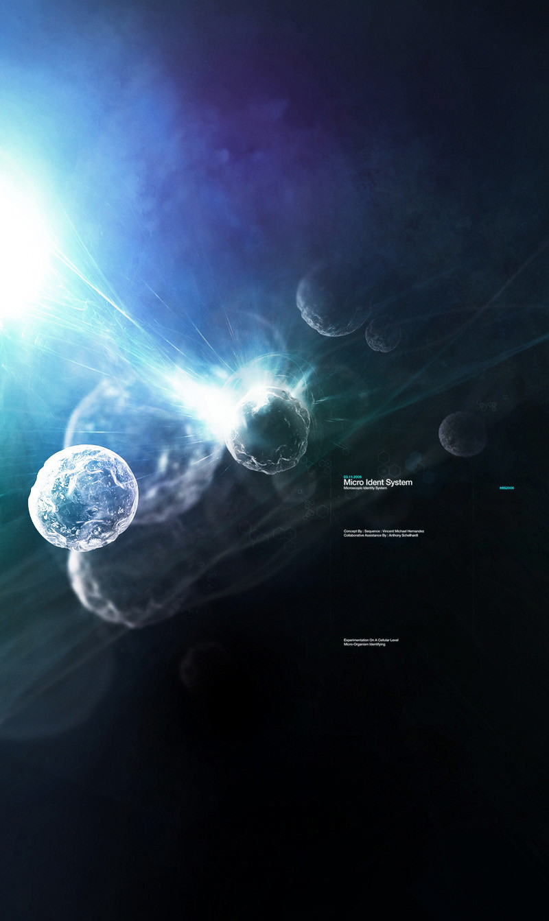
Description For TheMidtoneConspiracyβ„’

Collaborative Assistance by Anthony

Special thanks to Erhan & Resurgere
Related content
Comments: 87

Crays [2005-12-26 13:44:29 +0000 UTC]

too lovely ~~~

πŸ‘: 0 ⏩: 0

enris [2005-12-26 13:14:07 +0000 UTC]

oooo superrr

πŸ‘: 0 ⏩: 0

Sapphire-the-chao [2005-12-26 13:09:56 +0000 UTC]

Very brillaint!
keep up the good work

πŸ‘: 0 ⏩: 0

LightBringer1 [2005-12-26 11:13:35 +0000 UTC]

amazing!

πŸ‘: 0 ⏩: 0

Antonieta [2005-12-26 11:09:03 +0000 UTC]

oh..wonderul

πŸ‘: 0 ⏩: 0

kwnsx [2005-12-26 09:30:57 +0000 UTC]

This is excellent work. Very impactful.
Congratulations on the DA.

πŸ‘: 0 ⏩: 0

mest In reply to ??? [2005-12-26 09:21:11 +0000 UTC]

DAMN nice

πŸ‘: 0 ⏩: 0

blither89 [2005-12-26 08:30:11 +0000 UTC]

whoa. impressed much? lol awesome

πŸ‘: 0 ⏩: 0

Exhale-NL [2005-12-25 12:12:22 +0000 UTC]

so this was made by you two... incredible stuff!

πŸ‘: 0 ⏩: 0

breakerr [2005-12-24 23:15:26 +0000 UTC]

___Well weeeelll Doneeeeeee keep up buddy my congratz on your effort

πŸ‘: 0 ⏩: 0

nightinga1e In reply to ??? [2005-12-24 17:16:38 +0000 UTC]

Brilliant. Really digging the atmopsheric ambience the soft brushing creates.

πŸ‘: 0 ⏩: 0

ag-plus [2005-12-24 09:22:28 +0000 UTC]

Wow that is really nice. I love the font its so professional.
Lovely colors, great detail.

πŸ‘: 0 ⏩: 0

urethane [2005-12-23 20:58:09 +0000 UTC]

i overall enjoy the highlights and colors and also the blurred blobs which add nicely to the scene. but the typo, which is just right itself, looks blurry to me. you could sharpen that a bit more.

πŸ‘: 0 ⏩: 0

k0zz [2005-12-23 16:45:50 +0000 UTC]

nice style _ great piece_

πŸ‘: 0 ⏩: 0

yulii [2005-12-23 14:56:50 +0000 UTC]

this is goood...the textures in the shapes are like ice or something and the motion is very cool.look likey are droppin out of space in a flash ...great piece u made there faros !! love it n the colors

πŸ‘: 0 ⏩: 0

onex [2005-12-23 13:19:51 +0000 UTC]

awesome love ur style m8. (sorry, but i'm not gonna fav this, someone else needs the attention more (pwess.deviantart.com, go check him out, he's made headlong progress in the last couple of months). it's worthy tho

πŸ‘: 0 ⏩: 0

Simex [2005-12-23 11:18:00 +0000 UTC]

very nice " D

πŸ‘: 0 ⏩: 0

Reusol [2005-12-23 10:27:33 +0000 UTC]

ok, WOW

πŸ‘: 0 ⏩: 0

n3v32bu2n [2005-12-23 05:56:11 +0000 UTC]

πŸ‘: 0 ⏩: 0

PrimaryVIVID [2005-12-23 04:06:05 +0000 UTC]

Christmas comes early when faros is on your watch list

πŸ‘: 0 ⏩: 0

F3rg [2005-12-23 03:08:33 +0000 UTC]

very nice contrast

πŸ‘: 0 ⏩: 0

JadeFalcon5 In reply to ??? [2005-12-23 01:40:27 +0000 UTC]

amazin, what did u use?

πŸ‘: 0 ⏩: 1

faros In reply to JadeFalcon5 [2005-12-23 02:17:37 +0000 UTC]

Photoshop and Cinema 4D. Thanks.

πŸ‘: 0 ⏩: 1

JadeFalcon5 In reply to faros [2005-12-23 23:36:31 +0000 UTC]

i want cinema sooooo badly

but i dont have any money

and at my age i cant get a job

πŸ‘: 0 ⏩: 0

Sekka In reply to ??? [2005-12-23 00:01:59 +0000 UTC]

Great collab. Wonderful work. Love the colour and minimal typography! Yay!

πŸ‘: 0 ⏩: 0

bilalkarim In reply to ??? [2005-12-22 23:44:25 +0000 UTC]

Wow. Awesome!

πŸ‘: 0 ⏩: 0

DJonasse In reply to ??? [2005-12-22 23:29:02 +0000 UTC]

gorgeous! +fav

πŸ‘: 0 ⏩: 0

Syretrip In reply to ??? [2005-12-22 22:43:46 +0000 UTC]

As denull said, just perfect!

πŸ‘: 0 ⏩: 0

denull In reply to ??? [2005-12-22 22:35:52 +0000 UTC]

pertfect bro! +fav

πŸ‘: 0 ⏩: 0

GreenBee In reply to ??? [2005-12-22 22:22:07 +0000 UTC]

gay

πŸ‘: 0 ⏩: 0

Orphik- In reply to ??? [2005-12-22 22:21:55 +0000 UTC]

DUDE I LOVE ALL YOUR WORK!

πŸ‘: 0 ⏩: 0

vekin In reply to ??? [2005-12-22 22:04:24 +0000 UTC]

looks good

πŸ‘: 0 ⏩: 0

affekt In reply to ??? [2005-12-22 22:02:32 +0000 UTC]

Beautifully crafted. The depth created, and the dynamicism created through the brushing is class. Even the fractals fit in with this, adds a bit more movement to the brushing. Typo-wise, this is quality, nice touches of colour, and well laid out.

πŸ‘: 0 ⏩: 0

Eventz [2005-12-22 21:27:56 +0000 UTC]

Great collab guys.. Amazing colours/Great concept.

πŸ‘: 0 ⏩: 0

Eventz [2005-12-22 21:27:46 +0000 UTC]

Great collab guys.. Amazing colours

πŸ‘: 0 ⏩: 0

VixenValkyrja [2005-12-22 21:04:45 +0000 UTC]

Lovely work!

πŸ‘: 0 ⏩: 0


<= Prev |