HOME | DD
 FelonDog — AzureHowlShilach Gift

#caracal #cat #character #fursona
Published: 2016-10-09 11:17:38 +0000 UTC; Views: 1290; Favourites: 231; Downloads: 16
Redirect to original
Description
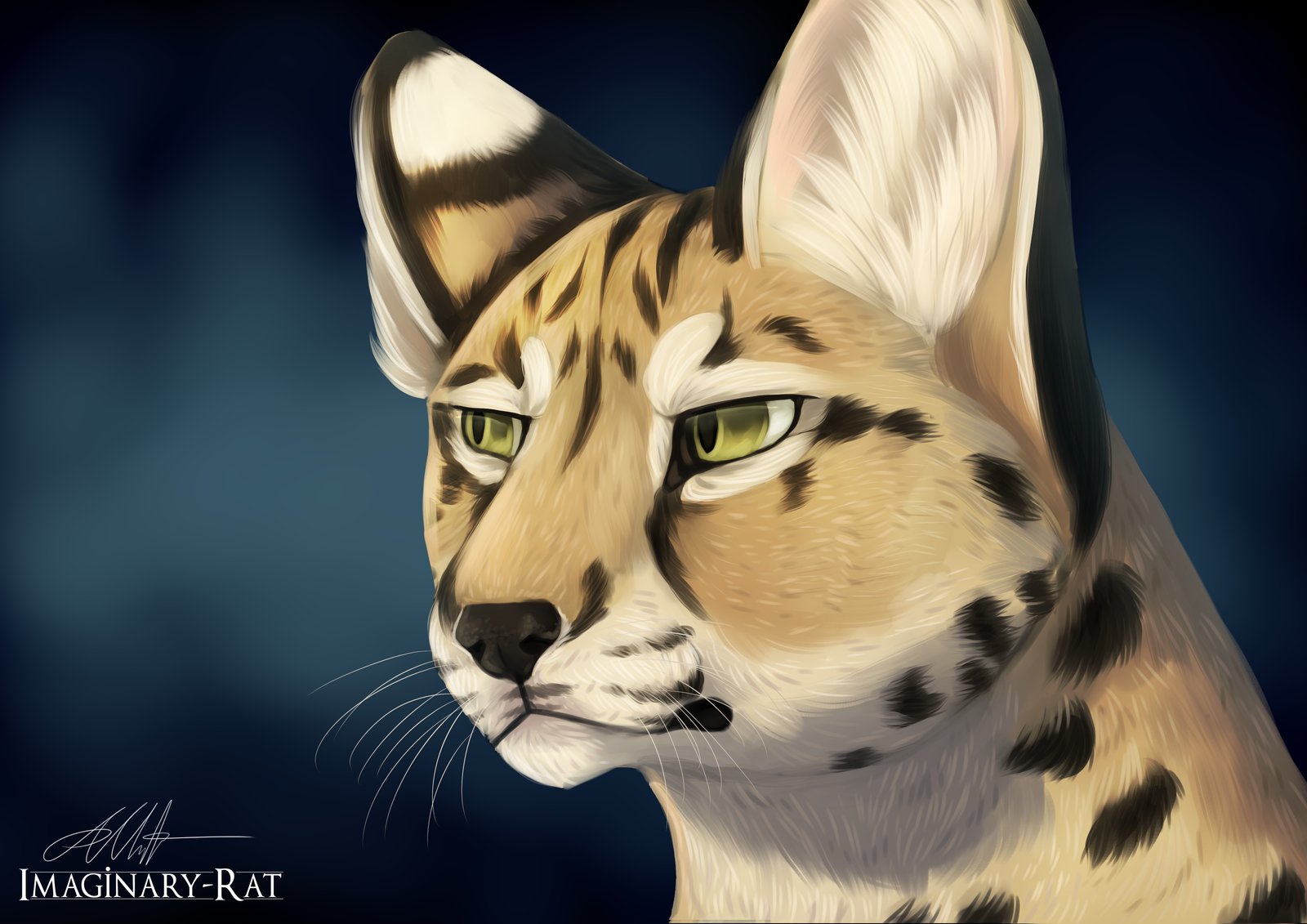
A little gift art for for being so awesome and always being so generous and dropping a comment on my art like every single time I upload something. It really means a lot to me. So thank you, and I hope you like this little gift. <3
<3 Referenced from this picture. dinoanimals.com/animals/caraca…
I loved the light play in it and just had to try drawing it.
")
Related content


Comments: 91

(Sorry for the late reply.)
Thank you so much for the critique! I really appreciate it, and I see what you mean about adding some more contrast in those areas. Thank you! <3
👍: 0 ⏩: 1


hi there! first of all i just want to say how tremendous of a artwork this is!! the detail is outstanding and i love the position she is in, most of all i must say her eyes are my favorite! this is just amazing, and i love how the fur looks! i personally think this could have been a actual real picture!! :'D i don't personally know how to rate off talent, but i'm giving you five stars because i do not see one tiny flaw in this amazing artwork and i just adore it. you are very talented and it is just amazing how so many people can do this!! <3 i love it!
👍: 0 ⏩: 0


Originality
Overall, I'd like to say that this an extraordinarily beautiful piece of artwork. I love the detail in the fur, eyes, and background, and the piece looks so realistic at a first glance that at first I thought it was a photograph (before I noticed the third eye, of course).
The angle of the lighting is portrayed very nicely, especially on the back of the neck, shoulders and ears. I personally think it looks a little odd on the right fang, though, because it isn't directly in the sunlight and therefore doesn't really need the lighting on both sides. In addition, a few light rays should have been visible in the background, otherwise the caracal looks out of place against the dark background with no visible source of light.
The changes in the coloration and background of the piece show originality from your reference. However, the pose is virtually unchanged, which makes them look extremely similar at a first glance. The true originality of the piece could be looked over quite easily by a viewer who doesn't take the time to study the intricate details of the face and background. Perhaps changing the angle of the ears, or zooming out a little so that more of the legs and the base of the tail were visible would have helped differentiate the piece a bit more, or even zooming in to make the painting focus mostly on the face. I know those things are easier said than done, though, so I won't be too harsh about it.
I understand that the slight blurring of the caracal's back is meant to draw the audience's focus to the face, but being as the back makes up a large section of the picture, I think it's a little too blurry. Even if you want to keep the face in focus, I think you need a little more texture in the rest of the cat. The detail in fur on the face is exquisite, and I think adding similar shading in the back would really help bring out the beauty of the piece.
Like I said at the beginning of this critique, despite its minor flaws, this piece has a strong impact on the viewer. The expression in the eyes makes this painting especially striking. Excellent work!
👍: 0 ⏩: 1
Thank you ever so much for the detailed critique and all the advice!
I really like your idea about adding rays of sunshine. Doh, I should have tried that.
Thank you so much for it all and taking the time to write a really nice, and helpful critique to me! I really appreciate it! <3
👍: 0 ⏩: 1
You're very welcome! I'm glad it was helpful!
👍: 0 ⏩: 0

This is an amazing piece, Shilach looks awesome in your style! What I like in it most, is that it's a one-of-a-kind gift, you managed to make her look realistic while still sticking to the character! Most of the gifts look quite the same for me in terms of art style (like cel-shaded or pixel art), this is the first 'painterly style' work I see of this character e.deviantart.net/emoticons/s/s… " width="15" height="15" alt="
 (Smile)")
e.deviantart.net/emoticons/c/c… " width="20" height="20" alt="

👍: 0 ⏩: 1
Thank you so very much! I really appreciate you taking the time to write a sweet critique to me!
👍: 0 ⏩: 1
You are welcome! Keep up the awesome work!
👍: 0 ⏩: 0

What the-THIS IS SOO BEAUTIFUL!!! OHHHHH, I'm SOOO jealous right now! I wish I still had moneyyyy! ;-;
👍: 0 ⏩: 1


Did I asked if you would be interested in doing any book covers?
👍: 0 ⏩: 1
I don't think so.
I don't really know either. I guess it would depend on what was wanted for the cover and I'd see if I could draw it. XP
👍: 0 ⏩: 1
I write a real blended sort of SF. Several of my main characters are hybrid creatures. I've had two covers done by a Ukrainian artist here on Deviant, but I haven't been totally satisfied. There good, just not quite the direction I wanted to go. Your drawing "Through the Looking Lake" Really caught my eye. It really captures the imagination and I can see one of my characters doing just that. Another one that I saw this morning was "Mint Swirl" is a fun representation of a new character in the book I have in Beta mode.
I've posted all the covers that I have put together of my books, 5 published, 1 in edits. The current series surrounds a new race of feline humanoids and Lupus humanoids. The first book "Rites of Passage" cover is the female heroine, Kaniko. The second book "City of Passage" cover is the male hero, Mathias. At some point, I would really like to redo the covers for these publications with covers that are more eye-catching and more in tune to the story at large. I am just starting the creative write on the third book in the series, working title "Voices of Passage," at the moment, I don't know who will be the main focus character. There are four possibilities at the moment. I have to see what develops as the story unfolds.
Hope I didn't just overwhelm or blow you away. I'm hoping you will consider working with me. One of the problems with working with my Ukrainian artist is the language barrier. The best translator programs from English to Russian or Ukraine are not very good.
I did a barter deal with him, because of his worldly location, but in dollar equivalent, I paid him $65 for the first (originally B&W) & the second $75.
If you're still interested. I share free copies of my writing in most any format you desire or I can send scenes that include physical descriptions and scenes that are pivotal in the story.
Thank you for taking the time to respond. Hope to hear from you again. Have a wonderful and safe holiday weekend.
John Sanders
Sandwolf5-2
👍: 0 ⏩: 1
Thank you; I hope you had a fun holiday too!
I can see what I can do. Send me your ideas for the cover/ the descriptions of the characters and I'll tell you if I'd be capable of drawing them.
My highest commission price is $80 for a full detailed/ full bodied drawing with detailed background, so certainly less than that for a book cover depending on what you wanted.
👍: 0 ⏩: 1
Okay, it is quite late and I put off what I said I would do this morning. The short of it is, I have started on it. Here is the link. docs.google.com/document/d/1Av… I will try to finish it tomorrow morning. If you have trouble accessing it. let me know here or email me at sandwolf5@gmail.com.
👍: 0 ⏩: 2
Okay, just finished reading through it all. I'll wait for the rest now.
Also, as a starting point for me for when I start drawing; are you wanting me to try out redrawing covers for each of the three books? (Or at least for one of them, so you can see if you like the style or not and continue working with me on it?) And are you wanting a redraw of the two covers you have right now in my style, or a cover completely different?
Feel free to add all the answers into the document so I can keep it all in one place to look back on (if you'd like). Let me know where you'd like me to start and what ideas you personally have for how you'd like the covers to be drawn.
Since it will be digitally, changes to anything will be super easy to accomplish once I show you sketches. I will send you WIP's too if you'd like so that you can tell me how you're liking it and what you'd like altered or fixed during the process.
👍: 0 ⏩: 1
Well, let me get your opinion. What do you see wrong or right about the covers? I know the fonts suck, I'm working on that. But as far as the drawings.
Book 2 "City of Passage" is not published yet, so that means, even though I have paid for the cover, doesn't mean that I have to use it. So let's start there. I think I put in the notes for book 2 most everything I disliked about and what I liked. I'll go back and highlight the likes and desires. Have you ever see San Francisco from Oakland? If not, I'll see what I can dig up and then you/we can figure out how to make it more futuristic to fit the overall story.
👍: 0 ⏩: 1
I like the first one. I think it looks very nice on the black and white version. I feel like shading/ lighting/ a bit of color variation would make the colored version look a lot better because with the colors added on top, it makes it seem very flat. Doing some shades of greens in the background would give it more depth, make it look like she's in the forest with leaves/ trees surrounding her. A few anatomy errors like the lower half of the arm holding the bow is a bit too short, and the hand seems a little small. The leg on the same side, the lower part of it looks to be a bit swollen, instead of having proper anatomy of a big cat's back leg. Other than that, I think it's a pretty awesome cover, but I feel it could stand out a lot more with a little work.
The second cover is nice. I agree with you that the face look more foxish instead of wolf though. I think it's the narrower snout and bigger ears. The pose isn't too flattering either. Your enhancing of the colors for it made it look better too.
From a Google search, this is an image I find of San Francisco from Oakland: a.travel-assets.com/mediavault…
Something like that?
I will admit that buildings are not my strong suit in art. Drawing them from a distance in the background should be easier though.
👍: 0 ⏩: 1
San Fransisco, yep that is about, how I remember it. For a more futuristic city after a recovery from a major war, though, I'm thinking few tall buildings, and one item that has been a part of every storyline is a Mag-lev elevated rail. (imagine the Disney monorail on steroids). www.schillerinstitute.org/grap…
s-media-cache-ak0.pinimg.com/o…
Do you want a copy of the books to get a better feel for the world these characters live in? I can send them in any format or simply share a copy to you through Google Drive.
👍: 0 ⏩: 1
Is there any sort of pose or idea you had in mind for the new cover? A certain angle? Setting? Lighting?
If you don't have any ideas I can wing it and sketch out some stuff for inspiration and see how you like it.
Unfortunately, I can't sit long enough on my computer to read something as extensive as that, and about the only time I can read is when I carry a book with me to read on breaks at work. So I don't think I'd get very far anytime soon in it from reading it on a computer. : (
👍: 0 ⏩: 1
It's been a busy few days for me, so to make sure we're on the same page. The first one you are going to do is book 2, City of Passage. This is the one that takes place in San Francisco and Oakland. This one is with Mathias the wolf hybrid. pose, maybe angled front. standing, not dark, but no happy sunny bright either. maybe lighting like this, sandwolf5-2.deviantart.com/art… or this, sandwolf5-2.deviantart.com/art… Just some ideas.
Reading, no worries. I do have copies of Rites in paperback. And other than writing, editing, and my job, I don't read at the computer. I have a Kindle e-reader for books.
👍: 0 ⏩: 1
Okay, I'll see what I can do and send you a sketch to see if you like it.
👍: 0 ⏩: 1
I'm able to access it.
Certainly a lot to go through and take in, give me some time on this (I'm kinda a slower reader even though I enjoy reading).
👍: 0 ⏩: 1
Sorry, I was trying to be thorough.
👍: 0 ⏩: 1
No worries, being thorough is a lot better than giving too little information. I just wasn't sure I'd be able to finish it and reply back before I went to bed was all, so I was giving a head's up on possibly being slow getting back to you, but I managed to read through it all and reply.
👍: 0 ⏩: 0

Your eye for detail strikes again and the lighting is very well done!
Such a nice piece.
👍: 0 ⏩: 1


I have them here: www.furaffinity.net/commission…
👍: 0 ⏩: 0


Love it! It's the kind of Cougar I'd expect to see Riddick have as a pet
👍: 0 ⏩: 2
That would be awesome.
Thank you! ^-^
👍: 0 ⏩: 0

It's a Caracal ....not a cougar
👍: 0 ⏩: 0

| Next =>