HOME | DD
 FIAMdesign —
Design Firm Design
FIAMdesign —
Design Firm Design
Published: 2008-11-03 13:02:47 +0000 UTC; Views: 80574; Favourites: 707; Downloads: 0
Redirect to original
Description
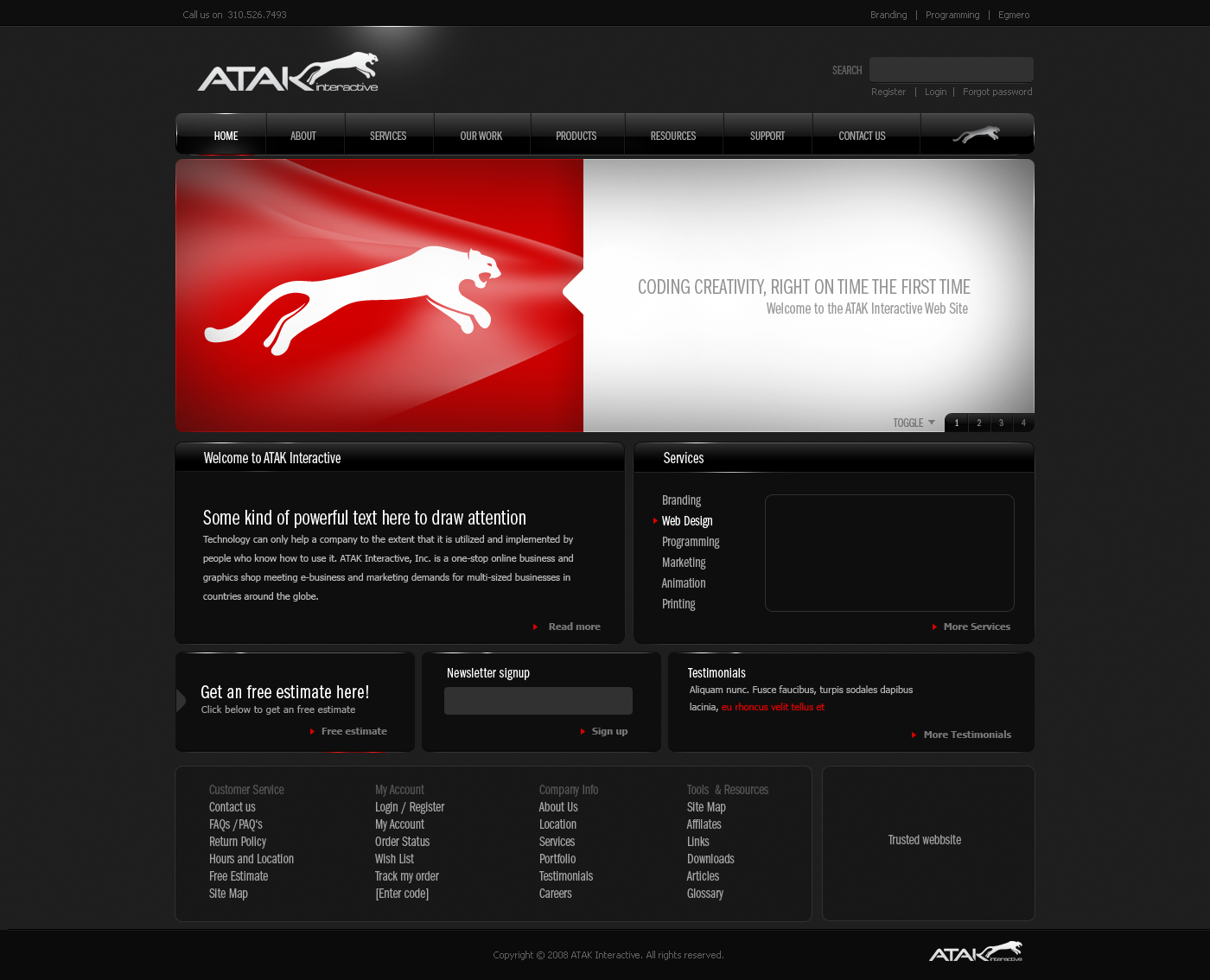
Uppdated design: Saturday ( New mid content design )I started on this design today. Its was built for an competition @ 99designs.com. Since its the first entry I will proably uppdate it during the week!
The contest url for the ones intressted:
[link]
I recived my first DD today! Im very happy for this!!
") And I want to thank `mindfuckx and `lemontea for makeing this happen!
And I want to thank `mindfuckx and `lemontea for makeing this happen!
Related content


Comments: 167


Hi There
I like your work, i need a website designer can you please contact me to discuss the project further.
Thanks
👍: 0 ⏩: 0


Hey man, the ATAK text at the top, is that in a specific font or did you create it yourself?
👍: 0 ⏩: 0

Brave & interesting concept * Clean design polished in every detail * Perfect choice of colours!

👍: 0 ⏩: 0


Hey could u tell me, which Fonts u used?! Mainly the one u used in the Menu.
Good Work.
👍: 0 ⏩: 0

What font is that used in the top nav text? Very nice work btw.
👍: 0 ⏩: 0


Good job mate!
-----------------------
Deviant Link : [link]
Comment and pls!
👍: 0 ⏩: 0

Nice Design, comment on some of mine if possible i would like some feedback of such a good designer
[link]
👍: 0 ⏩: 0


ficou irado demais esse design  (Smile)")
")
👍: 0 ⏩: 0

thats what i called amazing
nice work ã?
a masterpiece. fav!
👍: 0 ⏩: 0

")


Wow, the logo is very nice, a nice glossy
Im watching you
👍: 0 ⏩: 1


again you pushed back my eyes
hehehehe
great work
👍: 0 ⏩: 1

nice job! it's really gr8 design, but I'm not sure "custom service", "my account area"..... 
👍: 0 ⏩: 1


wow definitely worth the daily dev i realy like the dark lookof your sites, i think i'm in love.... but don't tell my gf ")
👍: 0 ⏩: 1


no hating on your design or anything but dont you think the logo is a bit too much like pumas logo?
👍: 0 ⏩: 1

The logo was provided with the contest, I have nothing to do with it! But it might have some similaries! Havent thought about it eaerlier.
👍: 0 ⏩: 1
i figured as much. the design itself is nice btw.
👍: 0 ⏩: 0


wow! stunning. hope you don't get sued by puma though  (Wink)")
👍: 0 ⏩: 1
The logo was provided with the contest, so I hope I wont!
👍: 0 ⏩: 0

nice job! it's really smooth, really readable, and exudes class.
👍: 0 ⏩: 1

the red link text is a bit too bright. Something more subtle or something a bit more akin to a gunmetal-color mix would be easier to read. My eyes literally had to adjust to the brightness of the link text.
Other than that, its nice.
👍: 0 ⏩: 1
| Next =>