HOME | DD
 FionaCreates — Moth
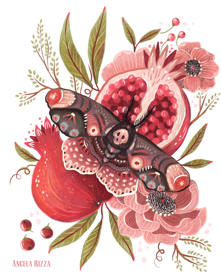
Published: 2017-09-04 16:14:27 +0000 UTC; Views: 6403; Favourites: 346; Downloads: 0
Redirect to original
Description
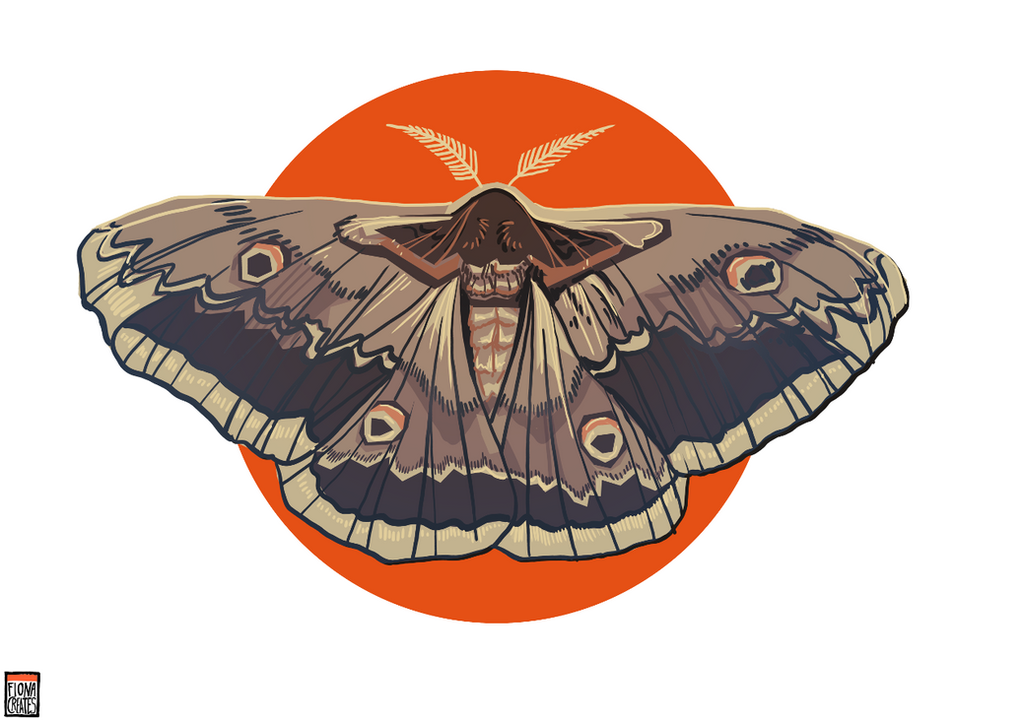
Creepy as they are... they are also rather beautiful.Related content


Comments: 18

👍: 0 ⏩: 0


First off, let me say I love how you added a splash of colored behind the moth itself, it really helped with the boldness to make the moth's subdued tones to stand out more and make the art really seem to pop off the page. The shading is nice and all, but I would have suggested a bit of opacity to the bold lines in the wings, to cut down on the roughness of the patterns. - Patterns that you captured well, but might help it seem more like the thinness semi-transparency of real moth wings. Particularly on the dark brown to black looking ones. While they contrast nicely with the rest of the colors in the wings, they seem to stand out more then the other colors to me. One of the lines in the middle left doesn't connect to the bottom of the wings end as the other lines do. It made it stand out to me. But over all this is gorgeously done, and I love how you captured the little eye patterns on the wings, which occur naturally on moths.
👍: 0 ⏩: 1

Thanks for taking the time to critique  (Smile)")
")
👍: 0 ⏩: 1
No problem! And, I hope you get to draw them then and I look forward to seeing them! (Added you to my watch list too.) Thanks for accepting my critique! Hope you find the suggestions helpful.
👍: 0 ⏩: 0


I've seen some of this trough ones out my life (if I'm mistaken at least I've seen some very similar)... I live in Brazil. Man, they are gigantic, so you can have an idea if you spread your palm it would have the spam from your pinky to your thumb.
👍: 0 ⏩: 0
tbh I don't know, I googled moth and picked a nice one XD
👍: 0 ⏩: 1

Okay, just wondering because it looks like the Rising Sun flag of Japan, also. Nice job.
👍: 0 ⏩: 0

")

Wow, you've struck perfect balance between detail and stylization!
👍: 0 ⏩: 1
Thanks! It's just a quick piece but I'm trying to learn where the line into overworking is
👍: 0 ⏩: 0
