HOME | DD
 FiRez-DA — Study
Published: 2013-10-12 05:27:39 +0000 UTC; Views: 2014; Favourites: 36; Downloads: 50
Redirect to original
Description
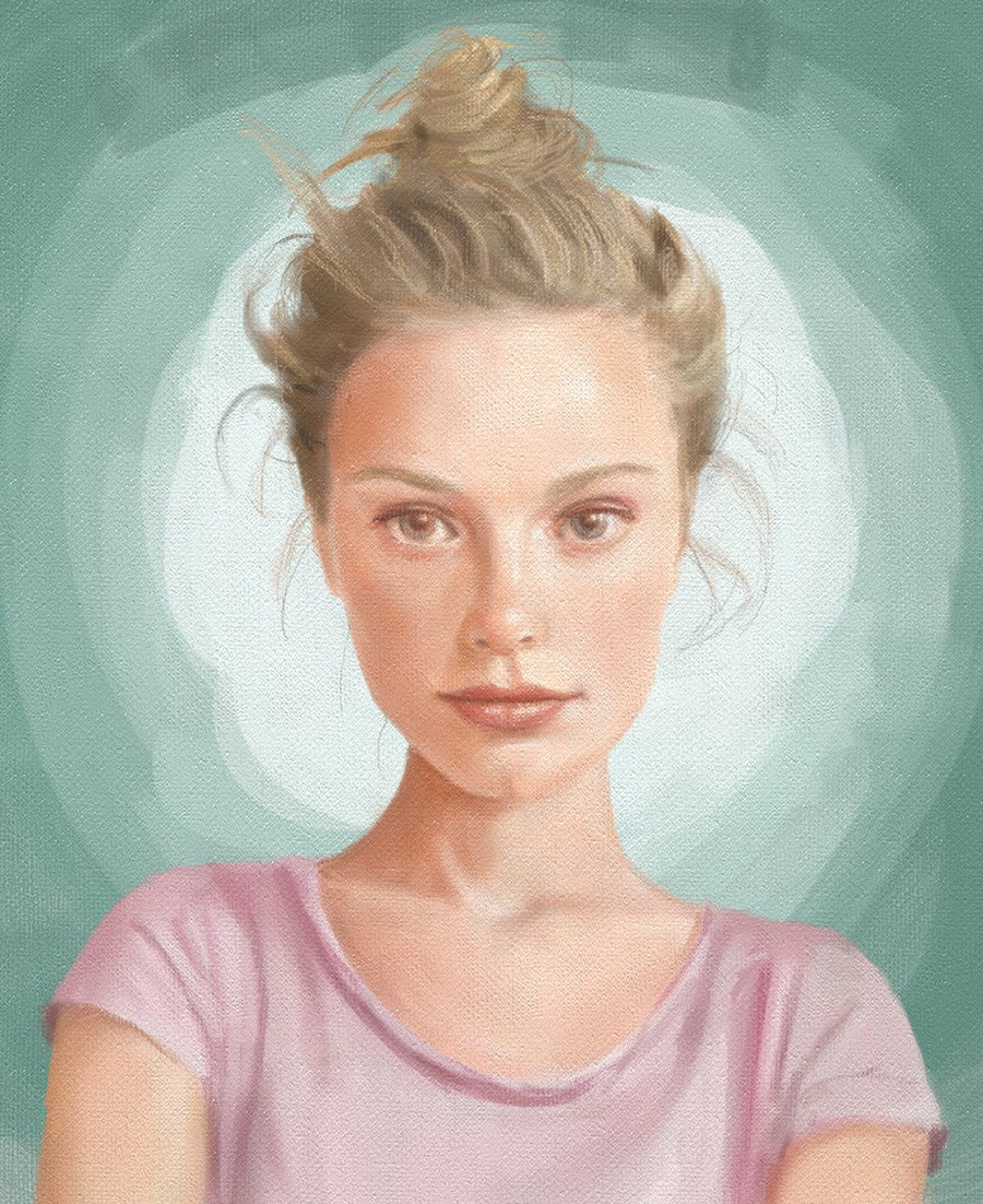
A rather failed study considering the reference: i.imgur.com/4BNVyx9.jpg but for some reason I insisted on it, trying to achieve something that was rather nice to look at.I'm currently reading "Stoner" by John Edward and I can't help but imagine her in every possible angle when Edith (Stoner's wife) is mentioned.
Related content


Comments: 11


I have to ask, because I at first thought this was a traditional work. How did you get it to have that canvas look about it. Is it simply having a filter of canvas or did you lighten your art onto a picture of a canvas or something?
Description of the work:
Really wonderful and the shape is also good. Would argue against the comment of Faitle who thinks the neck is too small. Looking at the reference the model does have that thin a neck. What I do love most about the work is just the warmth in character she has. It really is something of its own especially against the original that this is a study of. I mean look at the two comparatively and notice that yours has much more warmth and inviting while the model is a whole lot colder to the touch with her whole demeanor. The top bun seems to be the only real issue as it doesn't shape[e that well, I can't really see where it starts from. Looking at the reference picture I see that the hair in the front is actually shaded darker than that bun so it gives me a reference that they are in different spots.
Anyway I really like this work.
👍: 0 ⏩: 1

I started drawing with the program that came bundled with my tablet: ArtRage
ArtRage tries really hard to mimic traditional mediums, not only with its brushes but also with the canvas selection, this one is called "essential canvas", I also used said canvas here: fav.me/d6livdt
Thanks for the critique, after not being successful at capturing the likeness of the reference, I tried to give her my own interpretation, like you said the top bun leaves something to be desired, I will try harder next time.
Thanks a lot!
👍: 0 ⏩: 1
Okay, ArtRage. I might check that out. Also saw the kitten one. The only thing I can say is problematic about that one is the foreground hind paw. That paw needs a little more shading to distinguish where it starts from as it seems to start right from the front left paw.
👍: 0 ⏩: 0

colour is nice, i think the neck is a little small, which makes the head look big,
👍: 0 ⏩: 1
I did try to make the neck as close as possible to the reference but at some point I think I missed some other measures and a bigger neck looked really weird, so in order to keep a balance I left it as is.
Thanks for the critique.
👍: 0 ⏩: 0


Merci de votre commentaire.
 (Smile)")
👍: 0 ⏩: 0