HOME | DD
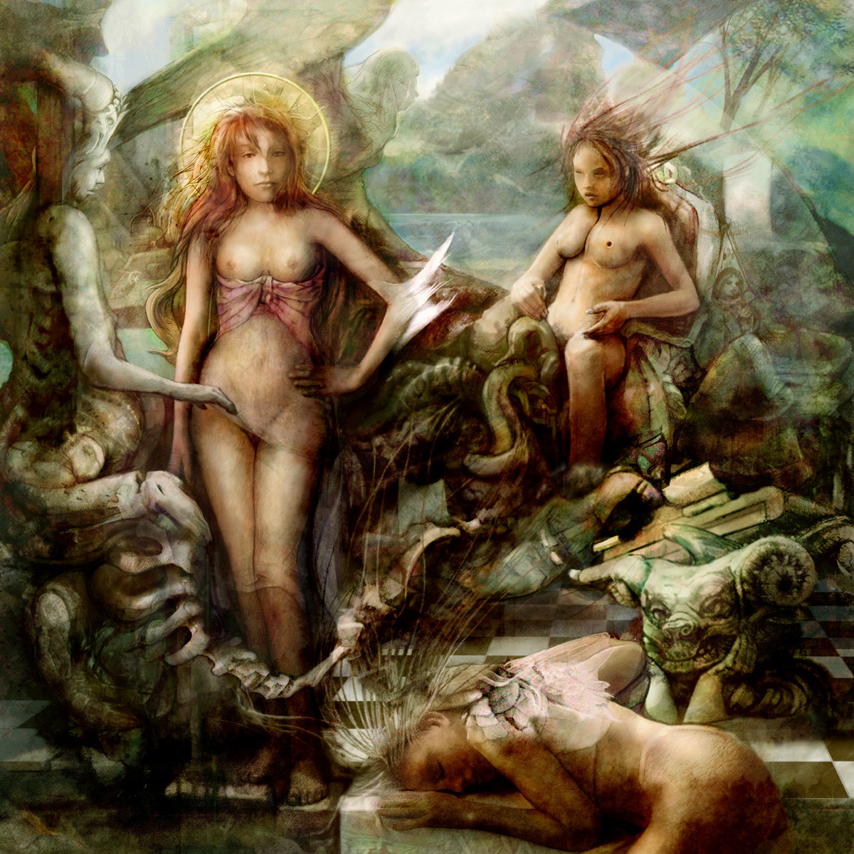
 Flockhart — Angels and Demons
Published: 2012-06-05 14:28:08 +0000 UTC; Views: 15660; Favourites: 93; Downloads: 12502
Redirect to original
Description
Angels and Demonsapologies for the multiple versions
 (Smile)") but I just cant get this to fit the image in my head. Every time I look at it I want to change something. Ah well.
but I just cant get this to fit the image in my head. Every time I look at it I want to change something. Ah well.
Related content


Comments: 14

Good job, i think the necks are a bit short especially on the left angel facing forwards, Besides that, it is nice, and the nipple placement holeon right side can be a little lower maybe to the right
👍: 0 ⏩: 0

It's truly amazing wow 
👍: 0 ⏩: 1


Wow, this is a brilliant piece. I love the subtle transparency here and there, it makes all the angels and demons that little more ethereal.
I really must see the rest of your gallery!

👍: 0 ⏩: 0

Is it very hot there and full of fire and brimstone?
👍: 0 ⏩: 1

I mean here=here in your artwork.
I'm not devil/daemon fun, more I fight with them.
I reformulate: No angels in your artwork, only daemons
Your artwork is good, don't missunderstand
👍: 0 ⏩: 2

In the background, You can see an angel
")
👍: 0 ⏩: 1
Perhaps we have other opinion about angels.
Keep a good work!
 (Wink)")
👍: 0 ⏩: 0
Cheers you might be right - even when i draw angels they look a bit messed up.
👍: 0 ⏩: 0

Looks different, not necessarily worse. Maybe it is because you are very accustomed, using the intensity and combinations of colors in the main line of your works. I do think the more transparent version looks well too. The colorwork is more powerful, but it takes a little mystique away
👍: 0 ⏩: 1
Thanks very much for that little critique - its a pleasure to read your opinions
👍: 0 ⏩: 1
No problem...if it helps, it helps
👍: 0 ⏩: 0