HOME | DD
 Flynn-the-cat — Symbolic Flows
Published: 2008-08-26 15:52:55 +0000 UTC; Views: 6669; Favourites: 227; Downloads: 0
Redirect to original
Description
PRINTS AVAILABLE on ZazzleAS well as stickers, postcards, postage stamps...
")
Colours of the Imaginsation on RedBubble
My RedBubble Gallery
A Belated Happy 16th to =Kechake . I got there eventually
Third place in *Belle-Art 's Opposites Attract Contest
FULLVIEW OR I WILL FEED YOU TO MY MINIONS
Details
(uhh, of the picture, not the minions)
Tools Artrage 2.5 , tablet
Time four hours
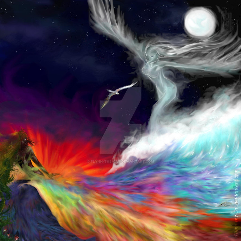
Title... needs improving, before it gets stuck that way. It's full of symbolism and it's all flowing into each other. Makes perfect sense. Honest

Also, because it's square, the 800pixels looks a bit large to me (but I think my monitor resolution's smaller than most). If it is too large, let me know and I'll reduce it to 600...
Warning
Nobody, but NOBODY, is to mention that I overused the goddamned so-called dodge tool effect.
1) I know I overuse it, in this case it was a conscious decision to flow everything together and give consistency.
2) I USE ARTRAGE, not Photoshop. It is NOT a random title, it is the name of my program. HERE, see for yourself>>> [link]
And it has NO SUCH THING as a 'dodge tool'. I use a soft palette knife tool (which... may have exactly the same effect, but you can't prove it, and neither can I).
Okay...
PICTURE THEMERY is so a word
Earth and Sky,
Land and Sea,
Day and Night,
Life and Death,
Mortality and Immortality,
Growth and Stillness Unchanging,
Warmth and Coldness...
Eternal lovers, chasing each other, untouching enemies dancing together...
They embody all of these, and more, and I had SO MUCH FUN. This is the indulgence picture of the week
...it's also four am. Oops.
Sea the pretty flowers... and the bird and the moon - which is not quite a circle I think, I painted it freehand (of course ^_^), and the fishy (the influence of hunger >.> ). And the foam on the waves...
Entered in ~4u64ica 's Sea Secrets contest
Related content


Comments: 128

I bought a print of this at Armageddon a couple of years ago, it's still on my wall ^_^ so beautiful!
👍: 0 ⏩: 1

Really? That's so awesome! Thank you!
👍: 0 ⏩: 0


Your art skills are just great, and now i feel even more inspired to get back and work on my AR program and create something. great painting.
👍: 0 ⏩: 0


My son (well hubby) got me a postcard of this for my birthday. I have a blog for my postcards, so if you would like to see it: [link]

👍: 0 ⏩: 1
Oh really? That's lovely! I always wonder what happens to them! Thank you for visiting
👍: 0 ⏩: 0

That is brilliant it just jumped off the page when I saw it.
👍: 0 ⏩: 1
Hee, thank you!
It's funny, this is one of the ones I never expected to be liked, because I was just throwing so many muddled ideas into it.
👍: 0 ⏩: 1
Well it turned out well.
👍: 0 ⏩: 0


this is cool, i love the idea and the colours xxx
👍: 0 ⏩: 1
Hee, thank you ^_^
👍: 0 ⏩: 1
your welcome! xxx
👍: 0 ⏩: 0

I really can see why you entered this in the Opposites Attract compettion. A really masterful (inter)playing of the two themes here!
 (Smile)")
👍: 0 ⏩: 0

i like the movement in this painting and the colors are very nice
👍: 0 ⏩: 1

Too good for words.
[But I'll try]
I'm infatuated with the movement that's going on in this piece, how the wave of water and air is about to collide with what looks like earth, then in the background is fire.
It's like the world is at war with itself, but in a style that's so serene.
I guess the only thing that I don't like is that on the left side, there's so much left over,. One huge gap and it sort of makes the picture flop over a little bit, making my attention turn away from that corner. I didn't notice earth was there until I actually clicked on the piece and full viewed it.
Try to give eartha bit more leeway room, to balalcne space. But I think I can understand why you had put earth so out of the way, since ,well, it's earth. It should be down near the ground or lowest parts of the piece.
Anywaaaays, me and my anylitical[sp] ways*sweat*, amazing piece.
👍: 0 ⏩: 1
(my gods this is a year old? O_o I'm sorry!)
First off thank you for the fantastic comment. Second - you're right, it IS unbalanced. I actually didn't like it much, nor expect anyone else to (but I think they looked at the pretty colours and it sucked their inner critics out
I actually painted Earth first, then added more space to paint all the sea, and then some more on top to add the sky/flying one, and then I went '... drat. Terrible composition' and threw in a few things at the end

👍: 0 ⏩: 1
Loool, I bet by the time you get this I'll be halfway through my freshman college year.
I seriously thought you weren't going ot answer this, nrrrm.
Proved me wrong, ehehe.
Certainly not a problem, freaking deserves it.
Even though it is slighty off blanaced the flow you put into the piece is very well done.
It's like the feeling of sailing.
Huh, that's sorta funny how that turned out. SO earth was drawn first...
Anyways, thanks for replying.
 (Wink)")
👍: 0 ⏩: 1
Actually, it's right at the top of my comments!
Yeah - I actually lookeda t it just now and *finally* saw it the way i think everyone else did. Very different - I always look at Earth and then the rest, and I realised that Sky actually takes up most of it
I actually got asked to redraw this as a commission, right after I found your comment, so the timing was especially awesome and helpful.
And your welcome - thank you for the comment! I was starting to worry that no one else seemed to see anything wrong >.>

👍: 0 ⏩: 0


Very nice! I really like the smudgy look you got with the palette knife.

👍: 0 ⏩: 0


Your wonderful art has been submitted
Submissions Admin Owner
")
👍: 0 ⏩: 0


Beautiful! Love the colors. Great contrast between bright and dark colors, makes the piece interesting.
👍: 0 ⏩: 0

Just wanted to let you know that I included this in a little feature .

👍: 0 ⏩: 1

the intensity of colour is really good. i love it
👍: 0 ⏩: 1
Thank you! I really love playing with the colours in ArtRage ^_^
👍: 0 ⏩: 1


| Next =>