HOME | DD
 Fragmaster01 — Commision - Dauthi
Published: 2006-07-15 14:15:25 +0000 UTC; Views: 880; Favourites: 5; Downloads: 43
Redirect to original
Description
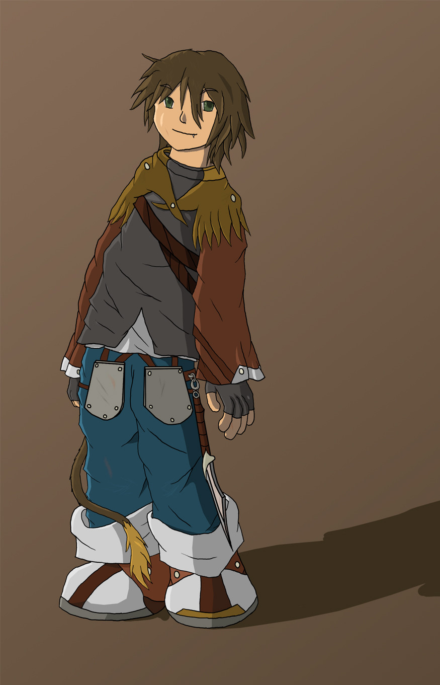
An unpaid commision from robpod99 of his demon thief, Dauthi. I like it overall, but a few things stick out to annoy me:Shoulda used the pencil tool for the lineart, the fuzziness took an extra hour to work around.
His shoes don't match. Oops.
I did put in several fine details, but if I put up a filesize good enough to look at it, it would fill the screen.
PhotoshopCS2
9 hours
Props to [link] for the lineart help([link] )
Character idea copyright to robpod99.
Character design and art copyright to fragmaster01.
EDIT: If you leave a comment like "So awesome" or "loved it", but didn't leave a fav, please tell me why so I can improve on my style!
Related content


Comments: 46


very cool piece.. the only thing about it that i dont neccesarily like is that the lines are a little rough, maybe you should try inking by hand?
really nice concept, and good colours
 (Smile)")
👍: 0 ⏩: 0


Very cute! I really like the way you've coloured him and the colours you've chosen. Great work
-Elise

👍: 0 ⏩: 0

it reminds me of an RPG game: Dark Chronicle 2
even though drawings aren't my favourites, i like what u have done with this one, the shoes are just fine, even if they don't mach, i love his expression and the way his clothes are way too big for him,
i don't like the background, i think ur charecter gets lost in it, 'cause it's all in the same tone of colours.
anyway great work

👍: 0 ⏩: 0


Mmm...I think it could use more shading as well. Like around the collar, you made sure the lines of the collar were visable, but I think if you are going to do that, then give it a little shading around the collar edges. Also on the right side, the thing on his shoulder, teh color doesn't match with the left side. Once again on the shading, around all the wrinkles, those could use shading as well. Hope that helps out.
👍: 0 ⏩: 0


Looks great, also, obligatory "pants are backwards" comment. :-P
👍: 0 ⏩: 1

Nice design, good use of shading, sweet concept and final idea, i really like this, the expression on the face of the person looks really cheeky, but sorta world weary, great job overall!
👍: 0 ⏩: 0

hmmm reminds me of raggedy ann and andy, anyway nice work!
👍: 0 ⏩: 0


There is a few greenish lines in the back, probably due to the reduction. While scrooling up he looks like he's gonna fall. Except this, all perfect!
")
👍: 0 ⏩: 0

Not bad at all, it looks polished and well-done. Nice job!
👍: 0 ⏩: 0

So, was the lineart hand drawn, or moused in?
The colour and shading are very nice.
👍: 0 ⏩: 1

Tablet, with the line size determined by pressure.
👍: 0 ⏩: 1


very nice
the clothig was very well drawn and thought of
👍: 0 ⏩: 0

he doesn't look much like demon theif and it looks like he has his ass backwards. But really I like his look, the vagabon clothing is really cool, and the hair is really well done, yet so simple.
👍: 0 ⏩: 0

i like the colors you used... they blend nicely.
im not really liking the way he is slouching though.. it seems slightly akward to me.
cool piece all in all.
👍: 0 ⏩: 0

very cool piece.. the only thing about it that i dont neccesarily like is that the lines are a little rough, maybe you should try inking by hand?
really nice concept, and good colours
👍: 0 ⏩: 1
Hah... inking by hand is worse. It's just bad because the original was so small.
👍: 0 ⏩: 1
ah, i see
good job then
👍: 0 ⏩: 0

This is pretty cool, I like the colouring and shading.
👍: 0 ⏩: 0


This is a really nice piece, my only crit is that the way his shirt wrinkles sort of makes it look as though his torso is twisted.
👍: 0 ⏩: 0

The coloring and shading are good, and the hand has been mentioned. It kinda loks like his head is on backwards.
👍: 0 ⏩: 0

oo very cool, the hand is a bit weird like posted before me, but its all good. GJ great piece!
👍: 0 ⏩: 0

cool character.
his hand is a bit strange, but excepting that, that's very nice.
👍: 0 ⏩: 0

Aww, he's cute! I love the outfit and the laid back pose he's in. Great job!
👍: 0 ⏩: 0

O_O I LOVE his outfit!! XD
I especially love his pants and shoes
👍: 0 ⏩: 0


really nice piece, i like the facial expression, and the tail is cool
👍: 0 ⏩: 0

The coloring, shadows and highlights are nice. Perhaps a few too many wrinkle lines on the shirt?
👍: 0 ⏩: 0

This came out very nice! The shading is wonderful; I never can master something like that. o_0 Very cool.
And unpaid commission? What exactly is that?
👍: 0 ⏩: 1
Means he's a friend, and he asked.
👍: 0 ⏩: 0

i like the detail and his shadow on the ground.
👍: 0 ⏩: 0

Heh, I like this. I'm diggin how his pants are kind of backwards, and I like the way he's shoes don't match. I'd have done a little more with the shading, but otherwise it's pretty good
👍: 0 ⏩: 0


 (Wink)")