HOME | DD
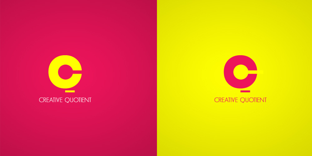
 freakyframes — Creative Quotient Alternate
by-nc-nd
freakyframes — Creative Quotient Alternate
by-nc-nd
Published: 2009-07-26 08:55:55 +0000 UTC; Views: 4609; Favourites: 19; Downloads: 183
Redirect to original
Description
Alternate option for creative quotient logo.The other and final one are here > [link]
Copyright 2009
Related content


Comments: 16

 (Smile)")

Great concept, great work. Perhaps the dash line underneath the C needs to be more visible and coherent. It should make think C and Q at the same time... What do you think?
👍: 0 ⏩: 1

I Agree, May the weight of that stroke can be equal to the counter-space of C.
Will make it more balanced. May b
👍: 0 ⏩: 1

hmm i think this could work good if you just put the stick into it haha! XD
👍: 0 ⏩: 1

i think the other one is better, this is good too
👍: 0 ⏩: 1
Thanks ! Ya, the other looks more striking.
👍: 0 ⏩: 1
check out the global warming wallpapers i made and do gimme some suggestions
👍: 0 ⏩: 0

")

this one was a simple type trial.
👍: 0 ⏩: 1