HOME | DD
 freakyframes — Too many Types
by-nc-nd
freakyframes — Too many Types
by-nc-nd
Published: 2010-02-08 18:47:12 +0000 UTC; Views: 7371; Favourites: 31; Downloads: 756
Redirect to original
Description
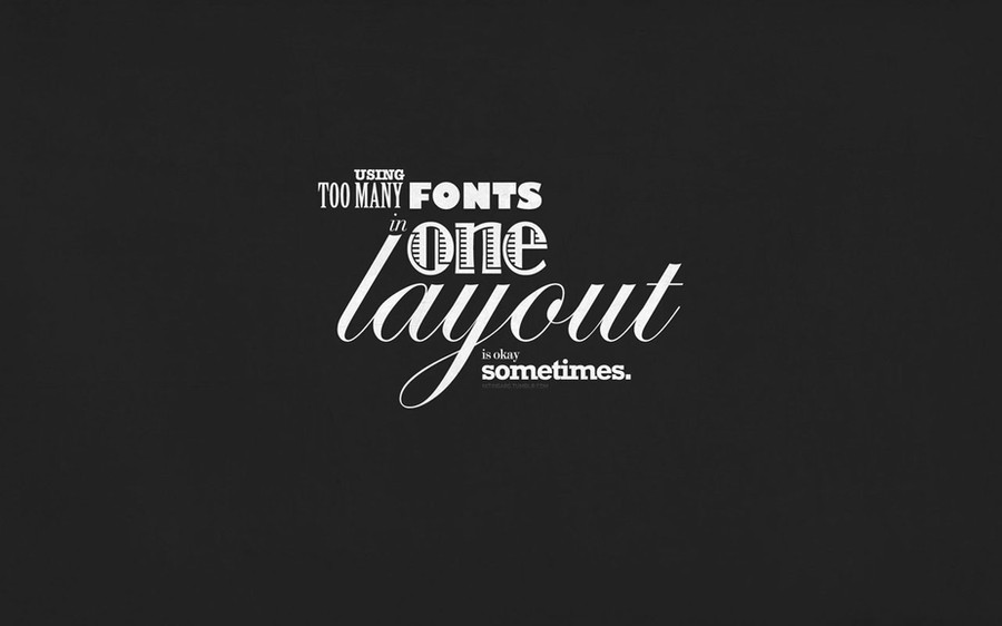
Its a good habit to restrict & use 2-3 typefaces in a design.But sometimes, its Ok to experiment.
Here we have the wallpaper as a result, i used 9 different typefaces in this one single composition.
 (Smile) - :)")
On download you get : 1920 wallpapers, Light & Dark version & the i-phone versions for the both.
More Typographic Wallpapers
Related content


Comments: 23

I think the gray in background kinda ruin it...
The typography itself is effective
👍: 0 ⏩: 1

Emm, may be you are right. But i think because i wanted to use this as wallpaper, the background helps as a desktop. Will try a poster version with just the typography. Thanks for comment !
👍: 0 ⏩: 0


this has a vintage touch to it,coz of the bg and the text
👍: 0 ⏩: 1
 - :D")
 - :P")
👍: 0 ⏩: 0


Shape, alignment, place is what contributes to the design and that's what masks the feeling there are too many typefaces. This piece of design works very well since you can read all at a glance without any trouble. Love it bro'!
👍: 0 ⏩: 1

inka kaam dekh..
dilli ki firm hai.. jaakar mil bhi sakta hai .. chahe toh..
intern kar sakta hai inke saath..
[link]
👍: 0 ⏩: 1
Haan, i have seen there Work. Rikta is working with their interaction design, called QuickSand. Let see. Saala, i dont think full-time job a well-settled place will suit me
👍: 0 ⏩: 0
shift 'using' to the left.. i didnt read it.. before 'too'
👍: 0 ⏩: 1
Hmm, now i think this composition needs a refinement. Thanks
👍: 0 ⏩: 0

Hy thanks !
Here is the list, from top to bottom : American Typewriter, Birch Std, Gill Sans Ultra Bold, Didot, Jazz LET, Edwardian Script ITC, Modern No. 20 & Rockwell Bold
👍: 0 ⏩: 1
Hehe, then may be its just me who thinks this composition still works
Thanks for honest opinion, anyway
👍: 0 ⏩: 1

yeah, but maybe its the big LAYOUT screaming at me and into my head
👍: 0 ⏩: 0