HOME | DD
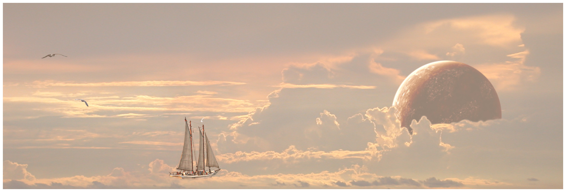
 freespace — Cloudscape 1.0
Published: 2003-11-14 12:25:22 +0000 UTC; Views: 1476; Favourites: 11; Downloads: 320
Redirect to original
Description
Sorry about the mix up, for some reason I was under the impression . My sincere apologiesMY friend Chris (ni) took a rather nice picture of some clouds, so I cropped it, then found a boat, then found some bird shots (Not sure where these came from, but I think mostly [link] , but if you see your work here, let me know asap so I can add you to the credits), then finally stole a portion of Effulgence, by , rotated, cropped etc.
Took my around 6 hours on the gimp.
My first attempt at this type of manip, comments and critque would be most welcome
 (Smile)")
Related content


Comments: 38


Nice one mate. The only thing I would do is blur and soften the boat so it blends in with the rest of the image.
Good work.
👍: 0 ⏩: 1

Will give it a shot if I can find the original. Suffered some heavy data loss recently :/
👍: 0 ⏩: 0

I like the treasure planet thing u have going here. The boat though looks like a photograph stuck on to a painting. Maybe use a filter or something to give the boat a more ‘painted’ look.
👍: 0 ⏩: 1
Will give it a shot when exams are over
")
👍: 0 ⏩: 0

Comments like yours, make it worth all the effort!
Cheers,
Steve
👍: 0 ⏩: 0

it kind of reminds me of what dreams may come i really like it great job
👍: 0 ⏩: 1


love the concept!! once again, like another fantastic photomanip.. the thing thats stopping me from favving this awesome idea (i love love the satellite)... is that it doesnt feel in place
👍: 0 ⏩: 1
Thanks for your comment, can you elaborate a bit?
👍: 0 ⏩: 1
the edges and surfaces themselves do not reflect the surrounding light, in order to put them 'in tandem' with the depth of the environment.. the colour is okay, but they stick out too much cause of sharp edges that are of different values, of the values that came with their PARENT pictures before u cut em out
👍: 0 ⏩: 1
ah I see, I'll dig out the file and see if I can fix the problem. Thanks for the input and pointers!
👍: 0 ⏩: 1
hey man im just glad i dont talk crap LOL
👍: 0 ⏩: 1

I really like it. I've barely touched the surface of The Gimp. It all seems complicated so kudos to you.
👍: 0 ⏩: 0

looks amazing. I give your props mainly for doing this with the gimp though. I have yet to do anything decent with it to this day.
👍: 0 ⏩: 0

amazing work
even though it doesn't belong in photography but in indy art-->manip, i'd say
also diny isn't quite my favourite...
but this is an amazing work of art!!

👍: 0 ⏩: 1
Thanks for the +fav! And I thought I edited the category. :S
BTW whats diny suppose to mean?
Thanks again
👍: 0 ⏩: 1
oh diny is
he's too controversial and bitchy for my liking (i know him from the forums... but then again everyone there seems to be that way, which would explain why i haven't shown my 'face' there during the past year)
👍: 0 ⏩: 1
Ah. Can't comment, I never go into the forumns.. and I am using his work...
👍: 0 ⏩: 0

man this is totally surreal
it reminds me of some of salvadore dali's, and to a lesser extent m.c.escher's work.
i think it looks fine as is. any more touching up would ruin the impact of a boat in the sky
👍: 0 ⏩: 1
Thanks for the comment mate
👍: 0 ⏩: 0

This looks realy great!
For some reasen I think the boat is a bit to much in here ... I would leave that one out of it.
But I do like the setting with the birds, planet and clouds!
Great work.
👍: 0 ⏩: 1
Thanks for the comment
👍: 0 ⏩: 0


Nice concept, looks like it a scene from treasure planet!
👍: 0 ⏩: 1
Thanks for the comment. Treasure planet eh, never heard of it ")
👍: 0 ⏩: 1
Oh a Disney movie, you must see it, even with a silly title like that, its an amazing peace of work.
👍: 0 ⏩: 1
I'll see if I can rent it some time
👍: 0 ⏩: 0

Oh man that's crazy. For a first manip. It's very good. The lighting work isn't bad at all, you've seem to have captured it on the birds well, and the boat looks good as light only touches the sails.
The planets a bit blurry though, you should try and create your own planet in photoshop. They're not that hard to do and that way it's a lot easier to meld into the scene since your working at at your level of lighting, etc.
..
I looked a bit closer and the boat seems a bit too bright where there should be shadows.. I think with some shading down the back and some sharpening will fix it up nicely.
Anyways, awesome work. I think with a bit of tweaking for consistency, it'll be amazing. +fav from me anyway.
👍: 0 ⏩: 1
I'll fix it ASAP, expect a new version, framed, in a few hours
Thanks for the comment!
👍: 0 ⏩: 0

interesting idea
👍: 0 ⏩: 1
I tried to apply lighting effects with light sources, but I managed to run out of memory @ 512 RAM :S Need a a better computer first
BTW, what do you mean by "more definition" ? Less blury / sharper ?
👍: 0 ⏩: 1
the planet is too blurred
👍: 0 ⏩: 1
Will be fixed in the next upload
👍: 0 ⏩: 0