HOME | DD
 freespace — without walls
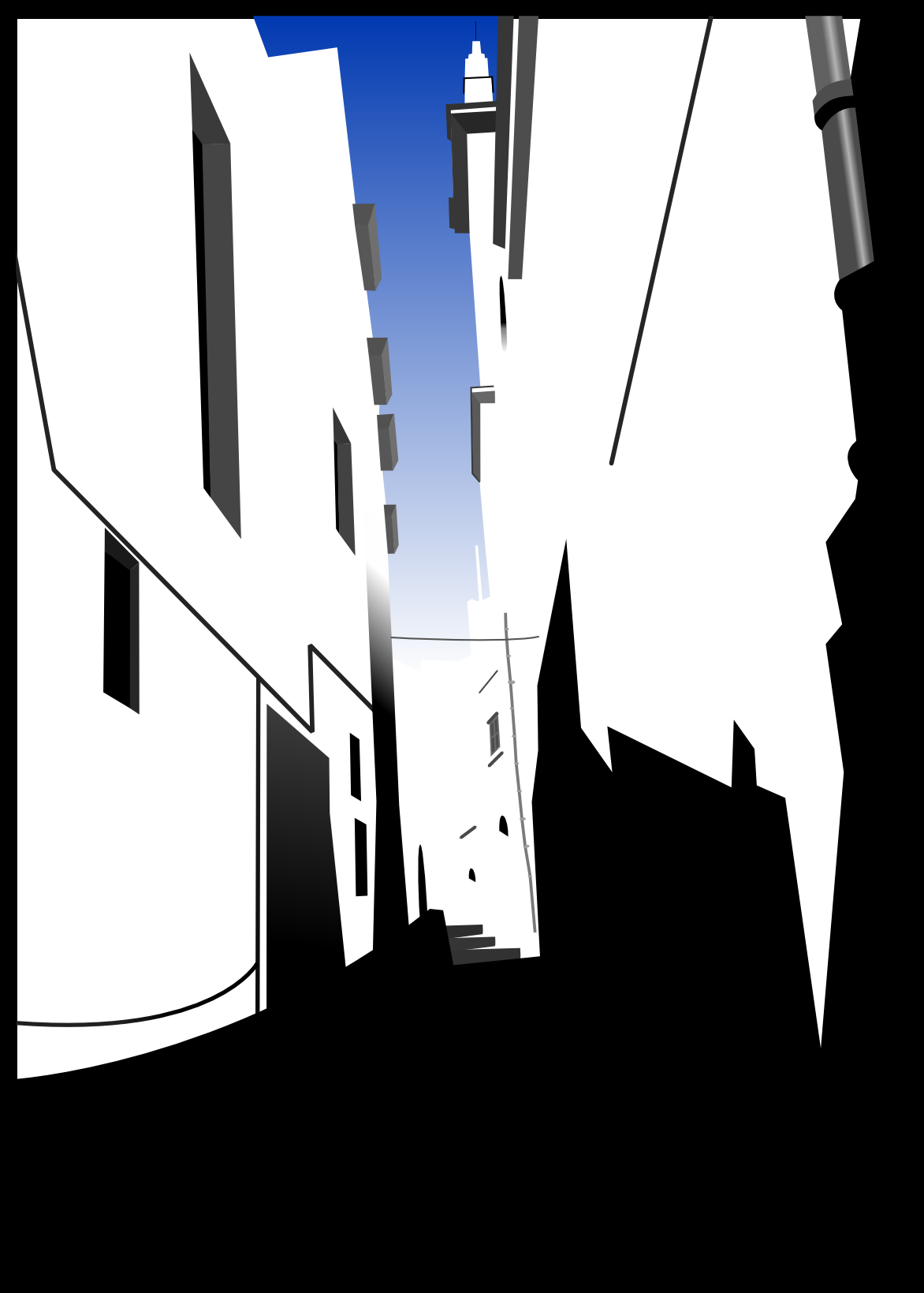
Published: 2004-07-08 13:44:44 +0000 UTC; Views: 1710; Favourites: 7; Downloads: 96
Redirect to original
Description
In a world without walls, what would you give, for a brick? o.OThis is "the men who wasn't there" gone wrong... enjoy the color
")
Inkscape, 4 hours'ish.
C&C are much sought after and appreciated
 (Smile)")
Cheers,
Steve
Related content


Comments: 12

I really like how you've updated it steve... gives a greater depth (in terms of what you can see away in the distance) to the piece. I would agree with ~beef that you might want to change the shade of blue slightly, and maybe even alter the sky so that rather than going from blue to white it can go from blue to a really pale cream.... but there's quality in the buildings far away merging with the sky.
Looks really nice.
👍: 0 ⏩: 1

F'n faved! Thats exquisite! Central focused vanishing point composition followed up with almost minimalistic use of details- bravo!
👍: 0 ⏩: 1


Wow, looking good freespace. The colour addition is nice also, but try a "creamier" - lighter shade of blue, the dark blue there is so generic.. lol.
Very nice though, your developing your own style.
👍: 0 ⏩: 1

I'll play with it a bit more. Although the blue used was taken from the reference picture...
👍: 0 ⏩: 0

Ohhhhohoh. Colour.
The colour is nice, is frames everything well, gives it a focus.
👍: 0 ⏩: 1
Mmm, color... expect to see more of it
👍: 0 ⏩: 0

when i was passing on the stair...
nice work! i love b+w stuff, and i love negative space.
this piece is so much fun to explore
sets the imagination going, no end.
👍: 0 ⏩: 1
Hope you like the new version... it has... COLOR! Its out rageous I know, but it had to be done!
Oh, and I am changing the theme too, my idea didn't work out >.<
Thankyou for your comment !
Cheers,
Steve
👍: 0 ⏩: 1
Looks cool to me.
Reminds me of Arcipello's "A better place" I guess because to me it looks like an alleyway with buildings crowding on either side.
👍: 0 ⏩: 0