HOME | DD
 frogface9 —
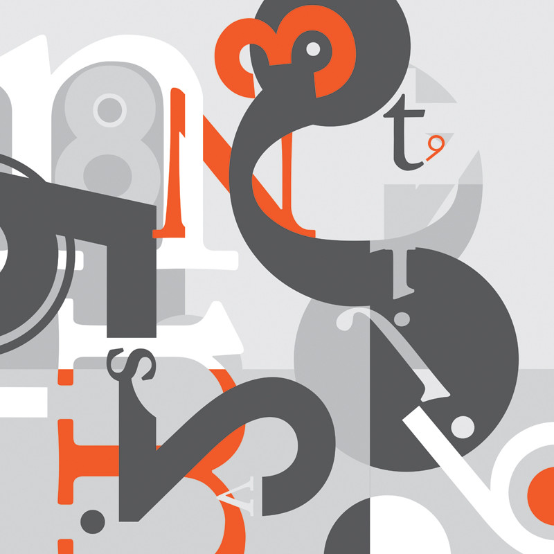
Type As Form: Composite
by-nc-nd
frogface9 —
Type As Form: Composite
by-nc-nd
Published: 2007-10-10 21:57:02 +0000 UTC; Views: 8047; Favourites: 169; Downloads: 275
Redirect to original
Description
Typography assignment.After designing nine separate compositions, each with a different number and letter, but with the same shape, combine them all into a single piece. Design this piece around an adjective. Colors can change where elements overlap multiple compositions. Elements can be moved from their original positions, but must remain in their original square.
Confusing? I probably wouldn't understand if I hadn't done it.
The adjective I chose was 'curious.'
EDIT: This is the first time I've been on DA in over a week because I've been busy. So, when I saw the DD I had to scroll up & down a couple times, just to make sure I was really looking at my piece. Thanks, everyone - especially ~marotiel and ^patgroove !
EDIT (2): This assignment was started on paper and completed in Adobe Illustrator.
Related content


Comments: 45

this must've been sooo confusing to figure out how to put the 9 separate compositions together in one complete piece. there is soo much going on, and a minimal color palette, but overall it flows very well and is quite an cool typographic piece!!! congrats on the DD! ")

👍: 0 ⏩: 0

The solid colors compliments the solid text and shapes wonderfully. I especially love your use of lighter grays with that one mid-shade of orange as a spot color. What really says "curious" to me is the way many of the icons interlock within others to give a normally flat image an unusual sense of dimention.
Congrats on the DD!

👍: 0 ⏩: 0

Ooooh, a DD  (Wink)")
And I liked the ones hanging in the FAB. Definitely love the overlapping and the circles! Cause I'm a circle junkie

👍: 0 ⏩: 1

You're an art student? Should I know you? I feel like I should.
👍: 0 ⏩: 1
haha, you do know me. But I guess I don't use my name on here...but I'm in your figure drawing class.
And this is seeming increasingly more stalkerish...so I should probably just say this is Michelle

👍: 0 ⏩: 0


I like it... I like it... Good colors. I'm waiting for more...
👍: 0 ⏩: 1
Thanks! And don't worry. The semester is far from over. I'll be posting more type art.
👍: 0 ⏩: 0

Congratulations on the DD. :]
"Curious" overflows from the work, I think.
The simple colours make it more intriguing, as well.
But, yeh, that assignment description confuses me! =_=''
Great job, & congrats again. 
Thanks for sharing~
-Alicia-
👍: 0 ⏩: 1
Thanks so much! I feel so out of the loop, since I'm pretty much the last to find out about my own DD. I'm so glad you get "curious" from this piece, because concept is very important to me.
👍: 0 ⏩: 0

this piece brings back memories of graphic design and typography classes. my professor had his degree in typographic design from long before computers existed. we did several compositions that were similar to this, but it was in hand-rendered caslon in pastel and conte crayon; torture, in other words. it made me a better designer and a better person.
this is a great piece. i am particularly fond of the orange 6 in the upper-right. such a great shape. i hope you print this as large as budget will allow!
👍: 0 ⏩: 1
Well, then, I am in the same position you were in. My professor has a strong traditional background and tries to get us to do a lot by hand, but computers are so prolific now that most of the students rebel, so she's slowly adapting. Even though this assignment was more confusing than it needed to be, I think that the final product really made me a better designer.
👍: 0 ⏩: 1
I think the problem with graphic design students today is that computers are making things too easy, and I am no exception. We heard every single day that we should have thumbnail sketches for everything, and we should be able to render type by hand, and we should be calculating line-widths in picas in order to set our type correctly, but none of us ever did that. Every agency that I've talked to or interviewed at tells me that they do thumbnails with a wacom right into photoshop now, so they rarely want to see those thumbs anymore. However, when you bring in a composition of hand-rendered type on 18x24 paper, it impresses the hell out of them. So it's ultimately worth it to fight your way out of the laziness that the computer affords.
👍: 0 ⏩: 0


Actually, I only used Illustrator. It's much easier to use for type than Photoshop, I think.
👍: 0 ⏩: 0

similar to stuff I am working on in typography right now so I feel yea. nice job
👍: 0 ⏩: 0

 (Smile)")

Thanks. I'm at Florida State University.
👍: 0 ⏩: 0


Very cool and interesting. I love typographic art and this is a very nice example. The use of only one real colour here is intriguing and the orange works well with the grays. Congratulations on getting a Daily Deviation!
👍: 0 ⏩: 0

ahhh after i check ur page and see the other part of this i think i understand the first part.. but still i don't understand the "around adj" part...
👍: 0 ⏩: 0
that assigntment desc is quite confusing @_@
do you mean there are 9 pairs of number-letter and each of them you combine / compose together. then compose again the 9 pairs into a typographical image?
and i can't understand "around the adj.."
is adj is the theme you must pick for the image?
T_T;;
i'm curious XD;;
👍: 0 ⏩: 1
Yes, apparently a lot of people were confused, including most of the other people in my typography class. If you're interested, let me elaborate:
For the first assignment, we had to choose nine different letters and nine digits. In each of the nine panels we had to use a single letter, a single digit and a shape - a circle, in my case. For the second part, we had to arrange the nine panels into a single square (3 panels x 3 panels) and then merge them to illustrate an adjective. So for mine, I tried to make the piece look like "curious." Someone else used "stressed" and her piece was tense, cluttered and explosive.
Hopefully that makes more sense...
👍: 0 ⏩: 1
thank you for the explanation ^^
i didn't see "curious in ur illust.. but when i see it again it's very interesting how i found that the shape intrigue the sense of curiosity
btw what is your school's name?
👍: 0 ⏩: 0


love it!
was it for school or something or did you it just for fun?!
👍: 0 ⏩: 0


something about this piece just begs for it to be
👍: 0 ⏩: 0

That's awesome. The colors really go well with one another, and the design is just plain cool.
👍: 0 ⏩: 0

looks damn.. cool.. but its tuff man...
good job!!!
👍: 0 ⏩: 0


This is good man i hope you get the mark for it!
👍: 0 ⏩: 0


")
