HOME | DD
 FrostRyu — Papillion Posse -vector-
by-nc-nd

Published: 2009-05-14 15:24:54 +0000 UTC; Views: 200; Favourites: 3; Downloads: 0
Redirect to original
Description
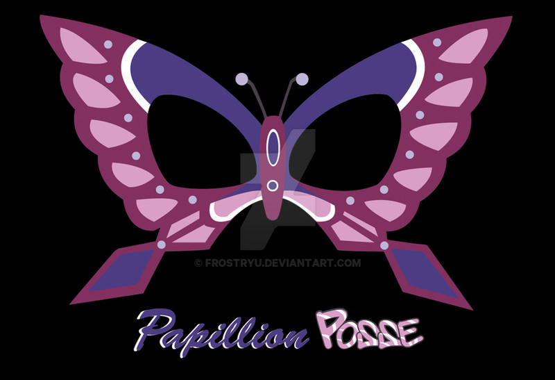
From Buso Renkin.This is going to be a T-shirt design for Papillion's fan club.
I may still add more detail to the mask tomorrow, but here it is with the text.
I don't own the rights to the mask, but it's my type design.
Related content
Comments: 7

OMG after watching that episode i SO need a shirt lol love it
👍: 0 ⏩: 1

Aww. I wish you would've said something sooner. I already ordered them. >.<
👍: 0 ⏩: 1

its cool...ill live lol
👍: 0 ⏩: 0

Hmmm.....
It would take me too long to text all this xD I love the text, it's awesome, but I was actually thinking... the script for Papillion being straight with "Posse" under it kinda sideways almost like someone graffitied it in.... you get what I'm saying? I like the Fonts though. ^^
👍: 0 ⏩: 1

I think I know what you're getting at.
You think "Papillion" should be centered under the mask and then "Posse" underneath it kinda skewed like it was quickly spray painted there.
Should I change the "Posse" word design or just move it? Or perhaps put a paint splatter behind it to get the graffiti look?
👍: 0 ⏩: 1

if you have something that can look more spray painted it would be cool ^^ if not, the font you have now would still be just fine
👍: 0 ⏩: 0


