HOME | DD
 FrozenFeather — elf sprite comparison
Published: 2012-07-19 21:02:40 +0000 UTC; Views: 560; Favourites: 18; Downloads: 3
Redirect to original
Description
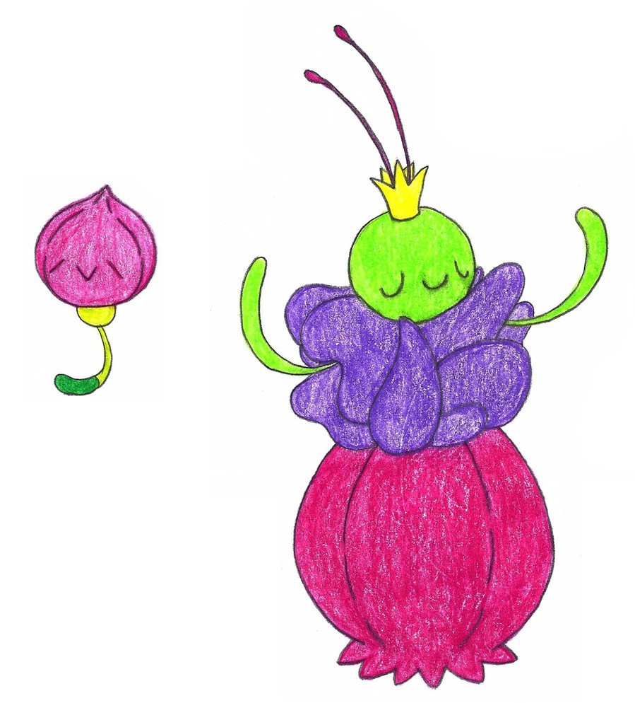
which one do you like better? right or middle or left?i'll probably redo it again in a little while. i'm still figuring stuff out.
Related content


Comments: 49

ok is there a specific reason?
👍: 0 ⏩: 1

The lines and the shading are better than the other two.
👍: 0 ⏩: 1

Sorry but your sprites are way too big :I Try comparing the fakemon you want to sprite with one with a similar body shape
👍: 0 ⏩: 1
yeah i know i prefer making larger ones especially while i'm still learning
👍: 0 ⏩: 1
I think that working on bigger sprites makes it more difficult to learn, speccially learn how to do smooth outlines
👍: 0 ⏩: 1
lol i think it is the exact opposite for me XD lol idk
👍: 0 ⏩: 0
")

definitely the last one. really good job this time xD Viyusgi has a point in saying the outlines may be a bit too light but other than that is great
👍: 0 ⏩: 1

The third one is beautiful! The whole sprite seems to fall together really well in comparison to the others
 (Smile)")
👍: 0 ⏩: 1

is there a specific reason?
👍: 0 ⏩: 1

I don't like those light outlines :S
👍: 0 ⏩: 1
oh i see what you're saying. i did make it a lot lighter
👍: 0 ⏩: 0
except for the face bush, it's better in the right one ^^
👍: 0 ⏩: 0


I prefer the right. It has a better shading, also, looks better.
👍: 0 ⏩: 1

The right one. It has better eyes, and has 7 leaves sticking out, my 2nd favorite number.
")
👍: 0 ⏩: 1
lol thanks
what's your fave number?
my favorite is 13 and second favorite is 7
👍: 0 ⏩: 1
My favorite... ∞ (Infinity) XD
👍: 0 ⏩: 1
ok thanks. is there a specific reason?
👍: 0 ⏩: 1

Well, to me (and I'm not sure if this is a major difference or not) but the shading seems better on the one on the right.

👍: 0 ⏩: 1
ok cool (i guess there's no right or wrong but the right is the "fixed" one)
👍: 0 ⏩: 1
Well then it looks better. ^^
👍: 0 ⏩: 1