HOME | DD
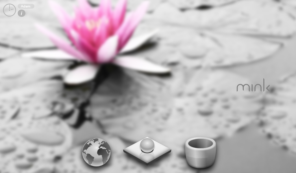
 FrozenTheaterD — Mink Netbook OS Desktop Mockup
Published: 2009-07-01 23:10:37 +0000 UTC; Views: 1170; Favourites: 2; Downloads: 72
Redirect to original
Description
As a netbook OS, it divides your system into web, system, and trash. Just a concept I had, it turned out great. I'm so proud of my icons!Related content


Comments: 6

I actually really like how the background is blurry but the icons are crisp and in focus. I'ts a great contrast. love it.
👍: 0 ⏩: 0

I really like your trash icon, it looks great.
I'm not sure what it is, but something about the globe seems kind of funny and it's just not as realistic looking as the trash. I was expected something that looked more like an aluminum marble. I'd say take hints from the pearl on the pillow, but it looks like it's a direct copy. Maybe it's something with the land masses....
I'm still not sure what the pearl on the pillow is, at first glance, and I don't think an end-user will know either. Also, it looks like it sits a little higher than the other icons, and that looks a bit funny.
Overall, looks good. I'd be curious to see how well the icons do on different bg's as well.
👍: 0 ⏩: 0

you're a genius, adam. really. this is great. though you could make the background less blurry, it feels like I forgot to put my glasses on.
👍: 0 ⏩: 1

:] well said. unfortunatly, the background is very speckled, its fuzzed for your own protection!
but really zed, that means a lot to me :]
👍: 0 ⏩: 1
")