HOME | DD
 fuzzyzebra — Morrison Solid-
Published: 2007-10-24 15:58:59 +0000 UTC; Views: 21238; Favourites: 90; Downloads: 316
Redirect to original
Description
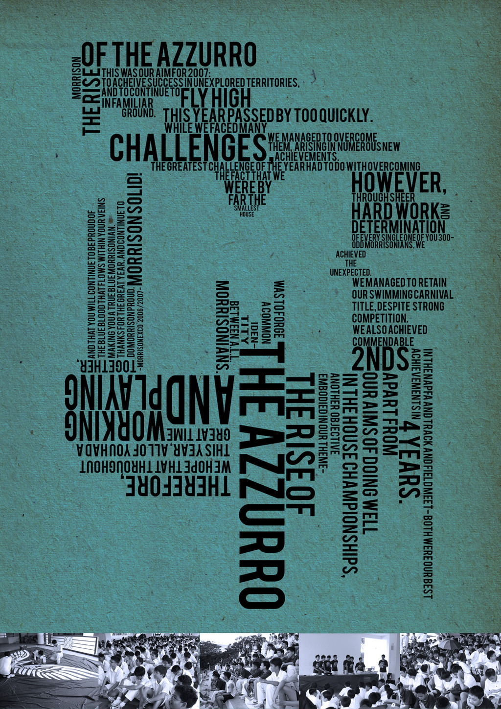
This is the Morrison House expressions page that I did for my house's section in the yearbook. Too bad you cant flip your computer a 180 to read the upside-downs!The message is written by a fellow Morrison EXCO member, thanks bryan!
Other typographic pieces:
Related content


Comments: 26

I still don't get what is this all about. Can explain? ")
👍: 0 ⏩: 1

well, it's a page i designed for my school's yearbook. It's a message from the House (Morrison) EXCO to the house members. I thought that arranging the text in normal paragraphs would be boring, so i made it a little creative. hehe.
the message summarizes what the house has done in the year and stuff. and the negative space forms an 'M' for Morrison?
Its pretty clear on the book. A4 seemed big enough! although the blue-green colour didn't turn out too well in CMYK...
hope i explained it!
👍: 0 ⏩: 1
What is House Morrison EXCO? hehe
👍: 0 ⏩: 1
EXCO = executive committee.
haha.
👍: 0 ⏩: 1
Oh ~ I see i see. btw, sorry for replying late.
👍: 0 ⏩: 0


Ooh ooh ooh I can make my compy do flips!
It goooooes.. Ctrl + Alt + Arrow Key!
And I just have to say.. I LOVE LOVE LOVE your typography.
👍: 0 ⏩: 1
omg i actually tried that and it didnt work. curses! tablet pcs ftw!
thanks so much for the encouragement! weeheehee
👍: 0 ⏩: 0

I so could flip my computer to a 180 degrees! It just take a while to do it...
This is beyooooooooooooooooooooooooooooooooooooo nd creative. I wish I had the creativeness like you have. My design stuff is cheap. Yours is all intricate, professional and polished. ^^
👍: 0 ⏩: 1
geeeee! and here i cam wishing i could sketch and draw so detailedly and sophisticatedly, yet so fluidly with quick lines that capture so much! yikes, we should switch places. rofl.
evrything starts with a good inspiration =]
👍: 0 ⏩: 1
That would be interesting...to switch places. Only if I had a magical spell book of spells!
And thank you....anyways.
And yes! Inspiration is the cure to art...if that makes any sense.

👍: 0 ⏩: 0


Yay! I'm so glad you are keeping up the beautiful sexy typography! 
Make sure you try to align wherever you can; so like where you said "avhieved the unexpected" the end of the 'e' in 'the' should have aligned vertically with the beginning of the 'O' in "Odd [Morisonians]" and the 'w' in "we [managed]" you get me? ")

👍: 0 ⏩: 1
AW CRAP. you make too much sense. too much! hmm.. i must do sumthing to you to make u more stupid. 
i really liked this font, it was simple, yet different, but the [space] was waaaaay too small! do you know how to solve problems like this? making the spacings between WORDS bigger, yet keeping the spacing between APLHABETS? killer killer killer!
thankies so much for using up 5 minutes of your life on the ubber long reply! =]
👍: 0 ⏩: 1


Anyways, for changing kerning (this does shift the spaces between each letter, but only minimally in comparison to the shift between words, and it only shifts the spacing between letters becoz its part of type rules
Adobe tend to keep the application layout consistent between programmes, but inDesign does differ from the others. basically just look for 'A V' with a double headed arrow beneath, which corresponds with a selection box where you can change the number of point size. This is usually located:
in Illustrator: in the top toolbar when you click on 'character' (its blue with dotted underline)
and in Photoshop: when you select the little folder in the top toolbar, next to the 'T' with a curve beneath it.  (Smile)")
let me know if my directions are confusing and you can't find what I'm talking about
What typeface did you use? Is it just a family that you used only the Capitals of, or is it a family that is made of only Capitals?

👍: 0 ⏩: 1
awwww is doesnt seem to work. the font's name is Bebas. everythings in caps (and yea, its a free typeface ")
👍: 0 ⏩: 1
the 'A V' is there, its what would have made the letters closer together and further apart. Illustrator really is best, you should go to Adobe and download a free trial of Illustrator CS3 then find a serial hax or summin (I could always locate it 4 u coz I have a mac, and don't have to worry about ppl haxin my computer 


👍: 0 ⏩: 1
yeeaahahahaha! thanks for all the help! i dont think i'll make you a criminal... just yet =X. ad guess what... today i boight a wacom tablet! (ok total random fact... (its installing (now!)))
👍: 0 ⏩: 1
yay!!!!! wacom tablet hav my babies! 


👍: 0 ⏩: 0