HOME | DD
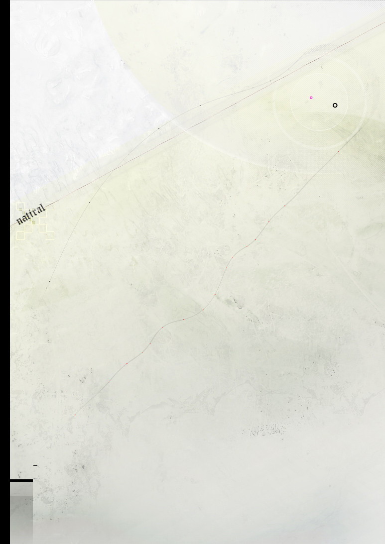
 gauravpatel — Natiral
Published: 2004-08-05 13:33:47 +0000 UTC; Views: 227; Favourites: 1; Downloads: 85
Redirect to original
Description
· n a t i r a lBoredom.
Related content


Comments: 11

I dun get it. Its like a paper, or sum engleesh guy did learnt his?
👍: 0 ⏩: 0

woa dude ! make it a print ! i want it ")
👍: 0 ⏩: 0

minimalistic indeed and really soft. Nice job, hun

👍: 0 ⏩: 0

Supahfly!! Needs adjusted curves slightly.. I like a good contrast.
 (Wink)")
👍: 0 ⏩: 0

sweet minimalistic work
only people who don't understand that art is expression of abstract thought would say that intentional lack of contrast is bad
oh well


👍: 0 ⏩: 0

Ohhh and this is so subtle and beautiful i just have to favorite it.
Thankyou.
👍: 0 ⏩: 0


its nice, not contrasting enough though, and it would be cool at a desktop res

👍: 0 ⏩: 0