HOME | DD
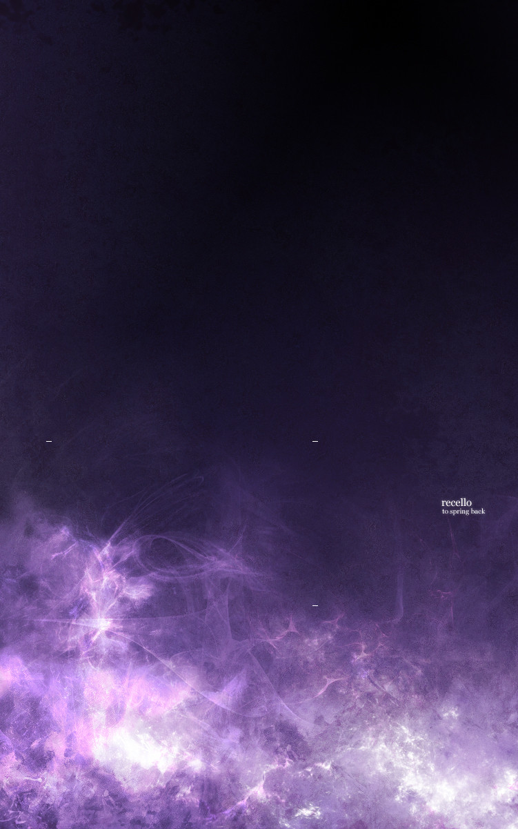
 gauravpatel — Recello
Published: 2005-11-20 19:10:10 +0000 UTC; Views: 328; Favourites: 2; Downloads: 47
Redirect to original
Description
--Related content


Comments: 8

 (Smile)")

 (Wink)")

Very nice but.. but.. but.. Those three _'s look out of place
")
👍: 0 ⏩: 1

I like them, and I like your username.
👍: 0 ⏩: 1

I like your username more. oi gaurav nice deviation man, a tribute to coming back, very sleak and stylish like gaymo's said the _ 's look like they're not mean to be there.
👍: 0 ⏩: 0

Fairly impressive. The highlights and use of colour through the image are great. Typo is well positioned too. I like the grainy texture used... adds a certain rawness.
👍: 0 ⏩: 0

The dimensions of the image are perfect and I think the placement of the text is great. That's quite a nice build-up at the bottom of the image; quite easy to stare at as there's a lot of depth there.
I like it, very hazy.
👍: 0 ⏩: 0

Excellent work. I love the colors and style.
👍: 0 ⏩: 0