HOME | DD
 gauravpatel — Void
Published: 2004-07-15 16:49:51 +0000 UTC; Views: 238; Favourites: 4; Downloads: 70
Redirect to original
Description
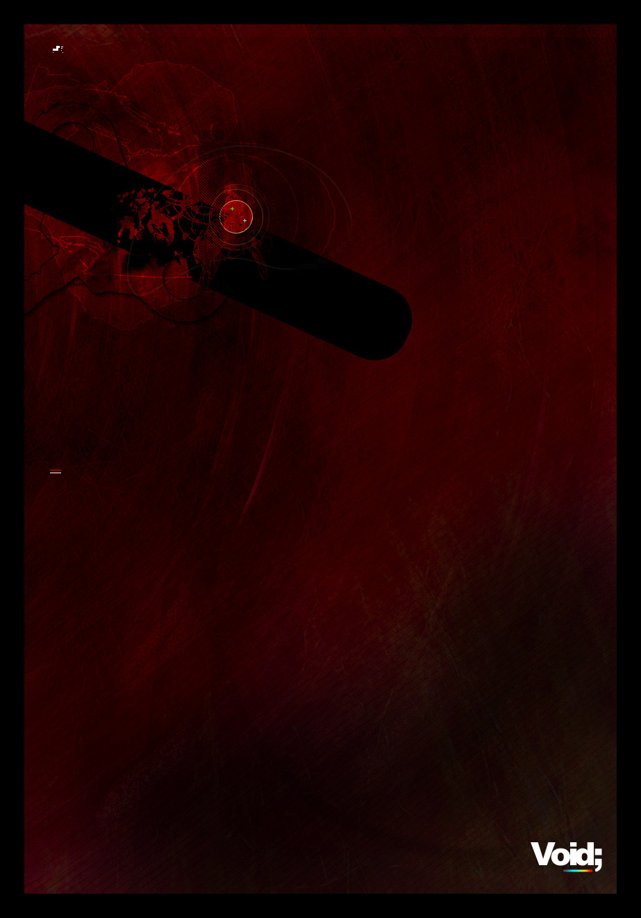
· VoidThe result of boredom.
Related content


Comments: 13


a dark, but an awsome detailed work of art.. very well executed and displayed
👍: 0 ⏩: 0

interesting shapes and color though I don't quite get the red/green/blue part
👍: 0 ⏩: 0

O.o morbid and dark and mysterious 
👍: 0 ⏩: 0


Wow. It looks good. But I don't like it. It's too dark. Sorry.
It's good though.
👍: 0 ⏩: 0


really beautiful colors for subject.
You have given really good judgment to such subject.

 (Smile)")
👍: 0 ⏩: 0


Lovely mate,a bit dark though,keep up the good work
👍: 0 ⏩: 0

very nicely done.
boredom produces some very interesting things.
Negative Space
you seem to use that a lot in your own pieces, ones where it isn't a collab. you've always used your negative space so aptly. you center things, or push them to a side or a corner, and that really helps the viewer focus on the main part of the piece. but what i really like, is that your negative is space, is never just negative space. it has colour and texture and it's like another part of the piece, without anything really being there.
Colour and Voids
at first, i thought the whole piece was a void, and i thought it was interesting that you used the fiery colour you did. then i realised that the void was that black space in the midst of all the red, which is very interesting. not only does it create a tremendous amount of contrast, it also is interesting how you imagine a void. i've alwyas thought of a void as something grey and dull, not something black, because black has this intesity and depth to it, whereas grey is just grey, there's nothing to that colour pretty much. no depth, no intesity, many different shades, but each as inexpressive and bland as the next. i also imagined a void as going on forever, with no beginning and no apparent end. so it's interesting, because you gave me food for thought as well as showing your take on voids.
Colour, Texture, and Detail
as i said before, your negative spaces, have never just been negative spaces. they have varying shades of colour, and texture, and for negative space, it seems so detailed and intricate. as in this one. the variations of colour, and the texture make the negative space, seem anything but. it appears to be so detailed and though out, even though it's just texture and different shades of a colour, it doesn't seem like that.
i've always admired the detail you've managed to obtain in your pieces. this one is no different. there's (as i said above) so much detail in this, especially the little islands. and the lines going in and out of the void. it makes the piece seem so much more, with those extra bits of detail. plus the texture there is absolutely gorgeous. i could almost reach out and touch them and know what they'd feel like. they seem to have the texture of paper, but rough, watercolour paper.
Focus
the area where you've focused is a bit distracting. instead of looking at the void, my attention always wanders to the highlighted spot. that's probably the only distracting thing in this piece, and the only think i don't really like. apart from that, the whole piece is gorgeous. earlier, i mentioned how contrasting your idea of a void is to mine, but i don't have a problem with that, it's just difference in imagination, and you can never pin a person down for imagining.
nice job gaurav.
👍: 0 ⏩: 0

get bored more often! i love it, great colors
minimalistic yet still has alot to showcase. Great work
👍: 0 ⏩: 0

 (Wink)")