HOME | DD
 gauravpatel — justforgaurav.com -- design
Published: 2004-10-01 17:43:24 +0000 UTC; Views: 568; Favourites: 0; Downloads: 229
Redirect to original
Description
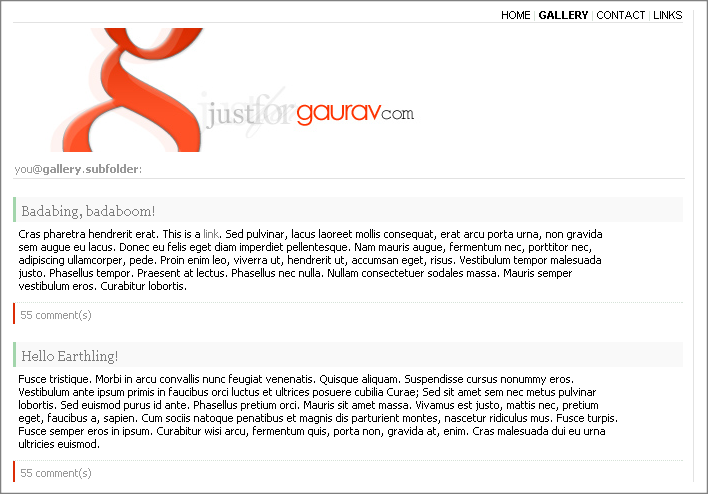
This is the design I have just recently made for my website. I did make one before, but it just didn't look "bloggy" enough. Coded by hand. No using those FrontPage or any of that shit. Though, I did use a CSS editor that previewed the styles. I found it a great tool to have, especially for me as I've just started out. Infact, I only made that first design less than a week ago. So yeah, I'm still messing around with the HTML and the CSS until it will be perfect in my eyes. I'm gay like that. At the same time I shall be re-doing the CuteNews templates so it will all, hopefully, validate properly.Anyway, suggestions and criticism please.
-- justforgaurav.com
Related content


Comments: 13

Oh, ok. That's pretty nice. A few things though... The content font contrasts too much in comparison to the rest of the colours, you should make that a dark grey-ish colour, I think. It just stands out way too much. Also, the navigation at the top, "HOME | GALELRY | CNTACTS | LINKS" stands out too much. You shold make the font a bit smaller, an again, grey, possibly not caps, though I'm not sure.
Design wise this is pretty hot. Though the code is the real kicker... And I'm too lazy to look at that. Though you said it doesn't validate, so sort it out
But aesthetically, I think it's pretty awesome.
👍: 0 ⏩: 0

")

Hot image thingy. Perhaps change the text font, sans serif's modern and cool, okay.
👍: 0 ⏩: 0


 (Smile)")

nice work, it still has that "html/css generator" feel to it  (Wink)")
👍: 0 ⏩: 0

Really nice layout.
I'm making a fake website today, and I think I'll use this design for it.
👍: 0 ⏩: 0

Oh, ok. That's pretty nice. A few things though... The content font contrasts too much in comparison to the rest of the colours, you should make that a dark grey-ish colour, I think. It just stands out way too much. Also, the navigation at the top, "HOME | GALELRY | CNTACTS | LINKS" stands out too much. You shold make the font a bit smaller, an again, grey, possibly not caps, though I'm not sure.
Design wise this is pretty hot. Though the code is the real kicker... And I'm too lazy to look at that. Though you said it doesn't validate, so sort it out
But aesthetically, I think it's pretty awesome.
👍: 0 ⏩: 0

Looks awesome man, other than the fact that well, i cant read it!
I like the simplicity and color scheme you chose, although I would kind of like to see a bit more color. I mean dont get me wrong simplicity seems to be the trend especailly lately, and I have no problem with that, its all fine and dandy by me, but i dont, sometimes its kinda fun to set the trend, not just follow it. I'm not saying I would like to see radiating orgasmic vivid colors penetrating my brain, just a little more something to grab my attention.
If I were to come to this site, quite honestly I would think its a bit boring, and I might just move on, I may check out the gallery, but for the most part I wouldnt take the time to read the text, or even scroll down to discover what else may unfold. I'm not saying you should change it by any means, but you did ask for the advanced critique

👍: 0 ⏩: 0