HOME | DD
 Genesis-Orbit — Passing

Published: 2007-02-03 19:19:37 +0000 UTC; Views: 2746; Favourites: 80; Downloads: 0
Redirect to original
Description
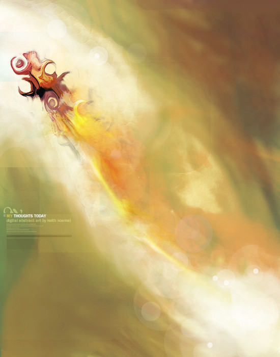
PassingCollaboration with Danilo Gusmão Silveira
[link]
It's only temporary, turn the other way when you're falling.
Render by me, composition by Dan, concept by me. Check out Dan's version on his website. If it's not up then check back in a day.
Related content


Comments: 81

xD, this is a poor excuse for a vector, but thanks anyways.
👍: 0 ⏩: 1

ARE YOU KIDDING ME?!??!!!! xD I'm too scared to do vectors because I know that I'll suck...=.="
I suppose I'd never know until I try, but I don't want to try.=.=
👍: 0 ⏩: 1
Yea they take a lot of patience, but seriously, this was like a 15 minute job lol.
👍: 0 ⏩: 0

Reminds me of Autechre. It even goes well with their music when I play them.
👍: 0 ⏩: 1
Autechre's the name of a British IDM duo. One of the most prominent acts signed up with Warp Records -> [link]
Untilted's my favourite of their albums.
👍: 0 ⏩: 1
Cool stuff, I might check them out ^^ thanks!
👍: 0 ⏩: 0


close to perfect; perfect to close ... that is what I have in mind

👍: 0 ⏩: 1
Haha thanks a lot brother
👍: 0 ⏩: 0

Grayscale is a nice way to do things, but some of the vectors get a bit lost, maybe because some colors are too closely related. The orange square really commands attention and I love that aspect completely.
👍: 0 ⏩: 1
Yea it was a little hard to get a nice balance of contrast in there, but I think for the most part I did a good job. It's not all vector but I know what you mean. Thanks
👍: 0 ⏩: 1
It's not all vector? 
And, no problemo.
 (Wink)")
👍: 0 ⏩: 0

not badd` but the main rendition is a bit randomm.
👍: 0 ⏩: 1
Yea I see what you mean bro. I still love you though.
👍: 0 ⏩: 1
lol did that make sense? haha. you made it. but you still love me?m haha i love you you sexy faced ass. now see i just pulled a you. ")
👍: 0 ⏩: 1
You're so refreshing to talk to bro lol, I love you too
👍: 0 ⏩: 0


Very well made. I like this one a lot. I think it is worthy of one of my prestigeous :+FAv: 's
👍: 0 ⏩: 0

really clean design. Love the use of so few colours with lots of midtone greys. Also love the fact that youv'e mixed curves with the small section with sharp straight lines on the left; it's really well balanced so it works.
+fav
👍: 0 ⏩: 1
Thanks a lot man, make sure you visit dan's portfolio, he pretty much did the whole look of this, I just did some color adjustments to mine and kind of made the concept for mine too.
👍: 0 ⏩: 0


Lovely! I like grayscale works. I think all details is OK. The effects, the render, the lines I think all fine!
Well done, Keith! Keep it up!
👍: 0 ⏩: 1
Thanks a lot, I'll try my best
 (Smile)")
👍: 0 ⏩: 0


")
👍: 0 ⏩: 0

id like to see more color involved, but its nice in these grey tones/inverted.
👍: 0 ⏩: 1
Thanks. Make sure to check out this too [link]
👍: 0 ⏩: 1

I'm not sure about this dude dude. Very low quality at some places, plus it doesn't have the "eye candy" feeling... I cant' see anything that turns me on at this one ")
👍: 0 ⏩: 1
No biggy. This really isn't exactly my style, but you'll see some cool stuff in a bit
👍: 0 ⏩: 0

new stile i see
i see a lil` bit low quality in some parts
try to save as png
")
👍: 0 ⏩: 1
Eh, it typically doesn't make a visible difference, 12 quality jpg has treated me well, but I dunno lol. Ah whatever
👍: 0 ⏩: 1
No, but I dunno where this bad quality is. I'm always a prick when it comes to good quality and I see nothing wrong with the quality here. Who knows lol.
👍: 0 ⏩: 1
i will show you very soon
👍: 0 ⏩: 0


| Next =>