HOME | DD
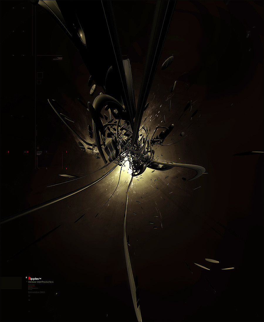
 Genesis-Orbit — Ripples
Published: 2005-12-23 05:46:24 +0000 UTC; Views: 977; Favourites: 23; Downloads: 574
Redirect to original
Description
RipplesFinally, this is my first actual 3d peice made entirely by me. A major breakthrough for me
 (Smile)")
Thanks to Ross Walby [link] for the materials for the render, and actually rendering the peice for me on a count of my computer sucks and needs more RAM lol.
Related content


Comments: 60


Liking the colour choise. And the part in the middle of the explosion, that looks like some planes which are separating is great, work on that a bit more ?
👍: 0 ⏩: 2

Ok I took away the sharpness at the end of the peice, look a lot more real now. Thank again
👍: 0 ⏩: 0
I'll see what I can do later tonight. Really appreciate the comment, your gallery is awesome
👍: 0 ⏩: 0

it just needs a little blur for full screen, the edges get a bit crappy near the middle part
👍: 0 ⏩: 1
Yea I think I overdid the sharpening a bit too much, thanks for the comment
👍: 0 ⏩: 0


Thanks but I didn't get a favorite lol
👍: 0 ⏩: 0


Nice one. The only thing I don't like about it is the red R.
👍: 0 ⏩: 1


I liked it when i hadn't seen full view yet, it's way too sharp
")
👍: 0 ⏩: 0

")


not my favorite piece from u and text does need to be fixed. its definitly not a bad first attempt. nice job
👍: 0 ⏩: 1
Whats wrong with the text? I like it
👍: 0 ⏩: 1
that red really throws it off =/
👍: 0 ⏩: 1
[link]
there is no red in that peice but the tech, I think it fits perfectly
👍: 0 ⏩: 1
thats en-tyrea's piece lol. and actually the R is in red. at least when i last checked ur recent devinations. that R threw it off, adn the font did too.
👍: 0 ⏩: 1
Eh, whatever, I think it looks good
👍: 0 ⏩: 1
lol then thats all that matters.
")
👍: 0 ⏩: 0


looks great other than the over sharpened parts of the render
👍: 0 ⏩: 0


a bit choppy and the render could be blended with the backround more.
👍: 0 ⏩: 0

very nicely done, great piece, looking forward to more!
👍: 0 ⏩: 0


thats awesome but the text and tech brushes kill it
and it needs more of an environment
👍: 0 ⏩: 1
haha...I dont use brushes you fool
👍: 0 ⏩: 0


I see nothing about ripples... I hear ripples and I think water. But this still looks cool.
👍: 0 ⏩: 2

Well...It's called abstract art for a reason
👍: 0 ⏩: 0
use your imagination, cant you see the circular lines comming off from the focus?
👍: 0 ⏩: 1
a little... my eyes dont do well with dark pictures...
👍: 0 ⏩: 1
I have no idea... its a flat pannel.
But its generally me... no matter what I'm looking at if its dark i just have trouble... I think I have some sort of stigmatism.
👍: 0 ⏩: 0

Thats amazing job for a first bro
👍: 0 ⏩: 0

i like it
but the fonttype of "Ripples" is not good =//
👍: 0 ⏩: 0


nicely composed, render looks like a copter crashing.
👍: 0 ⏩: 0
| Next =>