HOME | DD
 genesis — Painter First Attempt
Published: 2005-05-03 07:26:22 +0000 UTC; Views: 2603; Favourites: 26; Downloads: 376
Redirect to original
Description
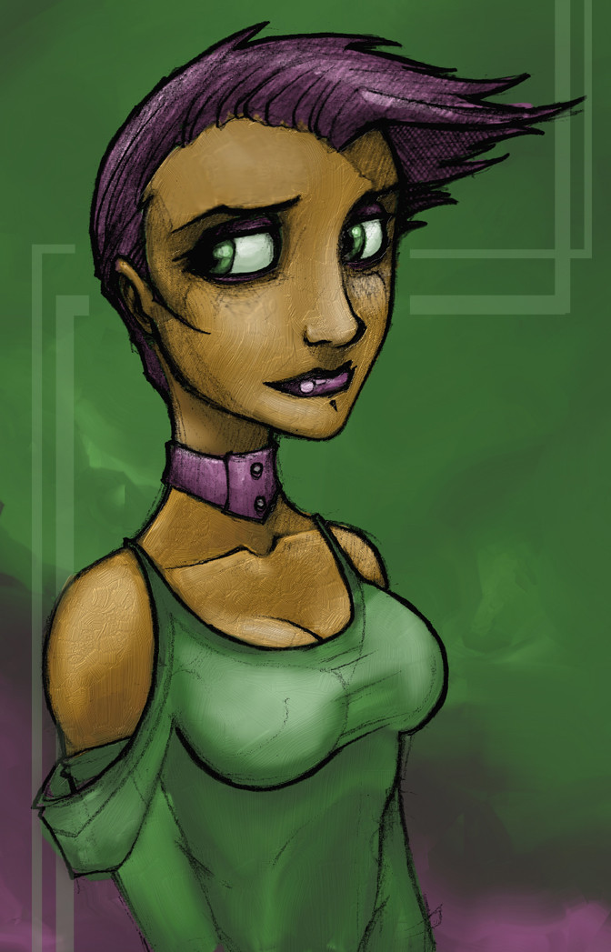
Ok so i havent submitted anything in a while, i have graduated uni at last and i am learning corel painter and been relaxing finally. I am slowly getting back into everything i always sketch alot and i have heaps of unfinished works i just prefer to submit works that i have completed. Anyway, this is my first attempt at using painter and yeh yeh its cheesy looking and theres brush strokes everywhere but hey, practice makes perfect.Comment if u wish if not then i wont get mad or anything....maybe.
Genesis
Related content


Comments: 47

I love the strokes I thought it was real acrylic, hey on that note If I was working with like real watercolours not digital how do you make anything glow
👍: 0 ⏩: 0

i like the brush strokes....they give it a more real look.
👍: 0 ⏩: 0

I like it.
The only thing I would say is that the texture of the brush strokes makes the strokes look fairly loose, but then the color areas conforming to the outline so well is tighter, and that seems to clash a little bit. Like, with that kind of brush stroke I would expect more of an impressionistic image overall.
Thats the only thing that pops out when I look at it anyway.
👍: 0 ⏩: 0

that's really nice work. I'd like to see you make more dark things like your monsters and such, the more evil things. Also, since you're learning coloring, it would be awesome to see your other stuff, which is mostly sketched, finished in color.
Awesome work, nice to see you submit a piece. Hope you'll continue this habit
👍: 0 ⏩: 0


yeh i noticed a few things before i posted it, like the texture and the colours thats why its my first attempt. i havent studied colour much yet so im probably going to read up on it and keep on trying out new programs at the same time. painter 9 is alot to take in and is confusing me alot but im getting there, cant be perfect from the start.
👍: 0 ⏩: 0

LOL! i hope you dont get mad. hey look i LOVE you art work. this is the thing its the texture... for somereason the texture is like sticking out really intensely... but otherwise its really good. well i shouldent talk though because i have never used the program so whatever. T_T i wish i had though.. either way its great ^ ^
👍: 0 ⏩: 0

Wow that style is really interesting! Its Freakin' Awsome, Looks Great and really looks like it would jump off the canvas. really Cool.
Congrats On another Good one Genesis.
👍: 0 ⏩: 0

Its the awesomeness genesis! you did a very good job for it being your first time
👍: 0 ⏩: 0

Yeah, actually, this is really nice, for a first go at it.
So...what painter are you using? I've had my tries at 6, 7, 8 and 9. Personally, if I could find 6 right now, I'd stick with it. Since I can't, I'm locked down tight on 7. 8....I hated and 9 is just a memory hog like nothing you've ever seen before. 9, though, has certain redeeming traits. It's workable, at least.
Aaaaanyway, back to the drawing. You seem to have a pretty decent control of the brushes, despite this being your first painter piece. They made my life -miserable- for about a week when I first started out. I'd suggest creating some custom brushes, with lower opacity. That should get you an easier blending feeling going on in your strokes.
The rest of my problems are directly related to color theory. Skintones need more red in them, maybe even some greens and purples (in moderation). It's not as...monochromatic as you've made it out to be. (Although, don't get me wrong, monochromatic schemes work at times, also.)
Also, it looks like you went with a flat white light source. Not really so great and idea, for a number of reasons. I won't touch color theory again, so much so as to say that white doesn't blend well (in painter) with the other colors. That more or less leaves you with those greyish-green tones on her chest. And the like. You might want to try offshite. Towards yellow.
Finally, there are some small issues with the shapes you're creating with your lighting. Her brests aren't coming across as well as they might, since you've illuminated them all down the sides, as well as on the top.
Anyway, despite the incongruities, it shows a great deal of promise.  (Smile)")
👍: 0 ⏩: 0

Well, you went a little overboard with impasto. It's something else than just brush strokes that you can see, because it brings texture.
At first it's hard to find the right tools to work with in Painter. I prefer the scratchboard tool, (oil) pastels and palette knife, but there are a lot others, which I'd like to know better.
Oh, and the shading on the dress is too soft, blurry.
👍: 0 ⏩: 0

I agree - nice boobs - something to aspire to perhaps. Also brush strokes are cool - they look all painterly and stuff and are certainly not a heinous crime.
👍: 0 ⏩: 0


Her breasts are to high positioned on her chest. But that's my only complaint,I like the dull colors(yet at the same time, vibrant) and the texture and everything. (to much coffee to really formally review this)
👍: 0 ⏩: 0

Nice job for your first. I like the texture. If you like smother brushes.. charcoal is nice.
👍: 0 ⏩: 0


I really like the look, espcially the face and colour choices

👍: 0 ⏩: 0

Awesome awesome Matt, that looks cool and i'm glad to see you submit something ")
👍: 0 ⏩: 0

Cheesy-looking? The hell is wrong with you! +Fav. ~Marz
👍: 0 ⏩: 0

Looks nice, it'll be good getting more devwatch messages pointing to your account again
👍: 0 ⏩: 0


Nice choice of color
but i find 2 things that kills your drawing
her face seems wood made to me (wood texture or something) ... not really big but when i thought this i couldn't remove it from my head
and the conection between her neck breast seems really flat and that's really visible :/
Anyway i really like your drawing and your "old" style (the grey one ^_^)
👍: 0 ⏩: 0

I think it's great, the only place I really see brush marks are on her skin. Can't wait to see more of your work
👍: 0 ⏩: 0


cool pick i likes her hair
and 

👍: 0 ⏩: 0

For a first attempt, that's pretty bloody good! Congrats on graduating Uni too! Good luck for the future!
👍: 0 ⏩: 0

first try ")
keep up the great work
silent greets


👍: 0 ⏩: 0

ok this might sound dmub but are you using a graphics tablet? please let me know if you are cuz im looking to buy one but i dunno what kind n all that.
👍: 0 ⏩: 0


This is a first go at using Painter!
Its amazing, beautiful linework and colouring, shading, everything is so perfect!

👍: 0 ⏩: 0

it's awesome !
👍: 0 ⏩: 0

someone few comments down wrote that she should have smaller boobs - please DON'T LISTEN TO HIM!  (Wink)")
anyway, nice colors here, nice pose (and boobs
oh, and congrats on your graduation btw.

👍: 0 ⏩: 0

it's really good nd the brush strokes give it a hand sketched quality
👍: 0 ⏩: 0

You should try out Alias Sketchbook Pro its quite a kewl program. Has some neat brush effects.
[link]
👍: 0 ⏩: 0

yeah your back
i dont think this piece is cheesy.. plus considering that its a try, it is pretty good..
👍: 0 ⏩: 0


awesome, GEN IS BACK!!!
and yeah, they look way too big to be real
")
👍: 0 ⏩: 0

Nice work
You'll master that stuff in no time I'm sure..
👍: 0 ⏩: 0

I'm just glad ur back m8... I think smaller brestats would enhance the overall impression of her, and give her a more defined personality
(her expression and pose doesent really match up with the boobs ")
👍: 0 ⏩: 1

ok, first of all, this is a really good piece, especially for a first try.
And second, since when can you coordinate your boobs to your daily outfit, expression, pose? I know I cant and if you have found a way then please, do tell. Anyways, great work.
👍: 0 ⏩: 1

and about the boobs, well... uh, it was just a feeling I got when I was looking at the pic
👍: 0 ⏩: 0

good stuff. a lot of expression in the face. no comment on the coloring, it works well, i love the texture it has and the dynamic feel, but what do i know ^^
👍: 0 ⏩: 0

Wehee. I really like your facial structures, and colour choices.
👍: 0 ⏩: 0