HOME | DD
 ginnyhaha — The Invisible Difference 2
Published: 2004-11-24 19:48:00 +0000 UTC; Views: 1119; Favourites: 12; Downloads: 159
Redirect to original
Description
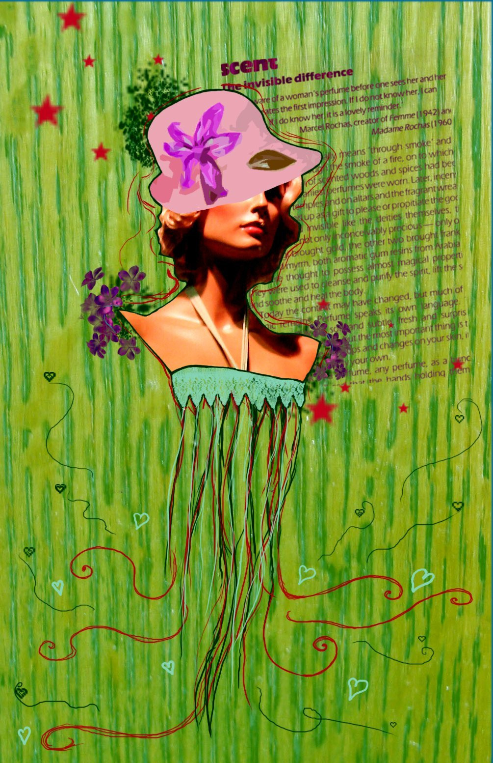
The original, colour version of The Invisible Difference . I hope the colours turn out OK... things often upload looking more washed-out than they did in photoshop!Anyway, woman stock from ~rubydream and wood texture stock from ~bluecanarystock
Enjoy!
Related content


Comments: 50


Wonderful colors and placement of shapes.... a little reminiscent of a jellyfish! Excellent Pop art! 
")
👍: 0 ⏩: 1

ahee! i have the "scent" article as well. ^_^ i love your style; tres chic.
👍: 0 ⏩: 1

woahhh nice.. im so jealous of you.. you have talent.. sorry i dont have any advanced critique  (Smile)")
👍: 0 ⏩: 1

I really really really like this.
Sorry, I'm not very good at the whole constructive comment thang,
but I like what i see.
👍: 0 ⏩: 1


Hehe This is cool.. but is that a cutout filter I see?
Other than the red stars, This is proper funky and i like
")
👍: 0 ⏩: 1

I cheated and used the filter on her hat... disgraceful, I know. 99% of the time using filters makes my computer crash, so I don't tend to use them but this time... I did!
Thanks for your comments
👍: 0 ⏩: 1
Hehe. It's all good. The cutout filter is one of the few filters I dont have a problem with (even if it's because I'm lazy)
I'm just surprised I can pick it out so easily...
*feels quite sad... gets out more*
👍: 0 ⏩: 0


oooooh! such beauty!
may I ask for the isperation source?
👍: 0 ⏩: 1
Thanks
I got the idea partly from Goldfrapp's album cover , and partly from a 1981 edition of Vogue that my mum had, which the "Scent" text is from.
👍: 0 ⏩: 0

Lovley done (: the green bakground is so nice. and the little heart from the rotes.. it's looks like you have cut the women out from a magazin or someting. then done the bakground.. really nice ^^ like it
👍: 0 ⏩: 1
Thankye. The magazene-cut-out thing was the effect I was after so... glad to see someone picked up on it
 (Wink)")
👍: 0 ⏩: 1

This is so adorable! I love the use of stock, Rubydream has such amazing stock. I love the green used, and the subject of text added in. It almost looks like she's gracefully pulled into ribbons towards the bottom. Beautiful work!
👍: 0 ⏩: 1
Yup, I agree... her stock's so pretty, and pretty useful! Glad you like
👍: 0 ⏩: 0

You should check out Hannah Hoch (the O in her last name has two dots on the top). She's a Dada artist... she did simular things. I think you would really like her work.
👍: 0 ⏩: 1


vert cool stuff
esp. love what you've done with the text .. it being slanted
but eh .. don' much like it being cut as a sqare ..
anyhoo..
it's cool how you've worked it in the same way as you did the flowers
cheese


👍: 0 ⏩: 1
Thanks
I had to cut it as a square because of the way the book it's from was set out. Although I think I'm happy with it like that anyway

👍: 0 ⏩: 1
ok .... considering that ... i'd consider hiding the last line with a mask.. and maybe a selected few ends of lines that bug the eye if you're a major annoying nitpick :majorannoyingnitpick:
p.s. if u like it anyway .... why am i bugging you?

👍: 0 ⏩: 0


Oh my god I love this one so much. It remindes me exactly the a fresh girly perfume would smell.. one of cut grass and orchids.
👍: 0 ⏩: 1
Thanks! I'm glad you like it!
👍: 0 ⏩: 0

I'm pretty sure I like the color better. It doesn't look washed out at all. And you see the varying textures much better.
👍: 0 ⏩: 1
Thanks
👍: 0 ⏩: 0


nice job~! i think i like this one better... the figure looks better... and i agree with hexdcml, i think the cropping could be re done to make it look even more fantastic hehe nice work!
👍: 0 ⏩: 1

ooo.. i dunno which I prefer. BOTH!
Could use a little tighter croppage.
👍: 0 ⏩: 1
yes... I thought so... but I wasn't sure... so... I left it.
👍: 0 ⏩: 0