HOME | DD
 glue — Partial
Published: 2004-06-19 06:47:09 +0000 UTC; Views: 1322; Favourites: 3; Downloads: 961
Redirect to original
Description
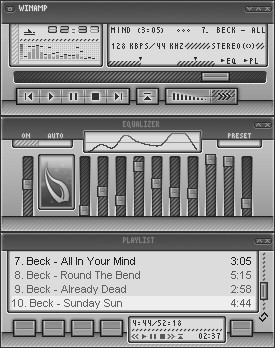
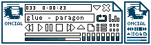
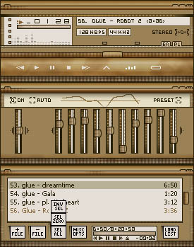
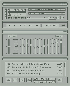
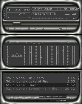
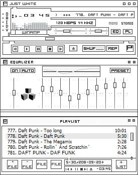
For Winamp 5+. With AVS, Video and the beloved Minibrowser skinned.Also check out ~C3I3C 's Partial Compact .
Related content


Comments: 22

great skin you've made there  (Smile)")
👍: 0 ⏩: 1
to make the winamp skin? hmmm, never knew it was so easy to port it over. Thanks
👍: 0 ⏩: 1
cheers! thanks for your time and help
👍: 0 ⏩: 0

Great skin. Very luminious in black and white. I just wish it was 10% more minimalistic. Or just 10% more ornate. It's kind of on the fence for me. But that doesn't stop it from being neat. If I could wink at you right now I would!
👍: 0 ⏩: 0

Looks a lot like the Bluecurve theme that comes default on Fedora Core, and I quite like it indeed. If only I didn't use Modern

👍: 0 ⏩: 0

using this as a winamp 2.9 skin... lookin good. nice work!
👍: 0 ⏩: 0

Very sweeet. I love the titlebars, the detailing on the scrollbars, everything. Very original, neat style and execution.
👍: 0 ⏩: 0


")


Nice smooth and usable skin 
👍: 0 ⏩: 0

seanfus: i think you can still use that on WA2
...anyways....nice lookin skin...i like the color theme you used, or the lack of it...heh.

👍: 0 ⏩: 0

Donnie didn't see Beck, wtf, I did, Donnie's a filthy lying mexican cherrypicker.
Nice skinny, if I had Winamp 5 instead of 2, I'd use it.
👍: 0 ⏩: 1

I saw Beck only twice.
But yea, you can use it on Winamp 2. You just won't have the AVS screen skinned yet...
")
👍: 0 ⏩: 0


dA tells me I can't download the file, so I'll just have to look at the screenshot. It looks pretty interesting, considering it's monochrome. What I like about the design of this skin are the large titlebars; they give a 'solid' feel to the skin. The returning pattern with the diagonal lines gives a consistent look, which is good. What I'd change.. I think the outer glow on the button labels look a bit too.. default? Maybe if they looked more like a stroke instead of a glow it would look better.

👍: 0 ⏩: 1
People at first didn't like those big titlebars [link] but I said "screw that, I like 'em." And thanks for the suggestion. I'm going to have to update this skin.
👍: 0 ⏩: 0

Very smooth, nice to look at. Certain element of originality. Nice work.
👍: 0 ⏩: 0