HOME | DD
 GraphiteFalcon — How time flies
Published: 2011-04-03 11:45:57 +0000 UTC; Views: 433; Favourites: 4; Downloads: 20
Redirect to original
Description
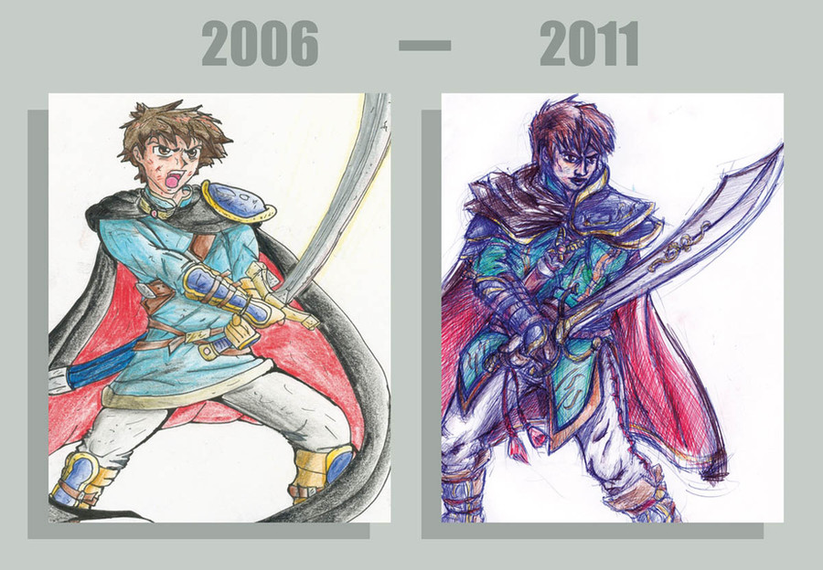
A comparison of a character of mine I drew 5 years ago and a remake of the same pic I just drew - figured it would be interesting to compare them.A few months back I was looking through my old drawings and came across the one that's on the left. '06 was about the last time I drew him, well, looking like that anyway. He didn't have a name then but he eventually evolved into my character Flint. So he changed heaps and this design was discarded!
But when I found it again I felt all sentimental about it, because I drew it before I started being too inspired by (read: ripping off) other peoples characters. It struck me as much more original than I'd anything done since.
So I redrew him! He's much less anime archetype and much more my style now. I'm thinking now he'll be another character in his own right. Sort of the antithesis of Flint: arrogant, confident and of the nobility
")
2006 version: [link]
2011 version: [link]
Related content


Comments: 14

Sweet job. My fav part is probably the glyph/symbol on the sword. all the added detail is great. plus in the 5 years in between the 2 pics, it would appear Flint's mad sword skillz have gotten even better. he has less scars now. and are those corellian bloodstripes on his pants?
👍: 0 ⏩: 1

Thanks man. Yeh figured he needed a more aristocratic weapon - but now I have to work on making it less assassin's creed 2!
Heh well that's also because now I realise scars don't always give people instant extra credibility. And he's not Flint anymore as I said in the description. They were just an added detail based on military uniforms - but yeah bloodstripes.
👍: 0 ⏩: 0

Whoa! Major evolution... The new one seems kinda gritty, serious and alot harder with heaps of battle experience and a "lets just get this over with" attitude, if any of that made any sense. The older one is more fluffy and "lets go have some awesome misadventures". It's alot more good old anime, whereas the new one kinda reflects the style of Solid Snake. Feel free to correct me if I'm wrong.
👍: 0 ⏩: 1
Heh yeah definitely, I know what you mean there. I've noticed that it's usually easy to pick my influences for any given drawing. Like in the older one, Fire Emblem: Sacred Stones and Jak and Daxter. And in the new one Assassin's Creed in the armour and sword and Dynasty Warriors in the details.
However ever since I played Metal Gear Solid it's actually influenced EVERY pic I do! Not really obviously in how characters look or any thing, but more the style of MGS. So my drawings have really taken on the gritty, world weary, strength in solitude sort of quality that is Metal Gear. So yeah you're spot on man!
👍: 0 ⏩: 1
You sound surprised... Both styles are equally good, they show 2 different sides to you, so it's impossible to say which is better.
👍: 0 ⏩: 1
Well I sort of am, I didn't realise how much of an influence Metal Gear has had on me until I compared these two. And usually my influences become obvious visual things but in this case it's almost purely stylistic so it's an interesting change.
👍: 0 ⏩: 1
Well, now that you've identified your influences, I have a feeling you will seek out ways to improve the impact they are having.
👍: 0 ⏩: 0

I know the new one is "better" and more anatomically correct and has more detail and everything... but I'm kind of loving the 2006 one. I think it's because it has the cliche anime style that I love. Also, I think that the new one is drawn in blue pen? And the way I feel about blue pen art is pretty much that way you feel about comic sans
But that's just me and my strange taste.

👍: 0 ⏩: 1
Well yeah that's why I kept the old drawing around, the style and colour of it still appeals to me. It's just not how I draw anymore.
Now that's pretty low sister, and I think you're confused about my opinion of comic sans
Also all of my drawings since September last year have been done in pen. You may have noticed I haven't drawn in pencil for about 6 months! Don't think I'll go back to graphite soon either. ballpoint pen allows me to put much more movement and energy into my pics and leaves the rough working lines which I think is awesome.
👍: 0 ⏩: 1
Haha, that's fair enough. I kind of wish I actually drew so I could get to a stage where I could do a comparison thingy, but that won't happen anytime soon
My apologies! I hear a lot about how disliked comic sans is
Yeah, I did notice that, I wasn't sure if it was on purpose though or because you just had a pen at that point. I think it's the blue that bothers me though. Do you ever use black?
Also you FAIL at note replies. FAIL!!!
👍: 0 ⏩: 1
Well all it takes is continued persistent scribbling on random scraps of paper on times you should be concentrating on something else - trust me that creates masterpieces
Also I looked at your drawings folder in your gallery and seeing them all lined up like that I can definitely see that you're improving.
Yeah I guess you would, it's a common topic among certain persons
And yes, I didn't forget about that note at all
")

👍: 0 ⏩: 1
FYI there's a difference between trolling you and offering an opinion that you may not like.
Yeah, there's an improvement, you get a bit more confidence (to press down the pencil harder, lol) and learn how to do different things, e.g. shading, and you also look at tutorials and stuff, and you get to know how certain things should look. At least that's how it was for me.
lol you guys just hang out talking about comic sans, don't you?
yeah, thanks for replying, lol.
👍: 0 ⏩: 0

I always love seeing stuff like this.
Wow, that is some serious improvement. It's nice to see how you've gained an understanding of human anatomy, as well as facial expressions and overall how to design a character visually!
I personally love the look of this fellow, I really like how that cape looks with the shoulder armor. c:
Keep on improving!
👍: 0 ⏩: 1
Thanks! It's always nice to get feedback and crit on my work! The first thing I noticed was the anatomy change too, I guess figure drawing classes helped more than I originally thought.
Yeah I really thought the cape and armour had so much potential now that my skills had improved, and thats part of the reason I brought this design back
Thanks again!
👍: 0 ⏩: 0