HOME | DD
 GreenLinzerd — Polygon

#glowies #grunge #polygons #spitfire #wireframe #mylittlepony #polygon #mylittleponyfriendshipismagic
Published: 2016-03-12 19:07:52 +0000 UTC; Views: 1423; Favourites: 38; Downloads: 23
Redirect to original
Description
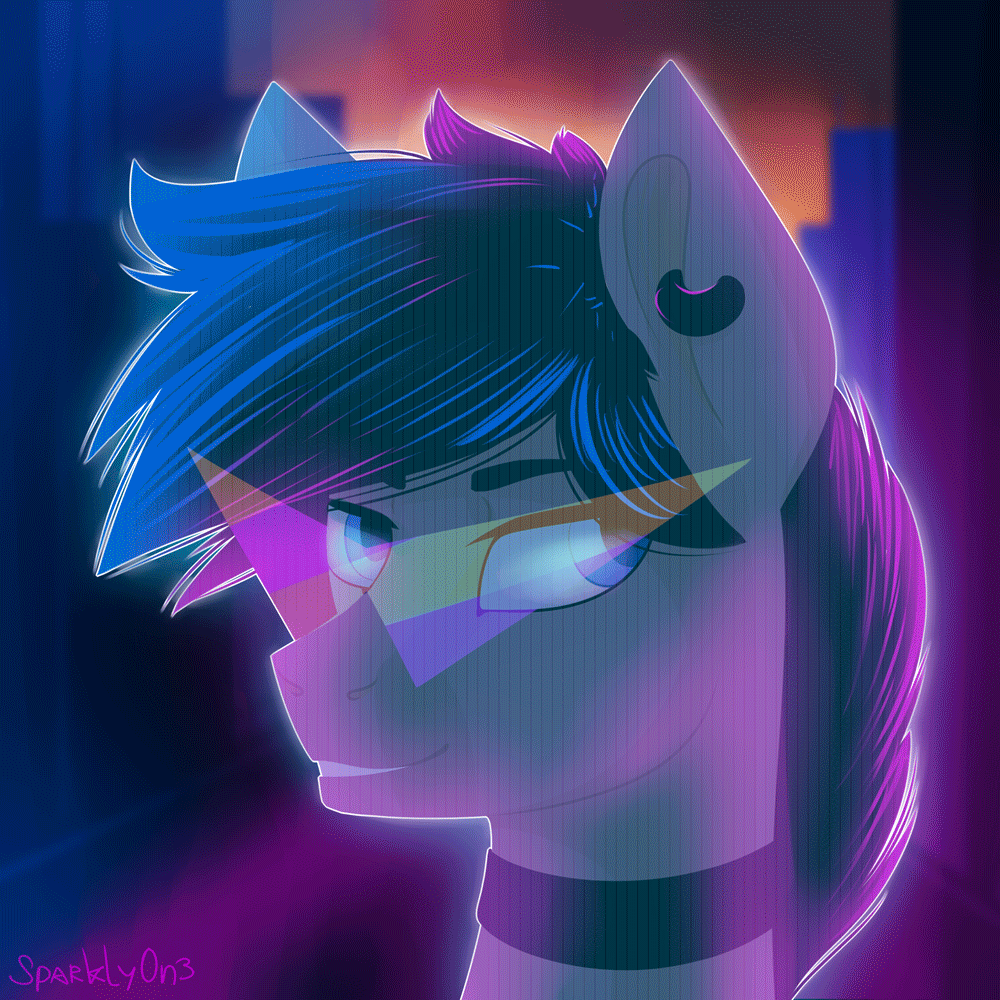
"What? Something on my face? Haha... you're just imagining things... it's fine... everything's okay..."So around 9 months ago I uploaded a picture called Mechanism. It was a headshot of Vinyl Scratch as a cyborg, with grunge textures, an appropriate font, paint splatters and some semi-grimdark undertones. And it was amazing fun, in between when Genevieve (my old graphics tablet, who has since been succeeded by Abigail) wasn't working. I really loved that picture, and I still do. Actually, looking at anything I drew a month ago or more always leads to me going "There's a flaw... there's a flaw... there's a flaw... ouch, did I really think that looked alright??" as a rule. But as I'm looking at Mechanism right now, there actually aren't any glaring errors. I think it's fair to say it's still some of my best work.
And shortly after I completed it, I wanted to do another one because it had been so much fun. And the two ponies who sprung to mind as good candidates were Spitfire and Octavia. Spitfire was the one that really stuck with me. And I always imagined it like this: she'd be facing the camera head-on, but looking slightly up and to the right; she'd also have cybernetic implants in the same vein as Vinyl, and she'd have this cocky grin (because that's just so her, you know?)
But I couldn't find that spark of an idea that made me absolutely want to draw it like "Yes! That's it! OMC, I totally have to draw that!!" until just a few days ago. I really can't remember what inspired me to think of the half-of-the-face-dissolving-into-polygons thing, but it happened, and I knew I had to draw it because if I pulled it off it would be really cool, etc, etc.
Then, with the concept about 65-70% fully-formed in my head, I started sketching... and the strangest thing happened. Her expression... shifted. She was still smiling, but she had this scared look in her eyes that wasn't there before... and I decided to roll with it. Is she a hologram that's breaking down? Is she just a simulated pony, a computer program that has maybe been corrupted? I'm not sure, but I like it.
Sketch (different to the WIP seen in the journal, because the "pony" layer is at full opacity here: )
Background grunge texture by - New Grunge Textures- FREEBIE
Foreground grunge texture by - Grunge Texture II
Circuit board photo by - lb1-54 circuit board
Prequel: Mechanism
Brohoof!
Photoshop's Linear Dodge filter really helped with this one what with all the glowiness happening. I used it on seven layers!
Here's a layer-by-layer breakdown that I did just for fun:
Related content


Comments: 5

"Actually, looking at anything I drew a month ago or more always leads to me going 'There's a flaw... there's a flaw... there's a flaw... ouch, did I really think that looked alright??'"
...Well, that's why I never release anything until it's sat on my hard drive for at least a week. 
Then I look at it again, and can see pretty much instantly if I "like it" or not --- although how to improve it can sometimes be a bit more tricky. 
And this looks nice indeed, yes.
 (Smile)")
👍: 0 ⏩: 1

Actually, now I think about it, Mechanism's lines are too thick, and the ear could be better.
👍: 0 ⏩: 2
On the opposite end of the spectrum, I have at least ... 3 drawings, or, rather, depictions of characters in comedic situations lying around my hard drive for months - I've had one I eventually released I didn't touch for over a year - and really, all I still need is a background.
Or to just decide not to use a background, like in some of my other pictures .
And I have a comic - right now - that's been pretty much finished since... a few weeks, maybe? And all that's wrong is... the speech-bubble layout, really.
Doesn't look right as a "text-less" comic... Speech-bubbles won't fit properly into one of the panels to show all needed dialogue...
Tried adding "black bar"-subtitles - that looks dumb, 'specially since not every panel has text...
Tried adding "overlay"-subtitles in the panel with character-colors ---- and that looks almost right. Except... not every panel has dialogue. Guess I just need to add some "What in tarnation?"s and "Huh?"s here and there. THEN it will probably look right.
So yeah, you're not the only "OCD"-case here.
👍: 0 ⏩: 0
Makes me think of this - there's a coloring mistake on the leftmost Pinkie. See if you can spot it?
Didn't notice well until after I'd submitted, and then just didn't feel like fixing it, especially since I'd also posted it outside dA and couldn't fix it there anyway.
Though after a while, the mistake stopped mattering to me.
I mean, I remember it's there, but I like the overall picture well enough it doesn't bother me. My eye's just not drawn to the mistake. Huh.

👍: 0 ⏩: 0
