HOME | DD
 GreyneArt — Control Brain Battle
#brain #control #controlbrain #invader #invaderzim #zim
Published: 2015-11-28 22:10:23 +0000 UTC; Views: 1602; Favourites: 45; Downloads: 0
Redirect to original
Description
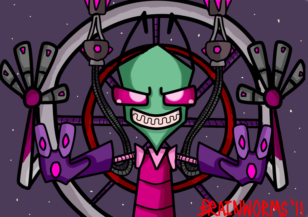
WOOOOOOOOOOOOOOO. I'm glad I'm done with this lol. This took forever but it sure was fun xD
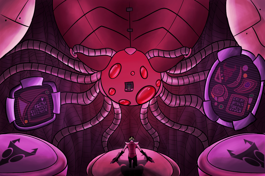
The story here is fairly simple. Heres this random little space bug (irken xD) who ohmy, just so happens to be defective. Conveniently. He's over here with his cool pistols, about to have a huge boss fight with the master control brain. (or how I see the master control brain.) I could explain this with a lot more detail buuutttt. xD
See if you can catch my easter egg. You won't know what it means just yet, but you will. Oh you will...
Invader Zim/Irkens/Control Brains/My soul belongs to Jhonen Vasquez
Artwork belongs to Me.
Related content


Comments: 12

Overall


Vision
Originality
Technique
Impact
The control brains are one of the most iconic features of the Irken Empire's power, so it's only appropriate that the artwork has a mood to it that displays a sense of authority and intimidation. I'm particularly impressed that you tried to imitate the style of background and technology from the actual show, which I know firsthand is very asymmetrical and intricately detailed. It can be very hard to replicate and, as you found out, requires a lot of time and work. The artwork was a very good endeavor, but I have some concerns to discuss.
The largest concern would be the quality of the lineart. It needs quite a bit of modification and cleanup. No lie, there is a LOT of linework required for this piece, particularly in the background, so it is very tempting to try and get it over with as soon as possible. But you shouldn't sacrifice the quality. Some of the lines are disconnected from each other, overlap and cause stray lines, and are crooked in comparison to one another, especially on the large electrical coils/pipes. As objects they are very streamlined, so the segment lines should be a uniform length apart and amount of curve. The floating screen frames also need adjustment, as their shapes are imperfect. Be sure to fix these things before you start coloring, or else it will be painful trying to correct them later.
There's also the matter of lighting. From what I can tell, the light source is coming from the "eyes" of the control brain. However, the way you colored it makes it seem like the light source is white when it is actually bright red. All of the highlights in the image should have a red color to them that mixes into the colors of the objects they illuminate, much like colored light bulbs. This would also add to the tension of the scene, considering red is a color associated with evil or danger.
You used soft shade, but the shading is uneven and doesn't agree with the shape of the objects well. I think you have the direction of light in mind, but different shapes react differently to shade. Shading should reflect the shape of the object, not just the path/direction the light travels. From the shading you did for the slightly curved, cylindrical pieces on the screen frames, for example, one could assume that they are relatively flat objects. On the four bottom pipes connected directly to the control brain, they seem to display additional light from behind them, not just above and slightly in front. The gradient of soft shading should curve with the object while still maintaining a sense of light direction. Try looking up how different objects react to different strengths and directions of light, particularly for spheres, cylinders, squares, and curved objects. Start simple and work your way up.
What I like to do is flip the canvas back and forth periodically and to receive feedback in parts as I go. You should consult a friend to see what they think of your lineart before you start coloring. Then later on, consult them again about flat color, then shading, etc... it helps a lot and saves you loads of time when you do your final touch-ups. Remember: someone will always see something you don't.
Just remember that whenever there is a higher amount of detail, there is also a higher likelihood of making mistakes. I sifted through your gallery, so I am aware that this is the most highly detailed piece of art you have on display. Please remember not to bite off more than you can chew; trust me, I have made that mistake far too many times before. Focus on the small things first such as lineart and shading, then eventually you can tackle the larger challenges such as leading lines, multiple sources of light, skewing perspective, etc.
Considering the amount of work you spent on this, I think as an artist you have a lot going for you. Just remember not to be discouraged by the amount of improvement needed for the road ahead. Take baby steps.
👍: 0 ⏩: 0


 (Smile)")


