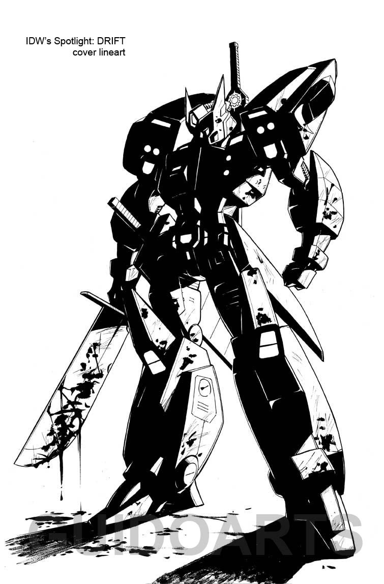
HOME | DD

GuidoGuidi β€” Drift Cover lineart

Published: 2009-02-13 16:42:42 +0000 UTC; Views: 11307; Favourites: 285; Downloads: 220
Redirect to original
Description Since the finished version has been revealed, I think it's safe to show the b/w version.
Inks on 11x17 Eon Art Board.

Colored version by the very talented Joana Lafuente: [link]


(Do not use without permission)


Transformers Β©Hasbro
Related content
Comments: 42

imaNINJA2 [2011-11-26 19:10:15 +0000 UTC]

THATS FUCKING EPIC MAN!!!
Drift ftw

πŸ‘: 0 ⏩: 0

hde2009 [2009-04-20 00:25:41 +0000 UTC]

Yow! That's quite a striking image!

Something I've often wondered with art like this - how do you go about electing which parts of it you want to block in as shadow? There's a lot of high-contrast stuff going on here - whenever I try to do something similar, I find that I generally misjudge the amount of shadow. My images tend to look either under-done or overly black.

HdE.

πŸ‘: 0 ⏩: 1

GuidoGuidi In reply to hde2009 [2009-04-22 03:00:43 +0000 UTC]

It may sound obvious, but It's all about practicing.. one trick is that, sometime, is better to leave in white some parts that in real life would be black as well as the opposite.

πŸ‘: 0 ⏩: 1

hde2009 In reply to GuidoGuidi [2009-04-22 13:37:56 +0000 UTC]

Thanks for the reply.

I guess you're talking about alternating values, right?

That's something I've been trying out a bit more lately. I find it's a bit of a struggle, as you don't necessarily lay the values down as logic would dictate. But as you say, it becomes a bit clearer with practice.

What I'd find kinda daunting bout an image like your line art is just the amount of shadow. I see other artists doing that stuff all the time, and it looks super-cool. But I just know that I'd tend to overwork things if I tried something similar.

πŸ‘: 0 ⏩: 0

Neko-Gal28 [2009-03-22 04:25:27 +0000 UTC]

Woah. Creepy. I gotta check this one out.

πŸ‘: 0 ⏩: 0

MurdererDelacroix [2009-03-10 04:06:35 +0000 UTC]

Epic.
Lovin the contrast.

πŸ‘: 0 ⏩: 0

wordmongerer [2009-02-24 16:33:06 +0000 UTC]

Suh-weeeet! Is there any chance that I could get permission to have a crack at colouring this? Per favore?

πŸ‘: 0 ⏩: 1

imaNINJA2 In reply to wordmongerer [2011-11-26 19:09:15 +0000 UTC]

its "por favor"

πŸ‘: 0 ⏩: 1

wordmongerer In reply to imaNINJA2 [2011-11-28 11:16:35 +0000 UTC]

Not in Italian it isn't, and both myself and Guido are Italian!

πŸ‘: 0 ⏩: 1

imaNINJA2 In reply to wordmongerer [2011-11-28 22:29:24 +0000 UTC]

ooooohhhhhh, i only know some panish o sorry

πŸ‘: 0 ⏩: 1

wordmongerer In reply to imaNINJA2 [2011-12-06 18:30:07 +0000 UTC]

No probs boss!

πŸ‘: 0 ⏩: 1

imaNINJA2 In reply to wordmongerer [2011-12-06 23:11:51 +0000 UTC]

Spanish*
^.^

πŸ‘: 0 ⏩: 0

Puffball [2009-02-20 23:15:38 +0000 UTC]

*Squee* :33 I love the intensity of the inks in this one. Epic! X3

πŸ‘: 0 ⏩: 1

GuidoGuidi In reply to Puffball [2009-02-21 01:35:24 +0000 UTC]

Thanks!

πŸ‘: 0 ⏩: 1

Puffball In reply to GuidoGuidi [2009-02-22 03:40:17 +0000 UTC]

You're very welcome! ^_^

πŸ‘: 0 ⏩: 0

RedWingsDragon [2009-02-20 05:27:38 +0000 UTC]

Awsome work here

πŸ‘: 0 ⏩: 0

WillMangin [2009-02-16 12:36:49 +0000 UTC]

awesome, guido. i love when you use the solid blacks like that. very dynamic looking.

πŸ‘: 0 ⏩: 0

metalformer [2009-02-16 07:15:46 +0000 UTC]

That's bloody brutal!

πŸ‘: 0 ⏩: 0

PriscillaTR [2009-02-16 03:24:40 +0000 UTC]

Wow, this cover is AMAZING 8O~

πŸ‘: 0 ⏩: 0

papercrownqueen [2009-02-14 17:49:04 +0000 UTC]

Loove the shadows. <3

πŸ‘: 0 ⏩: 0

generationmiko [2009-02-14 08:55:35 +0000 UTC]

Pretty~

πŸ‘: 0 ⏩: 0

Blackvegetable [2009-02-14 06:26:06 +0000 UTC]

Funky! Excellent shadow job!

πŸ‘: 0 ⏩: 0

emanz [2009-02-14 05:13:00 +0000 UTC]

πŸ‘: 0 ⏩: 0

JimPrime [2009-02-14 03:32:20 +0000 UTC]

OMFG one word AWESOME

btw how did u do that shadowing its prob the best of the work

πŸ‘: 0 ⏩: 0

Somvold [2009-02-14 02:51:32 +0000 UTC]

Like how you played around with the shadow here.

πŸ‘: 0 ⏩: 0

MrJellyfish [2009-02-14 02:34:26 +0000 UTC]

nice!

the highlights on the shoulders look like little happy faces

πŸ‘: 0 ⏩: 0

ryangenovese [2009-02-14 01:51:12 +0000 UTC]

HOLY SHIT...... that.. is.. awesome!!

Fantastic work!

πŸ‘: 0 ⏩: 0

kurisama [2009-02-14 01:13:05 +0000 UTC]

Gorgeous pic mate!! Love the pose and i'm guessing he has more than 1 type of sword?

πŸ‘: 0 ⏩: 1

GuidoGuidi In reply to kurisama [2009-02-14 01:30:25 +0000 UTC]

Thanks!
Yes, he has 2 big flat swords on his hips, and another one, very long, on his back.

πŸ‘: 0 ⏩: 1

kurisama In reply to GuidoGuidi [2009-02-15 04:08:12 +0000 UTC]

Nice. 1 Sword = Win. 2+ Swords = Epic Win. I really enjoy ur character concepts and designs. Hope u keep pumping out more! Ur Wheelie and Soundwave ones are the shiznit.

πŸ‘: 0 ⏩: 0

Stargazer27 [2009-02-14 00:54:42 +0000 UTC]

Wow, that's amazing!

πŸ‘: 0 ⏩: 0

s0ulsurvivor [2009-02-13 23:34:44 +0000 UTC]

Sharp

πŸ‘: 0 ⏩: 0

Totoro-Totoro [2009-02-13 23:33:54 +0000 UTC]

Love the solid straight shapes here, very mecha-like!!

I also love your style, very contrasting. And i love the dribble of ink coming from the sword, very good!!

πŸ‘: 0 ⏩: 0

swordmaster007 [2009-02-13 22:25:55 +0000 UTC]

Awesome. ^__^

πŸ‘: 0 ⏩: 0

pacomontoya [2009-02-13 22:19:57 +0000 UTC]

Nice.

πŸ‘: 0 ⏩: 0

g-kwan155 [2009-02-13 21:52:37 +0000 UTC]

this is cool. the black and white is awesome!

πŸ‘: 0 ⏩: 0

AosakiKeiko [2009-02-13 20:07:36 +0000 UTC]

Loving the b&w on Drift here ^^

πŸ‘: 0 ⏩: 0

lonegamer7 [2009-02-13 19:54:09 +0000 UTC]

A hint of darkness there...

πŸ‘: 0 ⏩: 0

enolianslave [2009-02-13 18:10:29 +0000 UTC]

uh, the inking and the stark b&w is so gorgeous, I would take this just as it is, it's perfect without colour as well.

πŸ‘: 0 ⏩: 0

BrenGun [2009-02-13 17:21:27 +0000 UTC]

wow awesome!!!!!!!

πŸ‘: 0 ⏩: 0

MobiusZero [2009-02-13 17:18:21 +0000 UTC]

sweet

πŸ‘: 0 ⏩: 0

quickblast [2009-02-13 17:00:25 +0000 UTC]

sweet i seen this in tfw news sit^^

πŸ‘: 0 ⏩: 0