HOME | DD
 h3r0 — Evocation Logos
by-nc-nd
h3r0 — Evocation Logos
by-nc-nd

Published: 2003-05-13 14:02:56 +0000 UTC; Views: 25760; Favourites: 143; Downloads: 2609
Redirect to original
Description
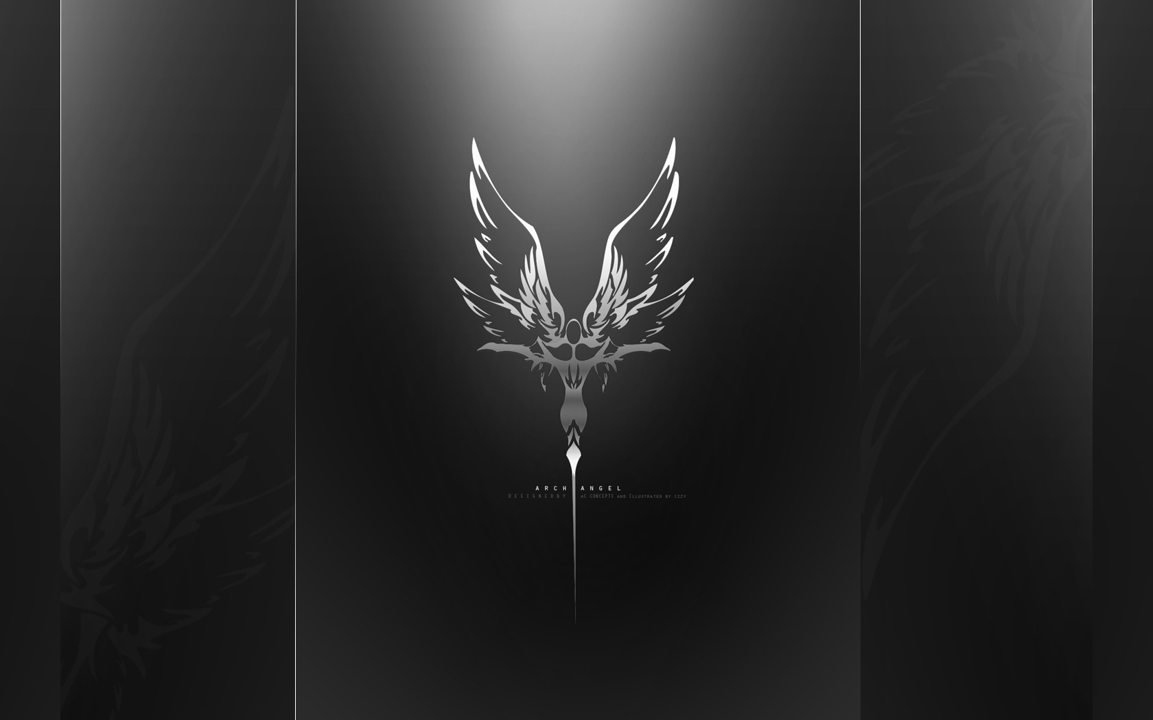
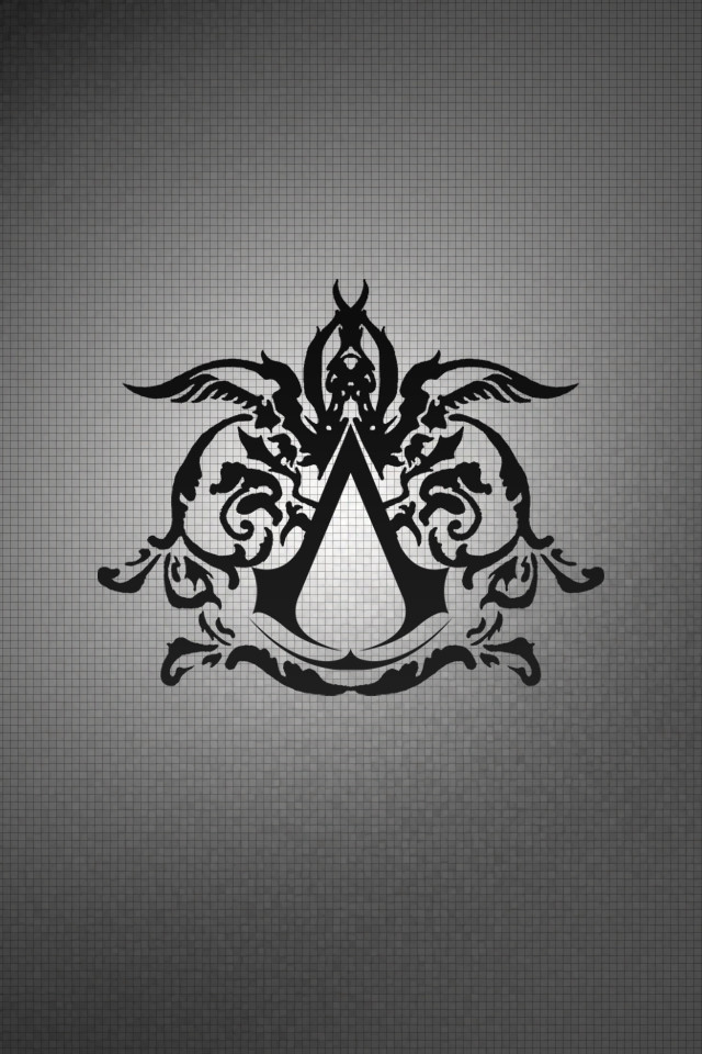
Originally these two logos were in the running for use on my personal portfolio site. Both logos were done with the pentool, if you havent noticed for yourself the bottem logo is a duplicate but with the two points crossing instead of meeting; Giving it that butterfly effect. Anyway Blah blah.. Questions and Comments highly welcome!
Tools:
Photoshop 7.0
My Brain
 (Wink)")
Related content


Comments: 25

Great job on them  (Smile)")
👍: 0 ⏩: 0

top one im actually working on a logo similar to that. I love birdzzz
👍: 0 ⏩: 0


My name is James and I am currently working on a project that we need a logo / concept art for.
We really like this logo design, among others, and would like to offer you the oppotunity to submit to us an original design for Brimst0ne Manor
Brimst0ne Manor is going to be Perth's leading World-Class Artist's retreat and Recording Studio. located in the heart of the outer southern suburbs of Perth, brimst0ne manor offers recording artists all the luxuries and necessities Perth has to offer.
What do YOU visualise when we say this? show us! that all we ask!
We will pick a favourite design, and that art will stand as a monument in Music.
thank you for your time
James Shenfield
Chairperson - Parker Street Project
👍: 0 ⏩: 0

i like both. a neat idea is to make mouse-over animation with one of them transforming into the other one.
But I feel that the type is a little bit condensed

👍: 0 ⏩: 0

Hello one and all
i was wondering....
I am doing architectural drafting as my course this year and i need a logo to place on the bottom of my work...something black and white...can be crammed in small but still look intricate and pretty...
My name is Linnea Eve Kelly
My company name is Lunatix...or the name that i go under anyway is Lunatix
If any one can give me a couple of designs...much appreciated cause right now im having a creative blank....
Thanks so much
Linnea
xxx
👍: 0 ⏩: 0

Both look great, but I'd pick the top one... and I'm not completely sure of why.
👍: 0 ⏩: 0


The Top logo just KICKS MY BUTT!!! man . . . i wish i couldve made that up for my Anime story (see my "Unicorn Mech"), its soo PERFECT!
👍: 0 ⏩: 0

Uu gots sum tight logos man . I'd say the bottom logo
👍: 0 ⏩: 0


photoshop pen tool, and paths + patience if i screw up lol
👍: 0 ⏩: 0


top! the top one is awesome, well they both are but the top 1 is better i think
👍: 0 ⏩: 0

I prefer TOP one its stronger
GOOD JOB
KEEP CREATING
👍: 0 ⏩: 0


I prefer the top design, it feels nicer.
I hope you don't mind if I just point something out... I find the type is a bit weak compared to the actual logo, especially at a small size. You might want to play around with making the type larger, maybe the placement.. not so squished down "inside" the logo, or maybe even try placing the type below the logo? Just some thoughts..
👍: 0 ⏩: 0

killer designs. I like the top one best because it's more dramatic and more bird-like (the lower one looks more like a butterfly which is more delicate). I guess it totally depends on what you are going for.
👍: 0 ⏩: 0

i'd say top but they both kick major ass... good job
👍: 0 ⏩: 0

I don't know, it's a really hard decision. But I guess I'd go for the upper one myself. Has the short of open, flowy feeling in it. But they are both good, it's just a matter of taste which you like better.
👍: 0 ⏩: 0

well I like them both but I do prefer the top one.
It depends what you're going for.
The bottom one reminds me of a butterfly more but at the same time looks a little squashed when compared to the top one (althought it only looks that way in comparison to the other, otherwise it's fine.)
::shrugs::
They're both very nice, but i do like the top one better ^_^
👍: 0 ⏩: 0

I like better the top one, it looks great, more like wings~
nice idea for a tattoo also~
👍: 0 ⏩: 0

I think they both rock, but I'd go with logo on the bottom.
👍: 0 ⏩: 0

for my taste the_top_one is better- looks like wings of dangerous creature, meanwhile the bottom one looks a little like a butterfly
good work!
👍: 0 ⏩: 0