HOME | DD
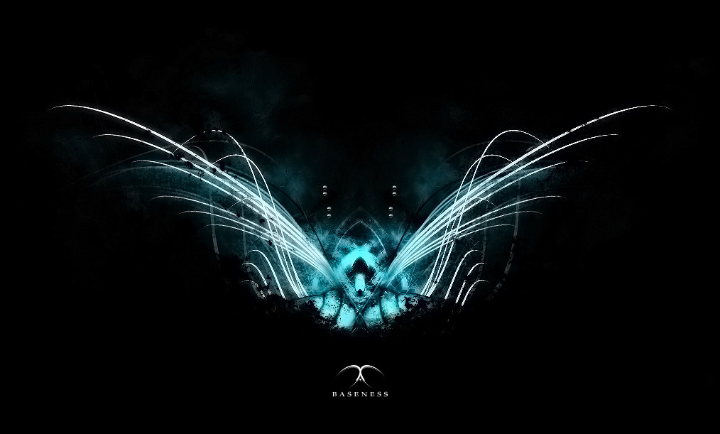
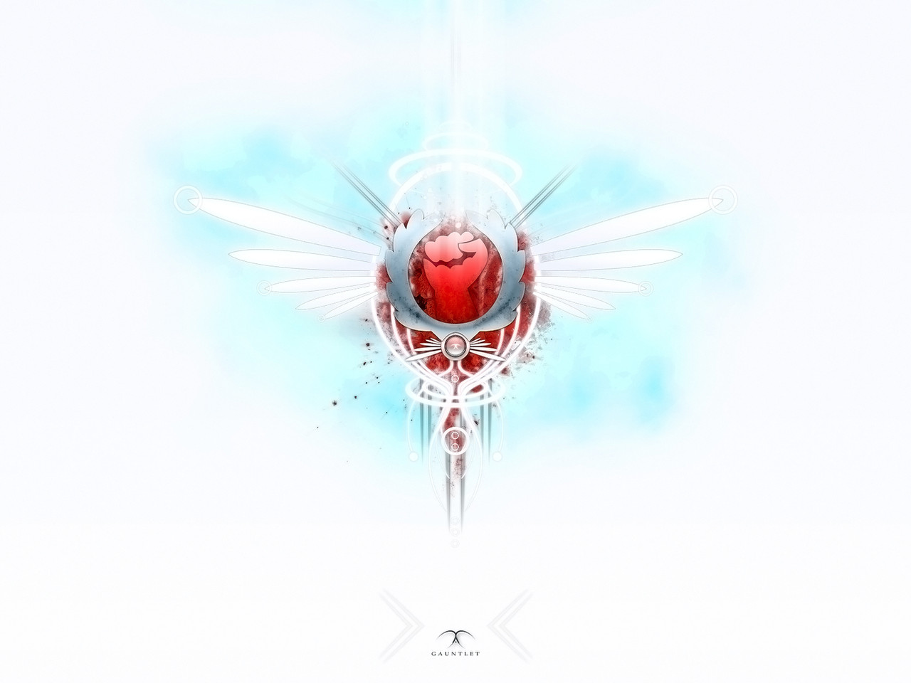
 HagerotH — Baseness
Published: 2005-08-22 18:52:19 +0000 UTC; Views: 1303; Favourites: 16; Downloads: 241
Redirect to original
Description
Arrived With The Day Ov BeginningCast Out Ov Blackness Into Eternity
To Conquer The Universe
We Are All And Without Equal
In Freedom Our Souls Burn
Conquered We Can Be Not
IAO SABAO
Wallpaper: [link]
Related content


Comments: 36

Wow, that's pretty cool, looks like it has a creepy little face. I like the colors also, nice job
👍: 0 ⏩: 1


Thank you, thank you very much. Smiles back
👍: 0 ⏩: 0

sieht interessant aus!
vor allem gefällt mir die farbe extrem gut!!! (obwohl ich seit dem wjt eigentlich ne abneigung gegen hellblau hab *g*)
das einzige was mir nicht so gefällt is die symmetrie.
sag mal, hast du eigentlich noch praktikum oder frei?
👍: 0 ⏩: 1
danke, also mit dem welt jugendtag kann das nur teilweise inbezuggebracht werden eher ein counterpice.
Ich hab jetzt noch ferien aber praktikums bericht schreiben o.O
👍: 0 ⏩: 1
nein, eigentlich kann der wjt gar nicht mit dem bild in bezug gebracht werden. (bis natürlich auf die ähnliche farbe, welche allerdings hier viel mehr leuchtet als bei den rucksäcken!)
3 gute gründe:
- das bild gefällt mir gut, im gegensatz zu dem wjt
- das bild ist viel zu düster
-das bild is viel ästhetischer als der papst!!!
 (Wink)")
👍: 0 ⏩: 2

okay, hab mich auch grad schon gewundert wieso der so wütend aussah... *g*
👍: 0 ⏩: 0
")

and remember DRUGS ARE BAAADDDD
^^^^^^^^^^^^^^^^^^^^^^^^^^^
nichts als ein Witz ... nicht witzig??? NICHT WITZIG??? AUFS MAUL???
oh mein Gott...... ich bin *Toast* XD
👍: 0 ⏩: 1
hehe, ne is schon ok wenn du willsd aufs maul ^.^
aber ich werde dich verschonen ^.^
👍: 0 ⏩: 1
danke Großer..... ich werde mich erkenntlich zeigen und den Auftragskiller auch wieder zurück pfeifen
👍: 0 ⏩: 1
nein lass ihn kommen.blut....
👍: 0 ⏩: 1
")
👍: 0 ⏩: 0

so I express this amazingly picture...in my opinion a also ....very expressive artwork
👍: 0 ⏩: 1
Der Schwan
Ich will mit dir schweben
Schwanenflügelgleich
Im irisierenden Taumel
Von weichen Federn versinken
Und wenn ich dich berühre
Die Samtheit deiner Haut spüre
Die Wärme, das Schlagen des Herzens
So wünsche ich mir
Die Zeit würde sterben
Doch nur einen Wimpernschlag
Darf ich von der Ewigkeit kosten
Schon enteilt der Schwan
Im Licht der untergehenden Sonne
Nur leere Wünsche hinterlassend
👍: 0 ⏩: 0

Yeah, this one kicks ass! The colors and the composition are great.
But I agree with saberrider about the reflection. It don't even look like one.
But anyway, great work!
👍: 0 ⏩: 1
w0h00.... thats hot.... love the white lines !!
dont know why but i rememberd Azrael from Diablo when isaw the pic *wired*
👍: 0 ⏩: 1
Hey!!! thanks!!!  (Smile)")
👍: 0 ⏩: 1
Ah ... yes ure right...!
Shame on me!!

👍: 0 ⏩: 1


reminds me of some kind of spaceship landing somewhere in the woods and lightening up everything...
in my opinion this is the best you've done so far... colors and contrast work fine...
just 2 things:
Isn't it supposed to say "of" instead of "Ov"
And the Reflection of the font doesnt look good... keep it simple there...
great work anyway... this is a deserved fav
👍: 0 ⏩: 1
"Ov" is my way of/v writing "of".
You don't like the reflection of the written?
I added it because i think its better this way without the reflection it looks pretty lost there.
👍: 0 ⏩: 1
well i don't think that this kind of writing is very clever... nobody will see what you had in mind when writing a simple word like "of" with v... it's ok when you're doing it the way you like it but you have to accept that it looks like a typo to most of the viewers...
and i think that a font, especially a serif font, is enough for the eye... maybe a shadow or a little glow but everything else is disturbing the eye and makes the font look weird...
👍: 0 ⏩: 0

Whoa.. That rules. I love the colours, and the abstractness.
👍: 0 ⏩: 1