HOME | DD
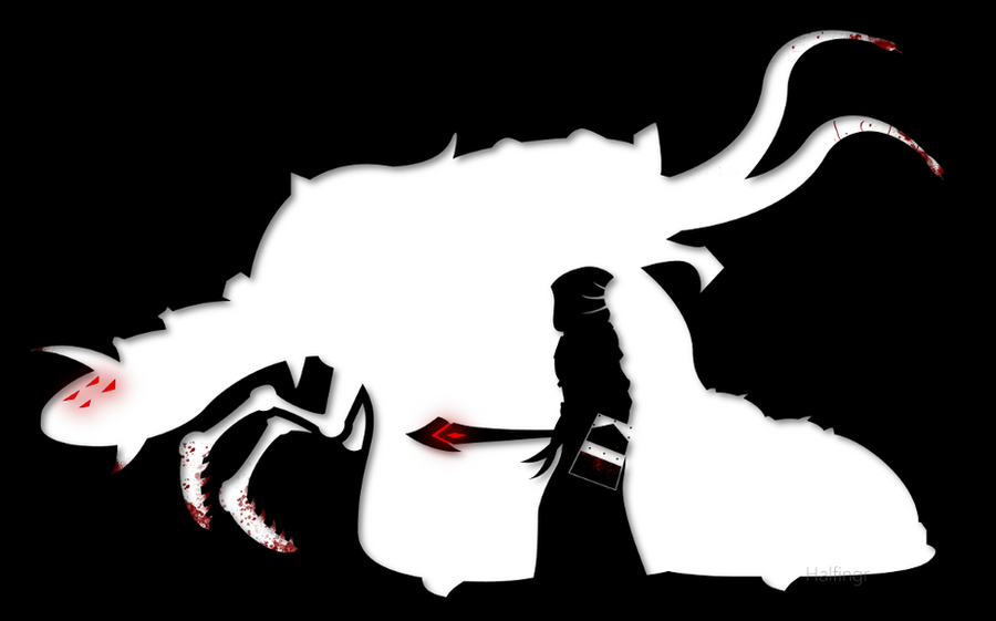
 Halfingr — Balance
Published: 2011-07-13 06:47:52 +0000 UTC; Views: 1804; Favourites: 25; Downloads: 0
Redirect to original
Description
"Balance".Related content


Comments: 23


I never thought of using it as a T-shirt graphic... ")
If you guys would like, I'd be more than willing to sell the Copyrights for the design with an .SVG or .AI to you guys to sell on your Jagex SpreadShirt shop, or I could post it to my Zazzle.com Storefront and link it to you (that is if you're being serious, and not just pulling my leg).
👍: 0 ⏩: 0

Congratulations on getting this in the Players' Gallery this month!
👍: 0 ⏩: 1
Thanks. =]
Awesome to see somebody connected the two.
But now I have to make sure people aren't reposting it as their own. =[
👍: 0 ⏩: 0

"So Balance arises from contrast. This is the wisdom of Guthix."
Win.
👍: 0 ⏩: 0

Magnificent!
(I confess to some slight bias in favour of Void Knights, but quite apart from that, this is a beautiful piece...)
- Mod Moltare
👍: 0 ⏩: 1
Thanks! =] I tried keeping it as simple as possible, while making everything mean something.
I too have a bias towards the Void Knights; my favourite questline/theme to date. I wish there were more though, or maybe an alternate questline that would spawn off of who the player decided to save during the Queen fight. A quest that has storyline repercussions based on previous quests would be something that I'm sure a lot of people would enjoy.
Thank you for the comment, by the way. =]
👍: 0 ⏩: 1
AvatarofWurms In reply to Halfingr [2016-09-30 05:37:31 +0000 UTC]
Would also adore more quests involoving the void nights.
👍: 0 ⏩: 0

I like the silhouette concept here. It really brings out the image, I think.
👍: 0 ⏩: 1
Thanks - I tried to take as much focus away from tiny 'skillfull drawing' details and put it all into a more conceptual image that is easier to digest, and focused more on the compositioin.
See, the black and white being 'normal' balance, and the red being where there are imbalances fighting against each other.
👍: 0 ⏩: 0

I love this work. Although I'm struggling to put my thoughts into works here.
The simplicity is genius. I love it.
👍: 0 ⏩: 1

very nice design! other than the feeling that the pest queen is a little too simple, the piece is great!
 (Smile)")
👍: 0 ⏩: 1
That was the point; super basic simple to-the-point, with only black and white with red accents.
👍: 0 ⏩: 1
No no, not that, like the Pest Queen's silhouette could have been better. I can't exactly describe it, but the parts that bugs me the most is the arms and the head
👍: 0 ⏩: 1
Really, the mouth is the only thing that is incorrect - the arms are exactly like they are on the queen, though maybe a little thicker.
👍: 0 ⏩: 1
I think on the arms, you made the joints to big, giving the arms kind of a K'Nex appearance. Maybe if the joints didnt so much like a pivot point of some apparatus, but more like armor plating over the joint, it would look better. And I think you rounded out too much of the Queen's outline, which in turn make her appear soft and squishy. It is my own personal opinion that the claws, as well as the queen, could obtain more "areas of extra definement," which I can only best describe by comparing the claw of the queen with the claw of a StarCraft Zerg Hydralisk. The accented groove in the claw makes it look more lethal
👍: 0 ⏩: 1
Its an outline though.
A agree, the joins are a bit large and some of the parts could use a few more angles, but that is what it looks like.
👍: 0 ⏩: 0

")
Thanks!
It was supposed to infer an epic aura.
👍: 0 ⏩: 0

wowwwwwwwwwwwww
All I have to say about this is. You did it right!
I love this man
👍: 0 ⏩: 1
Thanks.
I took the idea pretty much exclusively from a project I did for my 2D Design college course.
👍: 0 ⏩: 0