HOME | DD
 Harm-Less — Harm-Less Design
Published: 2007-03-27 18:39:35 +0000 UTC; Views: 4757; Favourites: 21; Downloads: 0
Redirect to original
Description
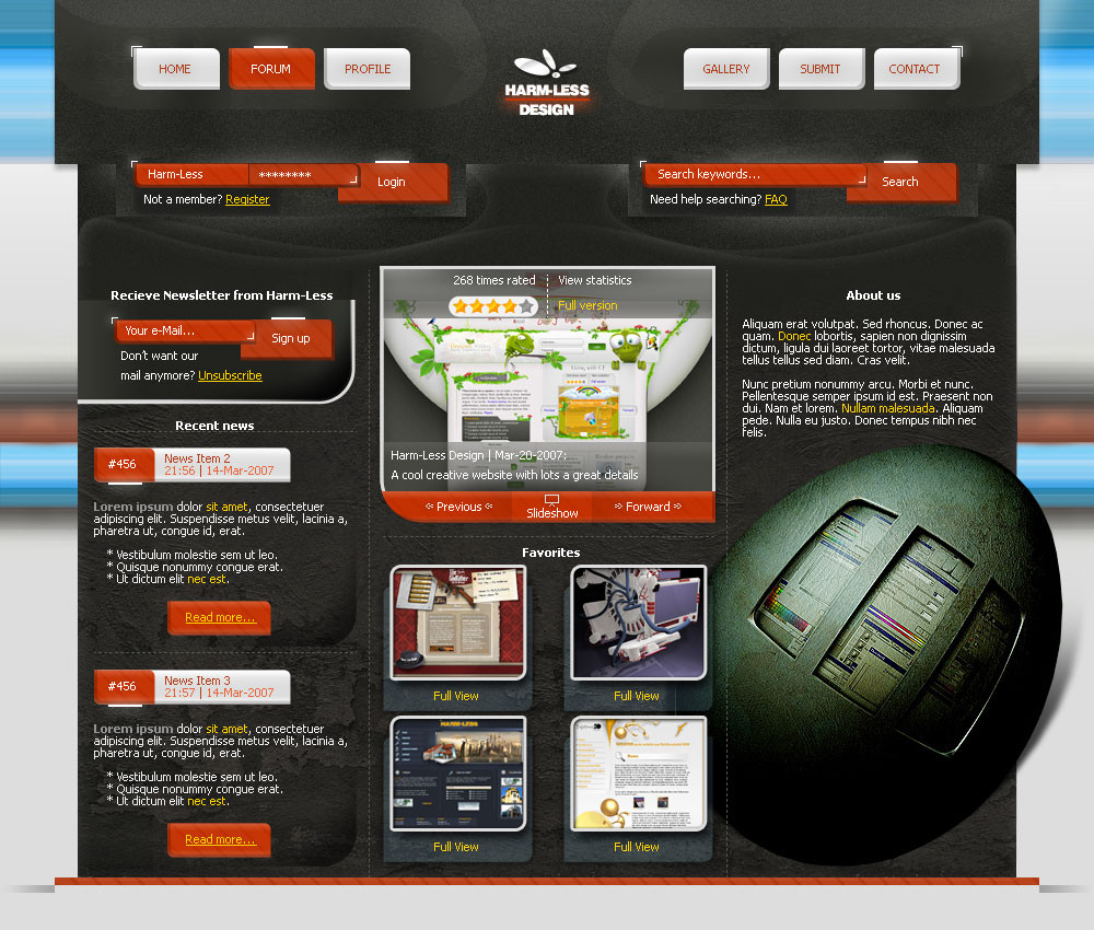
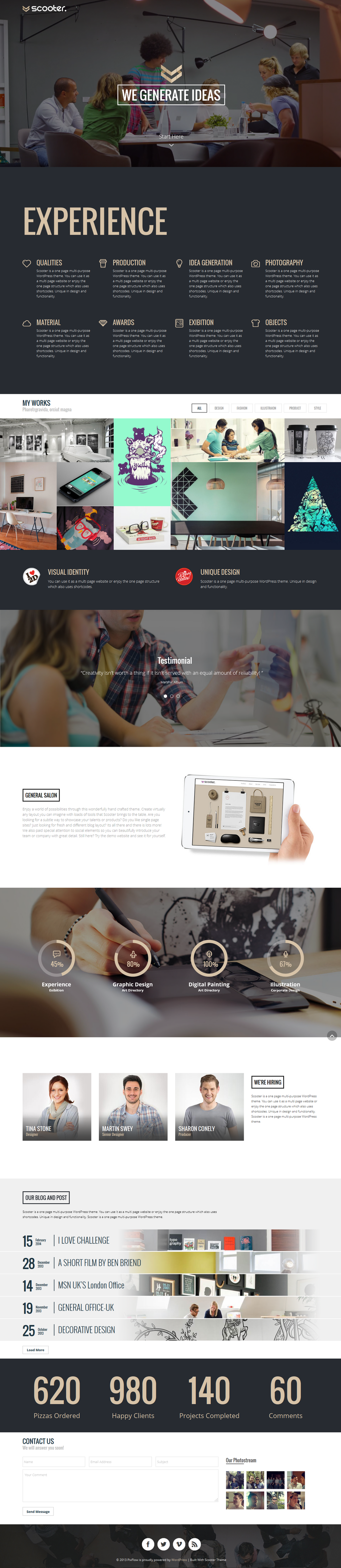
Again a template with no purpose yet, just a brainstorm template.I uploaded it in two versions, the difference is the header, and I want you to decide which one looks better.
EDIT: The one active now is better.
--------------------------------------------------------------------
Picture egg: ~DanielYuen who made this deviation
Website: myself (also images of favorites and gallery are mine)
Logo: myself
--------------------------------------------------------------------
Time: ±4-5 ours
Software: Only Photoshop CS2
edit: Removed a "ugly" red ruler (just like bottom one), just didn't fit
Related content


Comments: 39


Thanx, great to hear that from you
Question: can you make me a good logo, or just a idea so I can make it myself. I think you can do really creative stuff with "Harm-Less", right?
👍: 0 ⏩: 1

well yes i think i do, well have to get on this matter soon, i have a lot of work to do after i come from vacation ill go tomorrow, ill be working while there too :/ anyway, i have to do 2 logos for 2 friends here in dev, lets say that if i sketch them they will be ready in 2 hours...., and. when ill be back in a week or so, ill get on yours
 (Wink)")
👍: 0 ⏩: 1
Your the best!!
If I can do something in return, ask me (if its not to large ")
👍: 0 ⏩: 1

I see progress  (Smile)")
")
👍: 0 ⏩: 1
Thanx man, but what about the background? I think it splits up the website and the "non content" part really well, right?
And what does IMHO mean?
👍: 0 ⏩: 1
IMHO? In My Humble Opinion
I think it splits up the website and the "non content" part really well, right?
Right, but it brings more colours not used in the "content" and for me it makes it too colourfull. I would rather think of mid-dark gray with some pattern on it and the "content" has a black outerglow or dropshadow with small opacity and mid size so it looks like the whole layout is above the background. But thats just my humble opinion.
👍: 0 ⏩: 1
I thought it was good the way it is now, the blue color is making it much more colorful, I don't think I'm going to change it, i tryed the things you suggested before, but it was not so cool and colorfull.
👍: 0 ⏩: 1
De gustibus noli disputare
👍: 0 ⏩: 1
👍: 0 ⏩: 0


Some elements that are great - shapes, light and textures. Something doesn't draw me to it 100%. Maybe the background? Maybe to busy? Not sure.
But I am sure it's a good job done
👍: 0 ⏩: 1
I did this one real quick, so some part can be better
👍: 0 ⏩: 0

No matter what we do the amazing contrast of the grey and orange follows us . Cool!
👍: 0 ⏩: 1

It is indeed a very "busy" design, and I really like your design work, I am just trying to figure out if it is pleasing or not.
👍: 0 ⏩: 1
Lol, I got time, so don't rush it
But thanx for the comment.
👍: 0 ⏩: 0

Thanx, your last template is also freaking cool dude
👍: 0 ⏩: 0


Your right, but its the first time I see that site
👍: 0 ⏩: 0

whoa awesome, i like it... but i agree with about the rulers go fix that and its close to perfect
👍: 0 ⏩: 1
finally a comment from you
👍: 0 ⏩: 1

Thanx, a friend of mine (outside DA) told me the same.
👍: 0 ⏩: 0

Again,An above average template From harm-less.Im impressed...The Curvy type content boxes..motion blurred background and slightly grainy Header all remind me of kwaku which certainly isnt a bad thing......
One major thing however....Those 3 or 4px Red lines at the top and bottom break the Framing of your overall template....Fix it IMMEDIATELY.
I cant imagine Making a Website in 4 to 5 hours anymore...Mainly its because i spend so much time on the most minute details and trying every available option.....My most current Template ive already spent about 15 hours on and ive completed the Header and navagation.....Heh.
👍: 0 ⏩: 1
thanx, and I didn't even had inspriration from Kwaku
About the "red rulers", I think the bottom one is good, only the top one is a little "strange".
I find couldn't think about making a site so fast, but how longer you try, how faster and better they become. This was done in one try, but sometimes I must make a part of a site 3 or 4 times.
👍: 0 ⏩: 1