HOME | DD
 helekri — Spring Breeze

Published: 2007-01-05 12:00:33 +0000 UTC; Views: 1876; Favourites: 73; Downloads: 0
Redirect to original
Description
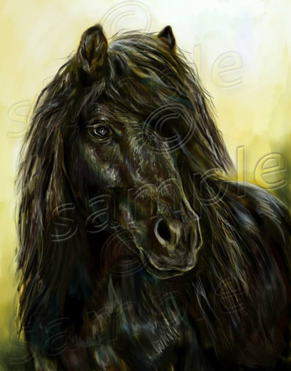
You probably thought I'd never finish this, didn't you?
Here it is. I decided to leave it like this because the rough edges and undetailed parts somehow back up the important bits. I still might fix those ears a little if they keep bugging me.
A Finnhorse mare. If you know a horse like this for sale, please note me immediately.
")
I can't believe the nose still seems crooked...

(better description coming when I have the time)
// AS USUAL COMMETS APPRECIATED MORE THAN JUST FAVING.
Related content


Comments: 48


YEs yes yes... .This is my favorite of your horses work! Great piece!!

👍: 0 ⏩: 0

Lovely piece! The shading and coloring is amazing. I really like the eye, she looks really sweet
👍: 0 ⏩: 0


Kiitoksia ja kiitoksia featuresta. ^^
👍: 0 ⏩: 0


Aivan ihastuttava suokki. 
👍: 0 ⏩: 0


You're an artist !! A very very good artist ! And I'm fan of course

👍: 0 ⏩: 0

This is stunnung 
👍: 0 ⏩: 1
Mares are *never* difficult. They've got personality. (Yes, I'm a mare-person thru and thru.)
Thank you.
👍: 0 ⏩: 1
Lol, I have 2 mares, and they are very, very difficult. Heh, I'm more of a gelding or stallion person
👍: 0 ⏩: 1
Where's the fun in easy? 
/ignore helekri, she's high on inspiration and low on sleep
👍: 0 ⏩: 1
Lol, that's true. Omg lol that didn't sound geeky! It just sounded pretty funny!
👍: 0 ⏩: 0


I love the mane! 
 (Wink)")
👍: 0 ⏩: 0

TODELLA upeita toita! Olet vanginnut hienosti suomenhevosen tassa ja siina mustavalkoisessa sivukuvassa
👍: 0 ⏩: 0

Beautiful. The way you painted that expression and those beautiful mane and tail is stunningly beautiful. The head however seems a bit too broad and the chest has too little definition for my taste, as it makes the painting look a bit strange. Gosh, that expression is so very well done....
👍: 0 ⏩: 2
Broad? ")
I agree on the chest issue. It feels really plastic and too smooth. I went and did some blending on it way back when I started this painting and since then my preference not to blend so much has taken over me. I'm just not sure if there's enough light and definiton to show on that area, I'll have to check it and see the reference. In any case, I think my shadows (esp. on the front) are a bit too lame...
Thank you!
👍: 0 ⏩: 0
Broad?
I agree on the chest issue. It feels really plastic and too smooth. I went and did some blending on it way back when I started this painting and since then my preference not to blend so much has taken over me. I'm just not sure if there's enough light and definiton to show on that area, I'll have to check it and see the reference. In any case, I think my shadows (esp. on the front) are a bit too lame...
Thank you!
👍: 0 ⏩: 0


It's gorgeous! I love the details and fine textures! It really brings the picture to life  (Smile)")
👍: 0 ⏩: 0


Beautiful work you have here! Absolutely gorgeous colors!
👍: 0 ⏩: 0


I love how it's all the same colour scheme. It's gorgeus.
👍: 0 ⏩: 0

Photoshop Elements 3.0 and hard round brush with a matching eraser, stylus set to opacity.
Painted with Wacom PenPartner and Aiptek HyperPen 6000U. Finishing work done with Aiptek, most of the work with Wacom.
👍: 0 ⏩: 0

Wonderfull pieces as always.A definite fav i'm glad you put it up.Hmmm the nose seems well to me.If it's to straight it isn't right but that's just my opinion.Love the manes and facials.
👍: 0 ⏩: 1
I agree, little imperfections are what make great pieces. But this is just disturbingly wrong.
Thank you for the comment!

👍: 0 ⏩: 1
No problem.Hmmm well it's like they say.An artists worst critic is him/herself.^^
👍: 0 ⏩: 0

I really like it! Just tweak that right ear alittle so that it looks more refined and matches the left ear.
👍: 0 ⏩: 1
The ears are quite crap.
👍: 0 ⏩: 1
No, only the right ear needs work. I think the left ear looks just fine. It's still a lovely piece.
👍: 0 ⏩: 0


I think you can make the nose better looking if you get rid of the mouth on the under side (sorry don't know how to explain it better) and make it again in the part wich is left... but thinner than it's now...
the mouth now looks like the way you would see the horse from up front, the horse should hold his head up a lot higher before you could draw the mouth like that... the down jaw should be way less visible....
and I think you should draw the right eye as well
but I think the mane look gorgeous and I love the color of the horse
if you wish I could make a redline if that would help you, but only if you really want it
Greetings, Merel
ps. I really like this drawing, just pointing out how to improve it more to make it an outstanding one
👍: 0 ⏩: 1
(I updated the picture after you commented as I once again submitted the wrong version...)
Actually I have a reference photo for this one and I can't see the things I do wrong, but I don't know how to correct them.
The mouth is/was one thing. I think the horse had her mouth open slightly, as the jaw showed so much. The photo was also taken a bit "under the horse" so that possibly enchanced the effect.
I think I should do the right eye as well but I have a problem I can't get my head around: if the eye shows better under the hair, where the hell does the light come from? Light to the eye is completely blocked by mane and forehead. I drew faint "borders" to the eye, but I can't see them in this small size at all and it looks like the horse doesn't have her left eye.
Thanks for the comment, important and really hard points you raised! I think I'll be leaving the painting as it is, at least until I know how to make the corrections I see are needed... But c'est la vie, we live some and hopefully learn some!
👍: 0 ⏩: 1
I'm just telling you what I see
and if you don't want crits you can say that as well
👍: 0 ⏩: 1
Me, I want and love crits. I'm so happy there's people like you. I'd put "advanced critique encouraged" to all my devs if people would still have the nerve to post their "non-advanced" ones too.
It's just a bit frustrating to see that the piece doesn't work and why it doesn't and not be able to fix it. Drives me mad!
👍: 0 ⏩: 0