HOME | DD
 HMontes — Chibi Ruby Gloom - WIP
Published: 2008-08-03 14:18:22 +0000 UTC; Views: 9575; Favourites: 115; Downloads: 2510
Redirect to original
Description
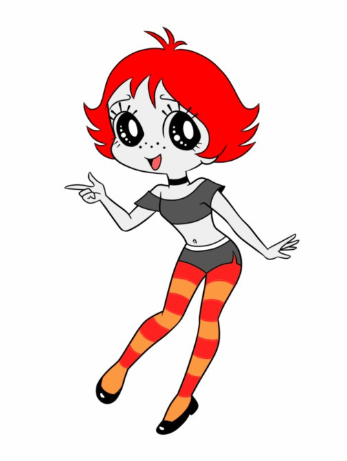
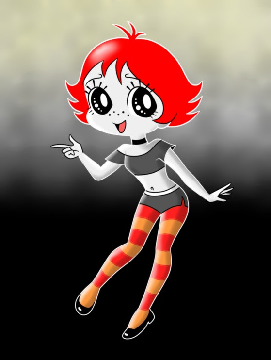
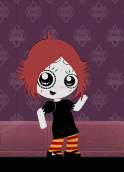
This is a work in progress. I just have the linework and the base colors done. I still have to add some shading and highlights along with a background. I'll be out of town for a while today but I may be able to finish this tonight.I like to draw characters in different styles sometimes. I was trying several with Ruby but none seemed to click. Then I remembered a style I saw I've been wanting to try. It's in Christopher Hart's book "Chibi And Furry Characters". It's a super-stylized chibi by Yurie Sugiyama. I saw a pose in the book that would work for Ruby so I adapted it for this drawing. Once I get comfortable enough drawing in this style I will create my own poses.
Related content


Comments: 28

")


In the Chris Hart book it's called stylized chibi. But then again your interpretation of chibi may be different from others.
👍: 0 ⏩: 1

This is awesome! I can't wait to see it finished!
👍: 0 ⏩: 0


thats a nice little book.....
👍: 0 ⏩: 1


Looks pretty neat so far! Can't wait to see the finished product!
👍: 0 ⏩: 0

Your lines look clean to me. Now I'm not into that style; so I'm not sure how good my judgement is. But it looks to me like the pose is right. The line weight, like I said, I'm not into the style, but to the best I can remember, your line weight looks close. Sorry I can't say how close and if your line weight is too thing or too thick. I can only say it looks close; for your talent is beyond my knowledge.
Keep drawing, your moving forward and upward.
👍: 0 ⏩: 1
At first I didn't understand what you meant by lineweight. Then it occurred to me that a lot of manga is drawn with very thin ink lines. Unlike American comics which have thicker and varying lines. I like to think my lines are more in between in thickness and I like to vary them sometimes. And since I'm more influenced by animation I don't do a lot of detail lines. Keeping it simple and direct. And I rarely use lines for shading, leaving that part for the coloring stage.
👍: 0 ⏩: 1
Yes, that is why I can only go so far when commenting how good someone is doing. As well as not being able to suggest much for improvement. I love Animation and Manga as a fan, not as an artist. So my comments can only go so far and are more encouragement than helpful. But hey, artist need encouragement as much as help, right?? So what does it matter if can't say just how close a person is or even if they are dead on.
I can still say, looks like your making progress to me. Keep drawing the style you love so well, it looks like you really love it.
👍: 0 ⏩: 1
Well I was going for a certain look but it's not a permanent thing. I learn something from trying these experiments that will benefit my own art and style.
👍: 0 ⏩: 1


You did a great job on the redesign .
I liked it a lot .
well done .
👍: 0 ⏩: 0

