HOME | DD
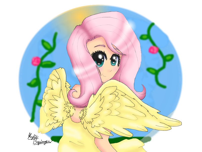
 Honey-PawStep — Human FlutterShy
Published: 2012-11-16 05:51:31 +0000 UTC; Views: 1123; Favourites: 17; Downloads: 61
Redirect to original
Description
This is THE BEST Picture I have uploaded sofar IN MY LIFE!!! This was what was so important ont he journal :/Anyway, NOBODY Can use this without permission.
Took me about 8 hours.
Related content


Comments: 18

Overall
Vision
Originality
Technique
Impact
I'm not typically one to do Critiques, but hey, I'll do my best. Also, please note, I may not be the best artist myself, but not all critics are artists themselves. Anyhow...
Anatomy
- The anatomy seems nice. I can't really judge completely because it's not full body. The wings also look very nice, and though they may be small, it fits the character's body type and of course, the character itself.
The eyes are a bit big, however... and the eyelashes really bother me. Perhaps you should cut back on adding so many eyelashes to a character... it makes her look like she used way too much mascara or something.
Also, the way you drew the hair bothers me a bit. I understand Fluttershy's hair is long and flips out, but it doesn't have as much volume as you put into it. Also, it doesn't look as "windswept" as it should be, as I notice her dress appears to be blowing, so there must be some circulation in the air in the picture.
Also, the shape of her face seems off. The size is about right, but with those huge eyes, it just doesn't look right at all.
Linework
I really don't like the linework. Some parts of it are too "blocky", and aren't smooth at all. Other parts seem to just fade out, while others are these thick, black lines. It could really be fixed up a bit, in all honesty.
Coloring
You did a good job at getting the colors to match the character. They're almost exactly the same as it is in the show. Good job on that.
However, the coloring job itself is really poor. Where you see the highlights and shading of the picture, it seems to go over the lines, making it look a bit confusing and completely destroys the linework. This is probably why I really dislike the linework to begin with. The highlights also go completely OFF of the character, and onto the background, and plus, they are just way to bright for hair in some parts.
Background
Well, I can see the idea you were getting at with the background... however, it needs a lot more work. I suggest making the flowers a bit more realistic, to leave more of an impact on people. They just look... "Blah", in the picture. Like you just threw them on there without any idea where to put them, how to make them bend and curve... They just look boring to me.
Other
The final thing that bothers me is that LONG fishnet thing where her dress is. I have no idea what it is, why it's there, and it just utterly looks wrong and pointless in the picture. It doesn't fit her dress or anything! It's place in the picture is just complete and utter disruption for me.
Well, that is my critique. I hope you look at this as a way to improve, and I look forward to seeing your improvements.
👍: 0 ⏩: 0


This is probably the best thing in your gallery!
I love her eyes! Her eyes are my Favorite part about this piece.
Also I love the wings! um...
the O N L Y thing is don't really like is the mouth... * flinches *
But other than the mouth its beautiful! just everything about it is just A M A Z I N G !
um I have no clue what else to say...
T H I S I S B E A U T I F U L ! ! !
sorry but im Horrible at critiques DX
~Evertide-Song 's is better
THX K BAI
👍: 0 ⏩: 0

I love it! the vines and roses in the background add a nice Fluttershy-y touch. I like how her wings are curled around her, and her hair was done VERY nicely. The skin tone was done very well too, as was the general shading. The way you made the background circular almost makes it look like when Pinkie shoves the receding black circle open at the end of episodes, and makes me feel like Shy is actually looking at me. Overall, very nice piece. Can't wait to see what would happen if you got a tablet. (BTW Thank Celestia for half days!)
👍: 0 ⏩: 0

you can do a critique for it to
👍: 0 ⏩: 1
Im not good at those though DX
👍: 0 ⏩: 1
thanks  (Wink)")
👍: 0 ⏩: 1
All I have to say: Epic and much deserving of more than 5 faves
👍: 0 ⏩: 1

")
👍: 0 ⏩: 1
*huggle* Well, think about it this way. I'm incredibly unknown, PLUS I'm a worse artist than you
👍: 0 ⏩: 1
*sigh* i will not think of it that way, i know your stressed, but STOP THINKING THAT!
👍: 0 ⏩: 1
