HOME | DD
 HOTgraFX — Fallen Angels
Published: 2003-12-04 19:11:44 +0000 UTC; Views: 25829; Favourites: 289; Downloads: 2760
Redirect to original
Description
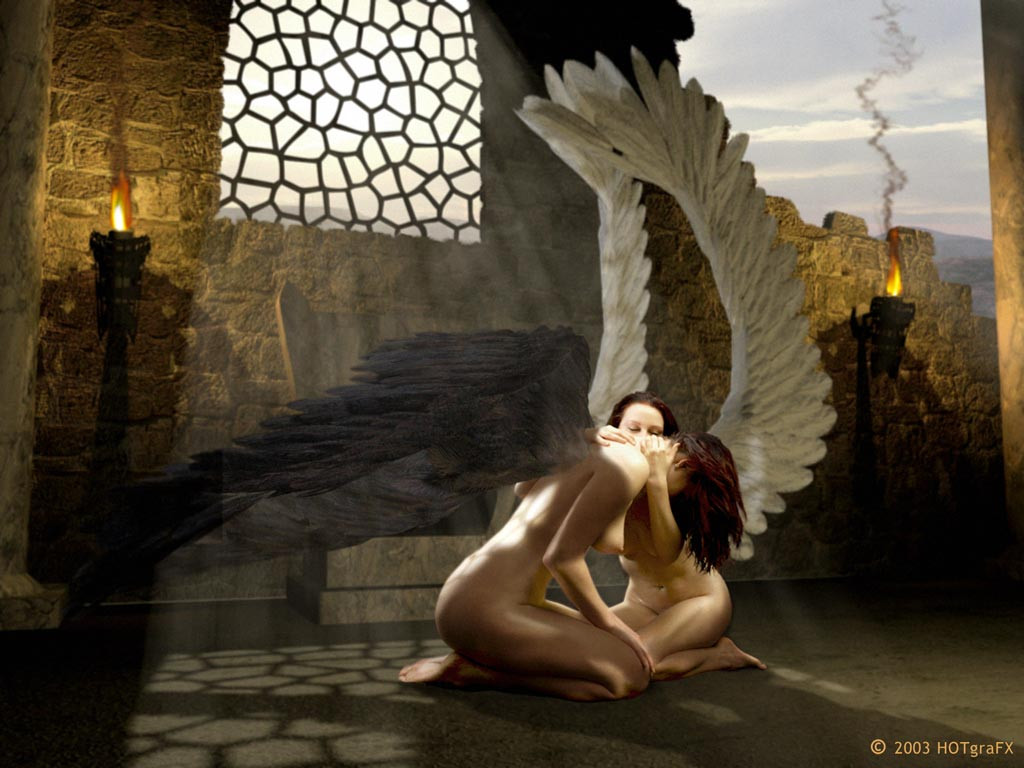
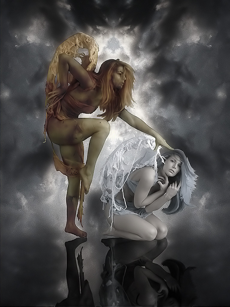
Hi! (Wink)") This is my "longest work on ever" ...so far.
This is my "longest work on ever" ...so far. Inspired by one of the famous Paintings of Luis Royo I made the photo of the 2 girls in my homestudio.
The original photo is just a plain black background.
I sculptured a set and wings with my computer and build this scene in (hmmmm.... lemme think....) about a month. (every time I had time for working on it)
NOW I think it is pretty close to be finished and I want some respond what I might haven't seen.
Oh. I forgot: Even the shadows and highlights on their bodies R not real.
Hope U like it as I do
Kind greetings from germany,
HOTgraFX
For the technical interested viewers:
Tools of use were MAX 5, Poser, Photoshop.
Related content


Comments: 58

Beautiful, personally I wouldn't change a thing. You've done an amazing job and this was an instant favorite for me!
👍: 0 ⏩: 0


That is amazing. What did you use? If you used Photoshop, I was wondering if you could tell me how you blended the wings with the girls body so well? I have an idea for this piece that I gotta finish within the next 3 weeks.
Your help would be greatly apreciated.
")
👍: 0 ⏩: 0

thats why i clicked it cuzz it reminded me of luis royo.
 (Smile)")
👍: 0 ⏩: 0


Your amazing work has been featured in my News Article, Women in Art 21 - Glorious Girls [link]
Love your work!!!!!!!!
👍: 0 ⏩: 0


I love it
but why do I see a nipple?
no nipple please?
maybe ?
I onno do what you want, its so pretty I don't care XD
👍: 0 ⏩: 1

??????? Nipples are unnaturally? ...or what?
👍: 0 ⏩: 1
I hate it when females nipples are shown, they make me sick, but reall I just love the pic so much I just don't care XD
👍: 0 ⏩: 0
Thank you very much!!!
xoxoxo,
Michael
👍: 0 ⏩: 1

you are very welcome Michael
👍: 0 ⏩: 0

I think it's absolutely beautiful... however, I agree on the lighting, it needs to be balanced out so there's less confusion unless it's supposed to be a balance between doubt of the path of an angel in which case, I'm all for it.
2.) I don't know if you're going for the realistic look or just the artsi look, but the shadows (if for realistic) look fake around the shoulders of the angel who's head is down, it's a feathered shadow, and I think it needs to be a little darker as well as being smoothed to proportions of a realistic shadow.
3.) Everything has excellent textures except the sky... it's like the building was the main focus on the texture, and everything else was kind of tossed in at the last second. I'd add a little more texture to the clouds maybe, or some different hues in the sky, and I'd add a smidge more texture in the wings, not too much but enouhg to give it that extra oomph (however that's spelled) atmosphere, and other than that I'd say you're done, oh and lighten the wings of the Angel behind the one who's head is down just a tad.
Other than that, it was well composed and just over all well done.
👍: 0 ⏩: 0

fantastic!xN
hey hey hey...
u really shocked me by ur pics!
👍: 0 ⏩: 0

Great, great, great.
Love it. Love the wings, looks very cool.
👍: 0 ⏩: 0

I choose this work for a newsarticle Angels you can see it here [link]
Via
👍: 0 ⏩: 1

Magnificent!!!
The wings (of the angel?) at the left have poor visibility...
👍: 0 ⏩: 0

hey, I was just wondering from where I know you, and I remembered this picture. (although I don't remember your old nickname... >__>
I'll be checking out the rest of your gallery soon!
^_^
👍: 0 ⏩: 0


their wings look a bit unrealistic may i sugest that you study pics of birds
👍: 0 ⏩: 1
Thanx for the constructivity!!! Its been one of my earliest!!!
Greets,
Michael
👍: 0 ⏩: 0

That would make htis a digital manipulation... This is a beautiful piece though I love the textures.
👍: 0 ⏩: 0


Royo is a great artist indeed and this is a very good piece of fanart
👍: 0 ⏩: 0

Great layout, I think the lighting is the only thing that needs work, from the 3d light source that is, the torch lights might need to paint a little onto the wings and the model to show a hint of it. The shadow under the other torch on the right side of the image seems too dark especially with a open ceiling there. But this is an incredible piece.
👍: 0 ⏩: 0

i haven't seen anything so beautifully crafted in a long time. thank you for your wonderful work.
👍: 0 ⏩: 0

This is awsome! Im so glad I stumbled across it.
👍: 0 ⏩: 1

Nice work
>> Inspired by one of the famous Paintings of Luis Royo
I know
👍: 0 ⏩: 0


I love Luis Royo's work and this is a fitting tribute - very good indeed. I agree with psy-333nudes that it could be improved by the 'outside' world being darker. Your hard work really paid off.
My Page: [link]
👍: 0 ⏩: 0


Hi Michael !
I appreciate your thoughtful comments on my work and I'm glad to see your gallery, fav+
The transparency effect of the black wings works very well, at least for me. I think is a remarkable rendering of photography and digital FX. I admire that talent a great deal ! Excellent work. Look forward to seeing more of your work. Great eye !
👍: 0 ⏩: 1
Thank you Michael! *smile* Ain't it good to be in the position not to have to learn a new name! *eg*
Hmmm.... the wings.... I'm about to re-render this image soon, 'cause I think the white wings look way to massive.
I'll B watching your way of artwork on this board too!
Have a nice whatever.
Kind greetings,
Michael
👍: 0 ⏩: 0

Wow!
Ich bin beeindruckt! Zumal ich so eine Engel-Teufel Fetisch habe, der demnach besonderes Interesse an geflügelten Frauen hervorruft.
Respekt für diese Arbeit!
👍: 0 ⏩: 0

i love the pose and background. i noticed a few things. the shadows around the torch are too dark and you lose the ends of the black wings. the balck wings need to be sharpened or darken. they blend too much. i love the light throught the window and shadows of the angels. you have done an awesome job. i am so impressed with your work.
👍: 0 ⏩: 0

fantastic image! if you would like some constructive crit to finish this image here ya go. dont get offended, your image is awesome, but you asked for crits in your comments
1. the torch lights and shadows are AWESOME! but it's not dark outside.... darken the sky so it actually looks like a time of day that a flame would cast that kind of shadow or remove it all together and just use the ambient light from the lattice window (which i prefer)
2. the smoke on the torches. either lighten it up a lot or remove all together. it provides a focal point that distracts from the image as a whole.
3. either pop out or fade further the hills in the background. they are kind of in that "halfway" state that draws your attention to try to discern what they are. either way, they are another focal point that your image does not need.
4. the dark wings where they meet the shoulders of the model look blended where as the wings and the skin are high detail. try a difinitive line somehow, maybe skin puckering, wing bone, a stray feather, a wound... something to make the transition without the blurry blend.
i love the composition and the methods, and i would never have the patience that it would take to create this piece. dont thinkn by my comments i think i could do it better, becase there is no way in hell i could come close to this kind of attention to detail - other than as a critic. it's a profession, not a hobby
👍: 0 ⏩: 1
| Next =>