HOME | DD
 HQheart — Floating thoughts.
Published: 2013-03-23 20:36:19 +0000 UTC; Views: 3736; Favourites: 155; Downloads: 0
Redirect to original
Description
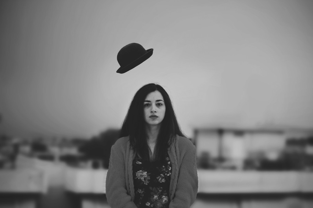
Flickr: [link]Black & White Blog Post: [link]
Related content


Comments: 28

Overall


Vision
Originality
Technique
Impact
The visual photo quality reminds of older, aged photos; those kinds of black and white keepsakes that your grandparents had from the early 1900s. There’s this faded, low contrast look. It’s a strange feeling, like this photo has a bit more history to it.
I feel that the expression and hat flying create a nice contrast or tension: she seems so unaffected by the things that are happening around her, and it only makes the viewer wonder why. It forces the viewer to fill the in the gaps, which are plenty. For instance, that’s a strange position for the hat - you cannot tell if it is blowing away or towards her.
The background and overall composition don’t feel to be very developed. The sharp contrast between how focused the figure and hat are and how blurry the background is makes the two main objects feel almost out of place - I get the same feeling when I see images using greenscreens/the background was photoshopped. I really doubt this is what you wanted, but the extremity of it is giving me this impression.
Also, is the background relevant? Like, what, artistically, made you choose this background over another one over just a plain white background? Because it is so blurry and has such a low range of value (even in comparison to the overall piece, which is fairly low contrast), I cannot see any aesthetic or metaphoric value that provides, so to me, it is more of a technical problem. It’s distracting.
While sometimes simplicity is beneficial, the sheer emptiness of the composition makes it much weaker than it could be. The centering of such small objects within the composition makes the entire thing feel very void, creating an off-balanced feeling to the whole thing (and that’s in spite of the fact that the composition is mostly symmetric).
👍: 0 ⏩: 0


 (Smile)")

Hi! Your beautiful photo has been featured in our monthly journal, where we show the best works from our group.
You can see it here: photo-feelings.deviantart.com/…
Be sure to fav the article if you like it!
Have a nice day!
👍: 0 ⏩: 0

I love it, Well done.
Featured in my journal [link]

👍: 0 ⏩: 1
You're welcome, Feel free to check my gallery [link]
👍: 0 ⏩: 0


Tried this on a top building... now I have no hat...
👍: 0 ⏩: 1
")


[link]
If you don't mind i used your photography on my video
👍: 0 ⏩: 1

It's okay and thanks for the credit
👍: 0 ⏩: 0

The title gives the picture a comical touch that makes me grin! Good work.
👍: 0 ⏩: 1
")


How did you do that? O.o
A really pleasant picture!
👍: 0 ⏩: 1
